The number of custom Android builds/UIs is bound to grow and one upcoming entrant will be Acer with their “Liquid” build of Android. Whereas HTC Sense is a pretty drastic makeover and Motorola BLUR mainly touches on social aspects, Acer took a middle of the road approach with Liquid. They make non-invasive improvements to Android that make it SEEM like an improved version of stock Android.
Of course this is all according to the wonderful screen shots found and analyzed by the Italian Android enthusiasts at HDblog.it:
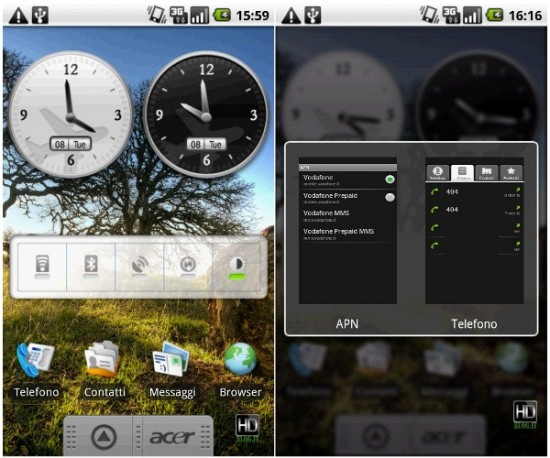
Notice the custom clock, and connectivity widget to instantly turn on/off things like Wi-Fi and Bluetooth? While these are elements of HTC Sense as well, it is these incremental improvements that Acer has made throughout the UI according to the folks who checked it out.
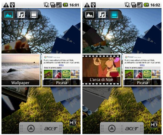
Custom gallery to scroll through pictures, music and video.
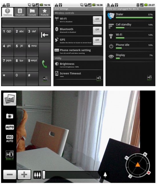
The dialer layout is customized as shown above but that battery usage indicator is included by default in Android 1.6 Donut – nothing new or custom to Acer Liquid. The camera experience seems to be pretty customized with an interesting feature that shows a compass! I’m not sure how often this would be helpful, but I suppose it is cool nonetheless.
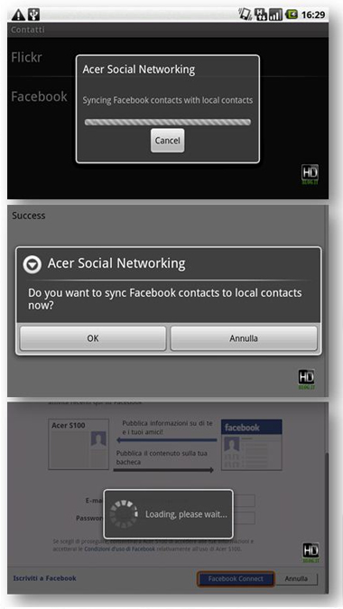
Then you’ve got the obligatory social networking and contact book integration/syncing. It isn’t discussed or displayed in detail, but we have to guess that it works similar to the existing solutions out there. How Acer displays/integrates this information on the front-end will be interesting to see. I’m surprised this wasn’t covered in this article but hey – we’ll take what we can get.
And those spec you’re so eagerly awaiting? No prob:
- 3.5-inch WVGA (800 × 480) Capacitive Touchscreen
- Processor: Qualcomm QSD 8250 1GHz
- 256 MB RAM
- 512 MB FLASH ROM
- 115 × 64 x 12.43 mm
- Weight 135g (including battery)
- Category 8 HSDPA / HSUPA Category 5 / UMTS (2100/1900/900 MHz) for EU
- Category 8 HSDPA / HSUPA Category 5 / UMTS (2100/1900/850 MHz) for U.S.
- GSM: Quad-band 850/900/1800/1900 MHz
- GPRS / EDGE: Class B, multi-slot class 10
- Messaging: MMS, SMS
- WLAN: 802.11b / g Wi-Fi CERTIFIED ® network connection
- Bluetooth ® 2.0 + EDR
- AGPS
- 5MP camera with Auto-Focus
- Accelerometer
- Light sensor
- 3.5 mm headset jack
- Capacitive buttons: Home, Search, Back, Menu
- Hardware buttons: Volume Up, Volume Down, Camera, Power / Standby
- 1350 mAh Li-on battery
- Talk time: Up to 5 hours for WCDMA / Up to 6 hours for GSM
UPDATE: The original source article seems to be down now so I’ve copied/pasted both the English and Italian versions of the original (minus the specs) for your archiving pleasure:
English Translation:
We are accustomed to different systems interfaces for Android. We liked the interface HTC sense, because the graphics Motorola with Blur and saw the solution adopted by Sony Ericsson. All interfaces certainly beautiful and striking, but certainly heavy and maybe a little far away from what is the system Android. We do not want to say that we dislike, indeed, are very comfortable and beautiful, but some of these interfaces are changing so much that the graphics of Android that altering the system deeply enough to make him another system. Perhaps the most convenient and practical for a user hand shrewd and quick, limiting in some ways for a user instead of more demanding and looking for customization.
Acer seems to have found a road somewhere between that of a Google phone Experience classic and a phone completely revised as the last HTC Sense. The A1 is in fact a terminal that offers personalization software and hardware solutions are very interesting. We saw in the previous article, the notification LED bar, comfortable and certainly fascinating. Now we see some aspects of the software that Acer has reviewed and adapted from the original version of Donut.
Some widgets have been revised and redesigned by Acer. The clock, for example, was amended and made more attractive, as well as the task manager that allows you to have a preview of open applications.
We can say that customization of Acer on Android Donut are really many, but very minimally invasive and fully integrated with the original Google system. The party multimedia and image management has been redesigned and is loaded with new features and a nice fan to browse images, videos or music:
The department connectivity, the phone dialer and battery management have been completely revised so as part of photographs which also integrates the electronic compass.
Another interesting innovation is the integration with social networks and in particular with Facebook that is very discreet but very functional:
In the following screen you can finally see some other parts of the interface and the navigation system screen inside the device.
Recall that the current software version is still under development and will soon release new updates. Any new features or widgets are possible and will demonstrate future software changes.
Original Italian text:
Siamo abituati a diverse interfacce per sistemi Android. Abbiamo apprezzato l’interfaccia HTC Sense, visto la grafica Motorola con Blur e intravisto la soluzione adottata da Sony Ericsson. Tutte interfacce sicuramente belle e appariscenti, ma indubbiamente pesanti e forse un po lontane da quello che è il sistema Android. Non vogliamo dire che non ci piacciono, anzi, sono molto comode e belle, ma alcune di queste interfaccie cambiano talmente tanto la grafica di Android che ne modificano il sistema a fondo tanto da renderlo quasi un altro sistema. Forse piu comodo e pratico per un utente mano smaliziato e veloce, limitante per alcuni aspetti per un utente invece piu esigente e alla ricerca di personalizzazioni.
Acer sembra aver trovato una strada a metà tra quella di un telefono Google Experience classico e quella di un telefono completamente rivisto come gli ultimo HTC Sense. L‘A1 infatti è un terminale che offre personalizzazioni software e soluzioni hardware molto interessanti. Abbiamo visto nel precedente articolo la barra di notifiche a LED, comoda e sicuramente affascinante. Ora vediamo alcuni aspetti del software che acer ha rivisto e adattato rispetto alla versione originale di Donut.
Alcuni widgets sono stati rivisti e ridisegnati da Acer. L’orologio per esempio è stato modificato e reso più accattivante, cosi come il task manager che permette di avere una preview delle applicazioni aperte.
Possiamo dire che le personalizzazioni di Acer su Android Donut sono davvero tante, ma molto poco invasive e perfettamente integrate con il sistema Google originale. La parte multimediale e di gestione delle immagini è stata ridisegnata e sono state inserite nuove funzioni e un simpatico ventagli per sfogliare le immagini, video o musica:
Il reparto connettività, il dialer telefonico e la gestione della batteria sono stati completamente rivisti cosi come la parte fotografica che integra anche la bussola elettronica.
Altra novità interessante è l’integrazione con i social network e in particolare con Facebook che avviene in modo molto discreto ma assolutamente funzionale:
Nelle seguenti screen potete infine vedere altri parti dell’interfaccia e alcune screen del navigatore satellitare presente all’interno del dispositivo.
Ricordiamo che la versione software attuale è ancora in fase di sviluppo e che verranno presto rilasciati nuovi aggiornamenti. Eventuali nuove funzioni o widget sono possibili e non mancheremo di mostrarvi future modifiche software.
Have a ball with that… Ciao!
[Via android.HDBlog.it]





The ‘connectivity widget’ is part of Donut.
Rob,
That toggle for wifi/syncing/screen resolution, isn’t an Acer developed widget. I have it already with 1.6.
Other than that, I can’t wait for the Acer, as this will be my upgrade path from the G1.
pictures are broken :(
Pictures don’t work and the link to the article is also broken. :(
pics broken
So 3.5″ instead of 3.8″? Not really a big deal, tho. This phone has everything I’ve been waiting for in Android, hardware-wise. And that picture with the compass is a good thing as it verifies there is a digital compass (obviously), which I haven’t seen before. I REALLY hope this phone hits for the holiday season (when my Tmo contract ends). It’s either this or Droid now. Decisions, Decisions.
not a fan of acer’s other products, but this looks like some nice specs. may have to trade up in a couple years for a higher processor(than on my new hero) still, im glad i have my fix now i can be a bit more patient for new developments.
wow nice compass on camera view!!!
this 1GHz is Snapdragon? i guess i will hold off my purchase plan for Hero/Moment/Cliq, and even Moto Droid!
This also shows that HTC is actively working on getting Donut on their phones. Eagerly awaiting it on my Sprint Hero! :)
On the second picture shown on this page….is that some sort of Palm Pre-esque application switcher? Is that something thats in the market now or a part of their phone?
Why don’t these fones include fm radio. I need it on my android fone
Same specks as Iphone when it comes to the GSM network for the US phone. We just may be seeing a phone coming to AT&T.
Ack… how’d my comment from the Donut article get here?
Is this the first android phone with a light sensor ?
Like the iphone, it could deactivate the software buttons when the screen touches the face or the pockets… Very practical if confirmed.
.
But the x3 ser interface seems to better integrate social networking.
vincent:
I would love to go with the Xperia X3 if it had the quad band of 850/1900/2100, but right now it looks like it is only dual band of 1900/2100. This cuts AT&T out as well as T-Mobile for 3G capabilities. But we shall see what happens.
check out the video at http://www.youtube.com/watch?v=9zEYmOCyjAE
micro sd? how much?
@m.smith
Thanks for sharing the video :)
so, what are the chances that t-mo will pick this thing up?
The Liquid has a WVGA touchscreen, HSPA connectivity and a 5-megapixel camera with autofocus, geo-tagging, ISO and a self-timer.
The speedy Qualcomm chipset also means the Liquid can support 3D graphics, and the phone will run Android 1.6… GOod but not great. Details: http://bit.ly/acer-liquid-a1-details