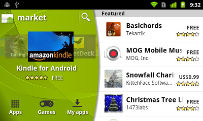
The new Android market looks good to some. Bad to others. But one thing everyone has to agree on is that it looks a lot different from the old one. If you’re interested in how and why this was done with more of a technical explanation, Googler Kirill Grouchnikov – a UI engineer who recently joined the Android team – has published a nice introduction to a series he’s calling “Meet the Green Goblin”. He doesn’t give away all of his secrets, but expect some insightful content from him regarding the changes to the Android market and how the layout was built over the coming days at his personal blog. [via Android Central]








AAACCKKKKK!!
Change!
It’s bad!
It’s better than the current market therefore it’s an improvment.
New Market is very cool.
I found this market to be all display and no substance, and thus a colossal waste of time.
It broke the fast install option form AppBrain making it harder to use 3rd party market systems without actually adding _any_ functionality … like any kind at all. Oh and it cut our app approval to 15minutes …
… This is the first time I’m legitimately disappointed by a Google patch. Nothing but steps backwards.
whats so bad about it? more cleaned up, a little more organized. pretty much more user friendly which any company looking to grow popularity once. one step in the right direction google.
Looks better, functional identical to the previous one though.
if it makes it easier to find apps im happy!!!
In the 200 plus comments about the Market on an earlier story probably 150 or more cried about the 15 minute refund window.I personally don’t see this being a problem because I know in the first few minutes if I am going to keep an app. The new Marlet looks promising. Baby Steps.
This new design is terrible (IMO). I really cannot believe that they are calling this a “significant update”. Cleaner? More user friendly? Significant? How so??
As a developer, I am seriously disappointed by this update (and yes, its installed on my N1). It’s simply a redesign. You can’t even count the ‘Related’ section as new. It’s barely easier to find apps now, than it was in Android 1.1.
I have no interest in reading a lengthy article about how they created an ugly header/carousel. Have you guys seen what it looks like on a tablet (in landscape)? It’s laughable.
The Android Market is, and has always been, the weakest and most embarrassing part of the Google Android ecosystem. Where’s the innovation?
This is (barely) a user-oriented update. I truly hope Honeycomb brings a dev-oriented one.
(Sorry for the rant. I couldn’t hold it in any longer – after installing the update today)
Easiest way to say what’s bad about it is to compare it to the other markets out there. For me that’s AppBrain.
First off in AppBrain, I can search sort and look through the marketplace and both read and make comments on the website. I can find an app and “push” it to my phone. I can build entire lists and push it to my devices all at once. basically, in general, AppBrain adds a bunch of functionality to the existing market place.
The new Marketplace didn’t borrow from _any_ of what made Appbrain good (or any other marketplace module from what I can tell). Instead it just seemed to skin a new interface over the top of the same limitations. Furthermore, it locked down and removed API that used to be present so it’s no longer possible for things like Appbrain to push install multiple apps at once. Finally it locked down the refund to 15minutes … which seems like little more than a reward to shoddy programmers who now only have to hold your attention for a half hour to get paid.
You can say it is more user friendly … but it’s still WAY behind what’s already out there while simultaneously making it harder for what’s already out there to function. That’s just poor all around.
No matter what they do, some will love it, others hate it. The market needed work and couldn’t stay the same and be taken seriously at the same time. The people complaining act like Google never improves things and this evolution will be the last. Seriously? Get a grip, it’s a transition, nothing more.
cmon guy the new android market looks awesome, the 15min oh well the developers might do apps for a leaving give them a brake, and with android you don’t really need to buy anything so cmon, anyways this is for the better guys, google ftw, and its not like if the new market is mandatory either
A lot of unhappy people here. Me and my fruity chums are loving this.
http://code.google.com/p/android/issues/detail?id=13116
i think it looks pree cool.but how do you get it?i have android 2.1 can i still get it?
I have to admit change isn’t always great… still trying to get used to it. I would like to comment on something that would be helpful (for me at least) if someone could allow in the search bar a copy and paste method on previous searches. Let me explain your typing something in to search whether it be on Utube or in a browser and its five words long, you make a mistake on the last word or your looking up something that you previous had searched for this time there is a new version out and you only want to change the version number or last word you were looking up unless you copied it right after you typed it in there is no way other than to type it out again to search for something. For instance I type out android market 1.0 than they release android market 2.0 months or a year later I have to type it out instead why cant i highlight a previous search I have done and edit it?
I really don’t care about the market update, it already did everything I wanted/needed it too. I can see how the 15 minute refund window can suck. The only thing I want is for the MicDroid app to come out of beta and work on my phone!!!! Oh 1st world problems, LMAOROTFLOL G4!
Well I was playing with my xbox360 and I got this great idea to change the look of the Apps Market….
I think android has really gone down hill with 2.3. For one 2.3 looks like crap compared to 2.2 and down. Now the market looks like a kid made it. Google really needs to take a look at the rooting community and hire some of these people doing awesome themes and mods to android.
The only reason I still have a android phone is that it is rooted.
android 2.3 looks amazing.the new market looks different but it still looks cool.compare to the android market for 1.5 which would you rather have?
@tell me homescreen alternate apps
shut up!who involved you in this conversashin?you are stupid you little mutherfucking bitch!!
@Don
calm down bro.you spelled conversation wrong btw.retard.im just saying that this doesn’t look that bad.it looks very different but there are prolly some better faster features in it.
dude,what are you talking about?
im talking about how i banged your mom last night
haha
@ tell me & Don…
WOW Guys!!! Really??? Is this the venue for that kind of behavior??? Both of you need to grow up. This is not a pissing contest forum. Anyway… from what I have seen of the new market, it seems ok. I haven’t had the pleasure of having it on my phone, but my daughter does. As a user, I like it and I look forward to having the ability on my phone. Like one of the other respondents said… baby steps.
Looks really nice in landscape mode.
Not so much in portrait.
The new market looks like it was made more for tablets then it was for smartphones IMHO.
@Don,
Seriously, what other option do you have, iOS? That sure doesn;t limit what you can do with it…
For everyone who wants to complain about the 15 min window it is actually a good sign for what’s coming soon, Google music, and the book store, and possibly a market for shows and movies they are not going to give you enough time to watch a movie or read a book and then return it when you are done. They will all most likely be available in the market and therefore subject to the markets return policy.
Wow, comments need some serious moderation here. Bans need to be handed out.
thank you @tattooMan and @bela! i really hate when people think android is getting uglier..
if you guys dont like it jump to another OS.. your negative comments do nothing but annoy me. :)
and idu why you guys think this looks ugly.. when you have the phone on landscape mode all you see are the tabs.. and only 3 apps at a time when scrolling.. just go look at it yourself. this interface is better because now you see the left for different categories and the right for your apps your searching for.. yeah it shows only one more app when scrolling.. but cmon.. its definitely getting better and better..
after some fair comments about the design, the designer turned the comments off. sorry, but you are on the wrong place – in your position you should be to handle that….
i reseted my moto droid trying to root it once again and i came across the market. i have it! but im not liking how you scroll up and down too see info, comments, and related.. what happened to sliding left or right? :(
How can we get rid of this ugly – sticky – clumsy – carousel?
It eats bandwidth and reduces visibility.
as written in other comments, this layout’s not very usable on small phones, like mine, I wish I could still use the earlier one or HAVE AN OPTION TO TURN THE APP-FLOW OFF (there’s a widget doing the same job) to save some space… hope they’ll consider this feedback