In the midst of all the CES madness it looks like someone at Google made a bit of a boo boo. Luckily for us that boo boo was posting up an official video overview of the next iteration of Android, what we have known as Honeycomb and what will be officially known as (like we expected) Android 3.0. The one major reveal that might cause cries of displeasure is that this version of Android is not only designed to look and run great on tablets, but let’s hope it’s not also designed to look and run great on tablets only. It looks like no version of Android you have seen before, complete with plenty of soft blue accents and major UI tweaks and improvements.
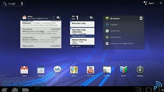
The guys at Engadget were able to grab the video and re-upload for all to enjoy. All we can say is we hope this version of Android (or something very like it) eventually makes its way to mobile handsets.
We’re about to head into Motorola’s CES press event where, hopefully, they will show off their new Android tablet and a lot more Honeycomb goodness.
[via Engadget]




Omg…. I’ve not wanted a tablet until now.
nice, wanna try it alredy!!
Same here…ithesenuts the iPad can suck it..go Google, WiFi only though please
show me where it says Tablet ONLY….
WTF, why not link to the offical video?
http://www.youtube.com/watch?v=M-80QD5Zjyc
ugkchuuhh uh uh! I’m done. That was nice.
Speechless …..
Wait, so this is an OS that is only going to be made for tablets?? Not going to lie, I have not really kept up with the Honeycomb news (i’m still waiting for a Froyo update with my USCC Desire.)
If it’s just for tablets, I won’t feel too behind for the next 6 months or so lol
Shit just got real
G8D, my thoughts exactly.
jiizzzzz!!!!! :o
WANT!!!
Not so sure that this was an accident. They search CES ’11 in the video…
That shit is NASTY. I want one now. ive liked the idea of tablets until now. Now i can see myself having one.
That looks pretty kickass, but I’m admittedly going to hold off making a real judgment until we see actual usage video on real hardware, though. Anything can look great in a video mockup and fall well short in actual product. (JooJoo, anyone? For that matter, have we even seen a RIM Playbook in actual use yet, in any video other than ones supplied by RIM?)
But if the actual OS runs half so smooth and usable as this video makes it LOOK like it could be… well, then I think I want one. :)
So 3.0 is for tablets…then 2.4 will be for phones?, or will phones get a 3.1 (striped down version to run on mobile devices)…???not that it matters cause my Mytouch4g (although i love it) will never see anything past gingerbread (IF that). The good old g1 days of getting multiple OS upgrades are over I’m afraid. Rooting is your friend!!!
Wow this thing is nice. This is what Im talking about!
Ya having to by a new phone every 6 months to keep up is a good move! Fuck you very much Google.
As n G1 user, cliq, nexus and now mytouch I will strongly consider moving back to winmo.
Even developers preder apple over android.
This is awesome.
man oh man . i thought tabs were a dumb idea but i think i might pick one up next christmas. that looks amazing and i cant wait to see what the big companys do with it :D
Jizztastic!!! I’ve been waiting and waiting for a GOOD Android tablet… YESSSSS
I think my balls just receded into my uterus….
Imo wat google will make is have android 3.0 for phones/tablets
For tablets they will have enhaced apps and widgets
Why? Because u would not be able to fit that gmail app to run smoothly on a under 4in screen… regardless of specs
Anyone notice that they are releasing gmail updates apart of android updates?
So we will have a base android OS w “plugins” based on hardware (tablet phone media player)
Android will rule the earth… and ur fridge…
i noticed no navigation icon for the maps app. i like the idea of the options already displaying in the notification bar when you do click on something, like a text..
It looks so ugly, Honeycomb is epic fail
I’ll buy one. If someone can bring me stock Android.
looks glitchy
Why do you want it to be on the phone???? Android 2.2 is for the phone and thats why people wanted something made for the tablet and now people want whats made for a tablet to be on a phone! We already have a great phone os now why do we need the one built for tablet to be on the phone? That makes no sense phandroid
@Chris… 13 seconds in – built ENTIRELY FOR TABLET in big letters on the screen.
Idiot.
I don’t see the notification bar in the video. Am I missing something? I hope not, the window shade notifications are one of the best things of Android and I hate when apps, like the stock gallery app, doesn’t show the notification bar. It makes multi-tasking a lot more difficult.
Ok, seeing their Tron vibe in the graphics of that video so makes me want to do an Android promo vid with lots of material from Tron.
I was struck by how sticks in Tron rez into vehicles. This is like the little Android in your pocket doing so much more than its size would convey.
I picture a voice over saying “This is your Android” and we see a handset. The voice over proceeds to tell you it can be like a computerized likeness of yourself, a helper for you in creating the perfect system. We see Flynn creating CLU, but instead of a mirror image of Bridges, we see Andy rezzed in Grid-style.
The voice over continues: Or, maybe it is like an unlooked-for friend and gift, an emergent intelligence, which manifested because the conditions were right. Perhaps we can use Bridges’ relevant lines from the movie in the voice over. We see a bunch of Andies as the Iso’s in Flynn’s flashback, or maybe we see Sam meeting Andy in place of Quorra (replacing Olivia Wilde would be kind of a shame, but hey, we gotta do what we gotta do).
Continuing, the narrator says that either way, our Android is greater than just a plastic and metal box, It’s very kernel is open to our control, because some things were meant to be free. It is a vehicle to transport us to the interface between the real and virtual worlds. CLU’s assistant hands Sam the stick, but instead of a stick it’s a handset. The assistant says “you don’t use it the way your thinking” or whatever the line was from the movie. We see a clip where a stick turns into a cycle or fighter, except that it’s a handset, and not a stick.
Its not that big of a deal that this is being built for tablets only. We should not be greedy, especially when we are talking about the fact that most people only notice the color/UI schemes. If the blue theme is indeed what they are going to use for Honeycomb, then they are separating it from Gingerbread and its green accents. Perhaps there will be a stripped down version for handsets, perhaps not. Im sure the modding community will come up with something anyway.
Where we are now, Google should concentrate on making android the smoothest and friendliest interface possible for users (eliminate choppiness/lag) so that even the staunchest apple fanboys have no choice but to say, “damn, I need THAT.”
looks like shit with that bottom waisting bar! and where the f**k is options button besides the back, home key and a f**king multitasking button??!
personally i dont like ipad eather and never had a bb but i think the playbook will be the best tablet of 2011!