We just took a gander at the platform highlights for Android 3.0 and came away a bit impressed. It’s a shame that this version of Android is only available for tablets starting out. (Though we’re sure some of you XDA-bred folks will cook some interesting things up nonetheless with the SDK that is now available.)
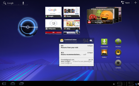
For starters, the UI is overhauled. We knew that before. They’re calling the new look a “holographic” design – it looks and works just as futuristic as they describe it here. The notification bar is now know as a “system” bar, where you’ll have a central location for status messages and notifications, navigation buttons (for buttonless tablets), and phone status.
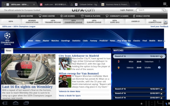
An “Action Bar” is a contextual dynamic bar that changes depending on what application you’re in. Think of it as the top bar in Mac OSX – most application settings will present themselves here, as well as other information defined by developers. Sounds awesome.
Then there’s the new multi-tasking: it’s ALMOST like the Pre-style system you guys have been waiting for. Instead of getting an icon and an application name for recent apps, you’re also given a visual look of the state you last left the application in.
They detail a redesigned keyboard and a new text editing system – something that was already introduced with Android 2.3. All of the standard sets of apps – such as YouTube, Gmail, Contacts, Email, the Gallery, and the browser – have all been updated and takes great advantage of the screen real estate you’d get from a tablet.
For developers, taking advantage of all that stuff is as simple as it can be with the updated SDK. You’ll be able to take advantage of high-quality, great-looking and functioning widget systems, the action bar, richer notifications, and more.
You’ll also be able to interface with the hardware acceleration controls introduced in Android 3.0 and you’ll be able to tap into a brand new animation framework – your applications can be as sexy as they are on iOS, basically. You’ll also be able to take advantage of new connectivity options and multimedia frameworks.
Developers will be able to create their applications to be mindful of a multicore architecture, as well – something that will be a godsend for many of you once the industry inevitably moves toward dual and quad core architectures.
I didn’t get extrmeely deep with everything here, but that’s what the Android-Developers site is for. Go ahead and check out the new highlights for yourself, and for you developers, new versions of the SDK, the NDK, and Android Development Tools are all available to help you get started.




Not happening on the Samsung Epic
I think it’s important to state that Google has never said Honeycomb is exclusive to tablets rather “large screen devices SUCH as tablets.” I think you’ll see honeycomb on phones though it will be a limited version in screens less than 4.0 inches (my opinion).
I was hoping to download the virtual device to play with, but no luck. It isn’t available yet.
Sounds great, now I want my Xoom.
Yeah, I’m really interested to see what the smart phone version will look like. GB didn’t bring much to the table so far, but HC looks completely overhauled.
The android 3.0 sdk image is available, im running it on my laptop atm, just go to packages on the sdk and download the “android 3.0 platform sdk”
In my 5 minute test drive, looking through options and a few things, it looks great. As a minor thing, there’s now the ability to put up owner information on the lock screen.
I’m sure it will not look like this. It will be a mobile optimized version when it comes to a phone. You can’t run the same exact thing on a phone.
I bet this will be on the Nexus One before it comes to Richard’s phone. haha.
Not likely 3.0 native resolution is wxga not wvga,system/apps pngs might have to be converted to wvga.
The UI will likely not be too different on phones. There’s no reason the new top and bottom bars couldn’t be done. The new multitasking, the new browser, and the overall aesthetic should all still work on phones. Really, the main difference on phones should just be the layout of icons and widgets.
i cant wait!!!i want my xoom now!!!
At first glance (and only at first glance) it looked like KDE 4.0! Still, I cannot wait to see it in greater detail.
http://www.kde.org/announcements/4.0/
me too i want my xoom hopefully the 14th is still good
Its all garbage without a note taking app.
Wow looks great