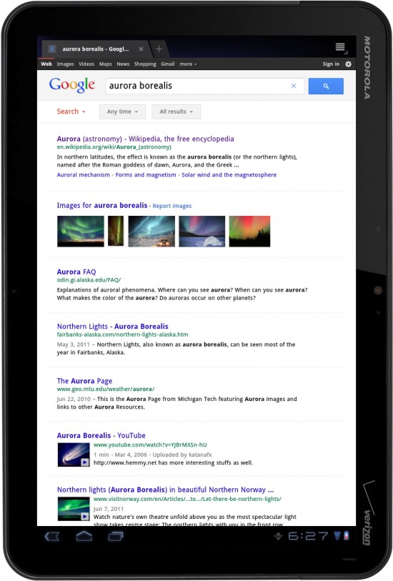
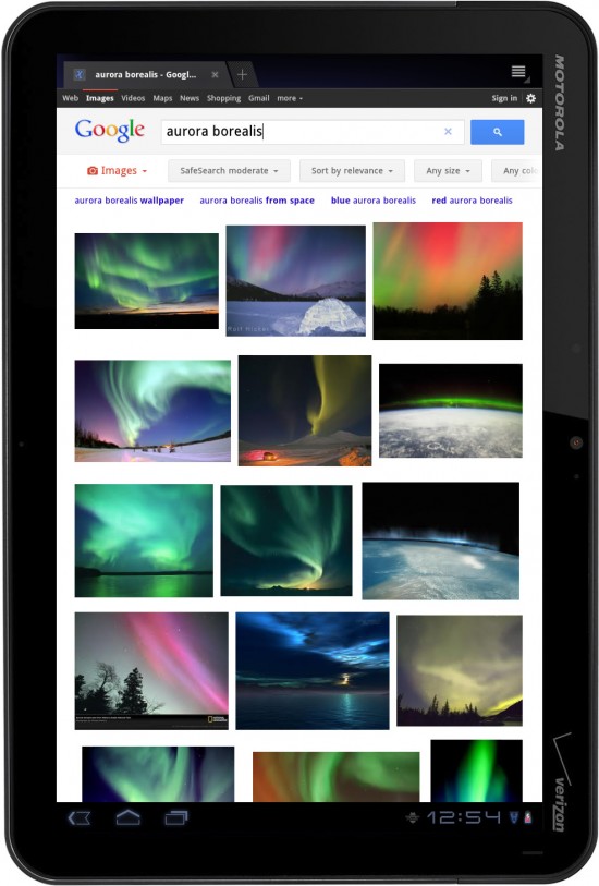
Google has updated Google Search (web) to improve the experience on tablet devices. Most of the changes the end-user will experience are all design. Buttons are bigger, text is more legible and images will scroll faster with better continuous scroll support. All of this is available now on your tablet’s browser – just visit http://www.google.com. [Google]






I noticed this yesterday. I like.
Way way way too much whitespace. I now get half the results on a page. Much with the hate.
Needs more contrast
It’s obvious you guys know more about design then the guys that work at Google and do it for a living. Good work.