Now that more and more folks have gotten the upgrade to the latest Android market overhaul, we’re curious as to how you are liking it? This isn’t the first time the market’s been revised and it probably isn’t the last time. In terms of design, the previous revision was flashier than the second update (remember when the market was black?), but the design remained largely the same.
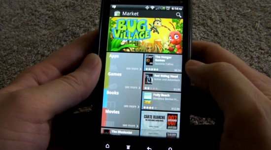
Market 3.0.27 is the most significant update yet in terms of design. It’s geared more toward highlighting popular apps in a number of different categories with big, hard-to-miss banners. It’s more “square” with tiles (Metro UI, anyone?) making the traditional list take a backseat approach. It incorporates movie and book stores now, and it will soon get a music store after Google is finished negotiating with record labels.
But in the here and now, how do you like it? I’m a fan of the design. Does it remind me of Windows Phone 7’s tile-centric Metro UI? Yes, but that isn’t entirely bad. Information is laid out in an eye-pleasing way and it’s easier to discover popular and quality applications recommended by Google and the community. And on individual app pages, information is separated in a way that it’s now almost impossible to get confused with what you’re looking at.
What about you folks? Has the new market been treating you well? Have you even gotten it? Would you rather revert to the previous version? There’s also a poll so feel free to partake in that. Let’s hear it!
[polldaddy poll=5299986]






the “tiles” don’t show up correctly on CM7 Nook Color. the tiles fill in, but they’re scattered about in portrait mode. Landscape seems to work fine.
its not made for a tablet its made for phones could be the reason
It sucks! Too congested, too sluggish and too much metro
The Android Market is way too mainstream.
Seriously? Going to hipster up the Phandroid comments? With a 46% Market share, I believe that gives Android a plurality, so it is now mainstream? Time to jump ship? Or are you going to start the whole “I used it before it was cool” thing? Give an opinion on the topic, e.g. “I like it” or “I hate it.”
Sorry to everyone else, but comments like this really grind my gears.
I would tell you the way I get apps but it’s a pretty obscure method, you’ve probably never heard of it.
jjrudey, I do believe I love you :p
How anyone could take it like anything other than satire is beyond me.
I guess you are too obscure.
Thanks for the laugh. It’s not the kind of laugh you wanted, but it’s what you got :p
By the way, I’m selling my 51% stake in android, it’s yours for $10K
I agree, go away damn hipsters.
Works faster than the older market for me. My favorite thing is that the What’s New has it’s own section up on top so now I don’t have to swipe thru 10 paragraphs to see that info anymore. The main screen is congested.
Also if you like the older one then uninstall the update.
for a new design it is great…But the one gripe I have is it is slow needs to be optimized for a faster performance then it will be raw
Not a big fan of the UI changes, but it’s still usable. My biggest beef with it is the app update mechanism – it seems to be sluggish and a bit flaky a times. Anyone else notice this?
The old version might not have been anything exciting, but at least it worked very well for me.
very slow
Agreed
it’s ok. nice to seem them continue to update/try dif UI layout etc. look at iOS appstore. it’s been about the damn same forever. whether you like it not, anything that never changes gets old to most people after so long (just like websites etc)
I love it. It feels like a real store with departments. It LOOKS appealing and clean and the fade transitions are better than any I’ve seen on my phone yet.
Navigating through the market is more of an experience now where as the old market was very simple and scroll up scroll down oriented.
From top to bottom the “Movies” section is very well thought out. Going from front page, to browsing, to watching a trailer is an easy path to follow. At the end of it all, the video quality is incredible(of course it is on a SuperAMOLED screen) and the prices fall right in line with what you expect to pay when you walk into a Blockbuster store(if your into going into those kinds of places).
looks far too much like the nasty windows mobile 7 interface. i picked android because i didnt like the cluttered tile crap. and now theyre copying them. cant win lol.
Dude…. its just the category home pages that are in tile form. Windows phone 7 didn’t invent this tile centric UI, I recall seeing it in the early days of arcade and video games. No?
No, the tile is everywhere except the “My app” page. Top paid and top free pages use the tile form too. So, I can’t even read the App name fully now!
I love Metro UI. If I ever jump ship from Android it will be to WP7. I am even more excited it’s coming to Windows 8 and XBOX. One UI to control them all no matter the form factor.
Am I the only one that hasn’t received the update? EVO 3D, North Carolina.
i haven’t yet EVO 3D California
I’m still stuck with the old UI. I wonder if it’s because my phone is so freaking weak?
I’ve got a SGS2 and still no new market, so I don’t think it has to do with preformance.
I think it came with the new Gmail update. Mine seemed to at least.
Nope, I’ve got the GMail update yesterday and still no new market.
Just checked again, don’t have it yet. I have a Thunderbolt and the new Gmail update and still nothing.
I’ve still got the old one … I’ve got an Evo 3D
What I like about it most is it really ties in the Market on the web to the Market on the phone… they feel the “same” now, which is a very important feature that can’t be overlooked.
The only thing I like about the new Market is the icon.
The updating of current apps half the time don’t work. The new version of Gmail never triggered, until I manually installed it again via the Market website. When updates do show up, it seems like I have to hit the “Update All” button about 5 times before (and if) it decides to register the click.
I also don’t like how they combine Movies and Books in the search results. I wish I could turn that off. Actually I would really like to turn off Movies and Books completely! Don’t want them, so I don’t need them to show.
Other minor things too bug me… such as why does the Trending screen take about 20 clicks and swipes to get to? Also, what’s with the My Apps screen? I have about 500+ apps in the list, and would prefer the “recent first” sorting method, or at least an option to toggle. If I want to get to “Wordfued” for example, why scroll down for an hour, when I might as well just search for it, and weed through the results.
And what is with all the gray!?! Geez! Google definitely needs to refresh this refresh.
My updates all seem to go through fine.. except one.. Don’t know what it is, but I have a Google maps update that has been showing for a couple weeks now, that just will not download.
Does anyone else have major data issues with the new market? (especially cellular) I can go for days without opening the market and have absolutely no trouble with my data connection but the instant I open the market the “h” icon blinks green and grey and it times out. I’ve been trying to update a couple apps for hours now and they just won’t download…
In case anyone else has this problem, try signing into google talk before you open the market; for some reason that seems to fix it for a lot of people (including me, now it works fine)
I don’t have it, but there’s not a single screenshot of it I like. I hate tiles, and I hate the palette.
Updates can get weird and it does take longer to load. I hope Google updates the featured movies/books/apps more often..there’s more than enough content to do so.
I’m not a fan, honestly.
It’s way too bloated (from approx 3Mb for the 2nd Gen of the Market, to 8Mb – Out of approx 60Mb I have available), it’s slower, the movies are not available (which unless they were to offer free movies of the week, i wouldn’t use it on the smaller 3.4 inch screen on my MyTouch3GSlide).
At times, the screen doesn’t recognize the tapping of some squares.
Also, there seems to be a lack creative uses for the available space, many random areas in the main screen where they just blank space or random reflections of apps instead of making the boxes smaller and fitting more on the screen.
Random times where even when just pressing the back button to go back a screen, i keep seeing the loading screen.
Seems like the app could be cleaned up some.
Is Microsoft going to sue Google for using their tile-scheme? The first thing I thought when I looked at it for the first time a couple of weeks ago was “WP7”. I prefer the old format personally, but to each their own.
I’m 50/50 on it. The thing that pisses me off the most is that 90% of the time I go to “my apps”, and it says I have an update for an app available, i click on the app, and there is no update available. My only options are Open or Uninstall. Usually about 12 hours later, the Open button turns to Update. That’s screwed up.
Exactly; I mentioned the same thing earlier.
I get that too and it shows my Amazon apps. If you try to update thru the market, it asks for money. It shows between 5-7 Amazon apps all the time. Its also noticably slower, but not much.
same thing here with the .apk version
I hate it. And to be honest, I’m going to be using the Market LESS because of the update.
Leave it to Google to release crappy updates. They fail so much more than they deliver.
i still havnt got it yet :(
the apk dont work for me it wont show the installed apps
incredible 2
looks nice, loads to slow!
I dig the design, but not the bugs. I also don’t dig how slow it runs on my milestone, but that’s probably my problem, not their’s.
I don’t have it yet, but the screenshots I’ve seen are nasty ugly. They need to have the guy who designed the UI for Google+ redesign the Market app. He seems to be the only one at Google with a clue how to design UIs properly. I love Google’s products overall because of their functionality, because after all, how good it looks doesn’t mean squat if it doesn’t do what I want or need it to do. But, they really could stand to take a few lessons on form too.
I don’t like the new transitions they’re putting in their apps. No more sliding transition from page to page, just a stupid fade that isn’t fluid at all. First Google Music, now this.
I still don’t have the new market. Do I have to manually update it with the apk if I’m rooted and running evodeck?
I hate new Android Market… slow and (what I hate the most) it uses way much bandwidth than 2.3.6 one… I didn’t get unlimited Internet packet from my carrier, just 500MB per month right now and Market 3.0.X eats about 800KB just for starting the app vs ~250KB in 2.3.6 one… that’s just lame Google, that’s just lame…
Damn you. You know I can’t resist a poll!
I want an option to customize my store preference like show no paid apps. realistically i will be buying no apps since the free ones are more than enough
The new market is much faster and more reliable for me. With the old market I was never able to update all. They would hang or download and not install. The new market is awesome. The new UI is fine, I’m still getting used to it but I am starting to dig it.
I like the look of the new market but it’s unacceptably slow.
Has anyone figured out how to read the App .Reviews in chronological order starting with the most recent ones? It did this automatically with the old version, and there’s no rhyme or reason to the App reviews now, which makes the reviews essentially useless since they are often reviewing old versions of the apps that may have been dramatically altered (a lot of times for the worse not the better).
I haven’t gotten it yet, but looking at reviews, I’m very excited about all the new top lists … don’t really care about the tile interface of the home screen. It serves it purpose just fine
For me on my phone with an old Arm 11 cpu, it was damn slow.
For some reason Google removed the option to turn on background data when you start the market without it on…wft?
I also don’t like having to click on menu to go to my apps.
There were also problems updating an app that was not automatic due a change in permissions. One time I clicked to update an app manually and it never had an option on the app’s page to update, instead it had an option to open the app. I uninstalled my update that I put on with an apk and hope that whenever I get the new market app automatically, that it will work better.
Edit: Google should be ashamed at how slow the new market app is, how could they release it like that?
I like everything but the home page. I don’t rent movies or buy books on my phone. Those just take up home page space.
I hate the new market:
* The my apps page no longer differentiates updates that as for new permissions vs updates that don’t need new permissions. This is a clear reduction in user privacy and security.
* The update all will now update all apps instead of only updating ones that don’t need new permissions.
* The tile format in top free/top paid making it harder to get the full app name.
is Evo 3D getting this?
I guess not yet. I have Evo 3D and no update yet.