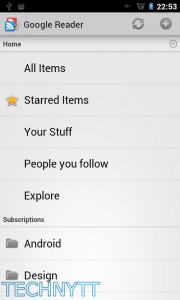
That updated Google Reader UI we saw last night? We didn’t have to wait long to get our hands on it. Reader has been updated in the Android Market with a changelog listing an updated Ice Cream Sandwich interface and widgets, swipe navigation controls, and the removal of redundant Google+ features. Also receiving an update in the same vein is the Google Docs app, though a full changelog is not available at this time. head over to the Android Market to grab both.
Android Market Link: Google Reader
Android Market Link: Google Docs
[Thanks, Manny!]


Apparently you actually need ICS to see the changes in the Reader app. There are no ICS cues on Gingerbread.
Yup, I updated both my Nexus S and my Xoom and neither of them look like the screen shots you have in the article… I can see (to keep in line with the Reader web update) they removed the “People you follow” etc, but looks very much the same on both devices.
The new swype left and right to advance articles is nice, though.
Google is finally getting their shit together. It’s nice having a uniform theme throughout my apps now. To bad they do not offer a dark theme though =(
That sucks, I was hoping to get the grey on my ns today.
Yhea, new interface only on ICS!
FINANCE updated as well…