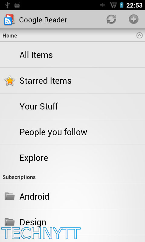
Google recently revamped the UI of Google Reader (web version), giving it more of a Google+ feel and it looks like their official app may follow suit as well. Google made known their plans to update the Reader app in a blog post yesterday announcing the new design changes of their web version saying,”A new Android application will follow soon,” but exactly how soon wasn’t mentioned.
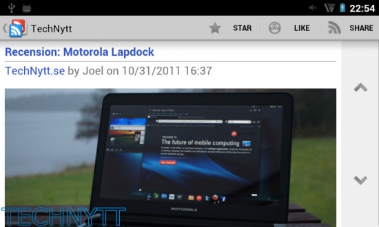
If you were curious on exactly what to expect, maybe these images we came across today will help you out. These were taken from inside Ice Cream Sandwich and aside from a few small UI elements, it doesn’t looks like much is changing.
Gone is the traditional “Google blue” replaced with the new “Google grey” color scheme. There is the possibility Google may have added some fancy new widgets options as well. We wont really know of any other changes until we can get our hands on the official updated app so until then, these pics will have to do. Anything you guys want to see from the updated Google Reader app for Android?
[TechNytt via Electronista]




ugly
I’m waiting for Google’s Pulse/Flipboard/etc competitor, AKA “Propellor.”
I want to make sweet love to Google’s new design philosophy.
Yes, a fix for this:
http://www.google.com/support/forum/p/reader/thread?tid=4e26470ed5eae8e4&hl=en
and this feature request:
http://www.google.com/support/forum/p/reader/thread?tid=12f24b1fdbcbb7e6&hl=en
this is quite a bit better than what we currently have on our google reader app. nice update, can’t wait!
It still has like and share buttons, which means that either this is fake or a really old build.
I want my friends baaaacccckkkkkk
I know a lot of people where mad about the loss of friends. But since you could only share with google peeps or via email what is so different about going through google+ you can still share with the same friends AND via email.
Looks just like the honeycomb app minus some color.