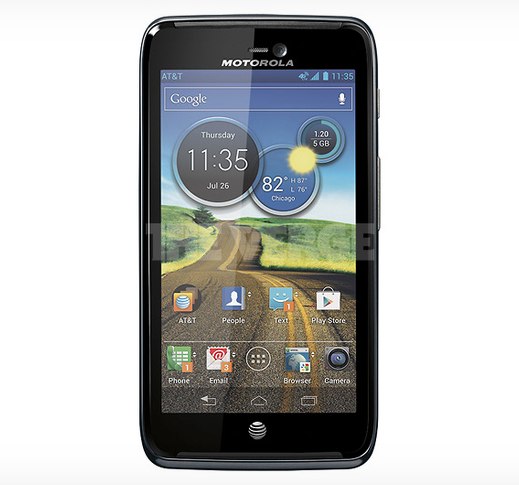
A photo of the press variety has surfaced purporting to be AT&T’s next Motorola handset. Signs point to the photo being the device codenamed Dinara. We’ve heard the name bandied about plenty in past months, and rumors point to the device featuring a 720p HD display and run Ice Cream Sandwich on Ma Bell’s LTE network. Given the higher-end specs, there is a strong possibility the Dinara could launch as the Motorola Atrix 3.
While the handset doesn’t follow Motorola’s recent design language that has made its way to the RAZR line, Xyboard tablets, and even the Droid 4 on Verizon, we do see from the photo a move towards Android 4.0 software buttons, an OS-level element that Moto is slowly bringing over to their newer devices. A July 26th date on the mocked-up homescreen could suggest a launch date, but consider it a rumor for now.
[via The Verge]


Yay more crap from Motorola..
Once again, another on screen button phone that is not small for it’s screen size. That area below the phone doesn’t seem to be changing, buttons or no. Looks like there’s a different limiting factor, and those buttons just make you lose screen space.
Exactly! 4.0 is suppose to entice manufactures to make LESS BEZEL, not the same! I think the Gnex is perfect, because it was the first and their bezel is sooooo clean looking. I just ended up installing AOPK’S rom and removed the keys to have more real estate, which looks AWESOME!
who would even consider this when the one x and s3 are out?
Its not getting blocked by apple? Motorola make Beast hardware?? Bro, come on
This will probably match the specs of those phones but have a much bigger battery (like the maxx) along with motorolas amazing radios….i would take this over samsung and htc any day
Well, they ruined the Atrix now. My Atrix (1) is awesome, 2 was stupid, 3 just looks horrible. Fugly.
Ughhh… They could have done better and if it’s another 4.3in screen then they automatically fail
Atrix 3 already? A little quick with the sequels aren’t we Moto?
What is that clock widget? Looks good…
“One more Clock Widget” there is a free and paid version
Wow! That is ugly. What is Moto thinking?!
Lol @ the AT&T logo at the bottom!
Yeah that AT&T logo on the front is hella ugly.
It looks pretty nice (except for that odd placement of the AT&T logo). It’s much better than what Moto gives T-Mobile!
WTB with a lapdock that doesn’t come with a data plan plz
Pass
I think Kevin made a typo, I’m sure that’s the Motorola Diarrhea!
This is probably the first time that I haven’t been turned off by Moto Blur. In fact, I’d go so far as to say that this iteration actually adds to the overall pleasant look and style of ICS.
I especially like the translucent touches added to the nav bar and notification bar.
motorola has the best radio inside period.this isnt that bad..