
All eyes are on Google for their October 29 event. The Search Giant usually unveils Nexus news during this time of the year and we are excited to see if all those juicy Nexus rumors will pan out. But while we wait, there is a bit of leak goodness we have to share.
A leaked system dump has been revealing multiple improvements Google is said to bring forth with the announcement of Android’s new OS version. This is Android 4.2, which is expected to be a small improvement over Jelly Bean, and will keep said moniker.
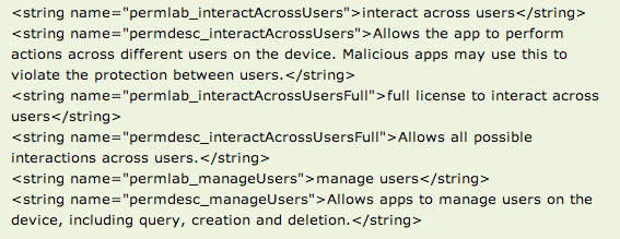
Among other things, the most exciting new features include a secondary quick settings section in the notification bar and the newly discovered multiple user account system. Now, we are not sure if this feature will definitely come with Android 4.2, but there are some clues in the code that seem to suggest so. If multiple user accounts don’t come with Android 4.2, we can at least be sure that it is in the works.
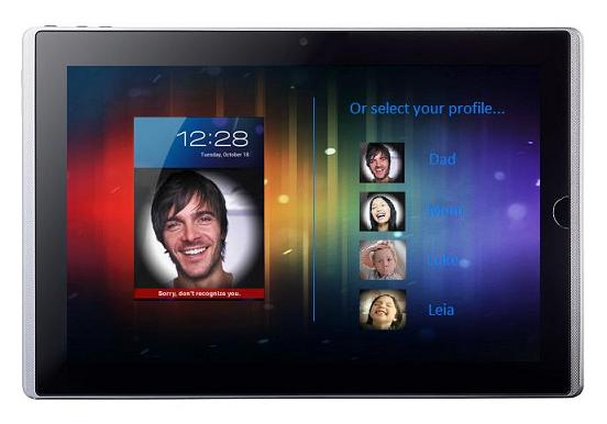
There are some extra code strings that suggest there are additional features in the settings. One would be allowed to manage accounts (create, delete-modify, etc.) and each account would be labeled with a user name and photo. The code also displays signs of parental control settings, which would be able to be edited to accomodate each account and its user.
There is no proof, but we can speculate that there will be some form of log-in system that can be accessed via the screen lock. It would be especially nifty if Google could incorporate Face Unlock to the log-in interface. Users could then simply log into their own accounts more easily, without the need of passwords or patterns.
Android users have been praying and begging for multiple user accounts for a while now. Especially since tablets started becoming more popular as a family unit. It might be a bit complicated, but we can hope this feature is well-implemented when/if it is released. Ideally, it should be able to save different passwords for social networks, e-mail and other apps. Preferably different Google accounts, as well. Much like a computer.
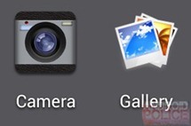 Another smaller, but still important improvement was also discovered. It seems the Gallery design is undergoing a major redesign, along with the gallery and camera icons. The design seems to take some cues from Google+, so it is a bit different from what we are used to since ICS.
Generally, it looks great. It does seem a bit wonky in some areas, like the album section, but this is probably not final software. We will just have to wait until the 29th and see! Are you guys ready for a new Nexus and Android version? We are, so stay tuned.
[Via: Android Police]







Nice.
Was just talking about multiple user accounts a couple of days ago.
Hope AOSP gets a version of multi-tasking that LG and Sammy have implemented/releasing aswell, although cornerstone looked far better, even if it was using code that was too complex.
Muli-user was in 4.1, there is just no interface to change or add accounts. There are a few roms for the N7 that have added a user account switch and it works well for the most part. It just doesn’t work with purchased apps at the moment.
There’s some code, yes, but without a way of using it, well, multi-user accounts aren’t in 4.1
Part of my DNA is for me to be female, but that doesn’t make have tits or an additional hole does it?
As for saying what custom ROMs include is also pointless, Paranoid Android has some intersting features to it, does that help everyone else?
Not really.
Ummm… via fail? That should read “Via: Android Police”
EDIT: corrected ;) – good work
New icons aren’t looking good. Gallery has never been great, but the new one is terrible. The camera icon looks great right now, why turn it into an iOS icon?
Not to mention, neither of these fall under the android guidelines of a 3D icon from slightly above, and the camera no longer has a distinct silhouette.
Edit: a click over to the source, and it looks like the icons are placeholders. Why they would need placeholders, when the current icons should do fine till the new ones are done, I don’t know. Seems weird.
Yeah, I almost lost my sh*t after seeing those. Thankfully, they’re not here to stay. I know “they’re just icons” but still… Got a little freaked out there for a second. :p
If you read the original post on Android Police there just stock photos being used as placeholders.
Comes in hours after I edited my post to say that exact thing. Says I don’t read. Love starting the morning with irony.
If you would read more than the first 4 lines, you would see I edited my post moments after writing it to say that exact thing.
Seems cool
Looking more like a real OS now. All it needs is to standardize the Note 2’s multitasking to compete with Windows.
Are you talking about Windows on a computer? Jelly Bean’s multitasking is superior to Windows Phone. You don’t have to exit by using the back button or long-press to get to the multi-tasking screen. Multi-tasking in Jelly Bean has a dedicated button, you can see more screens at once, and all you have to do to close them is to flick them away. I have to admit though, the Note 2’s multi-tasking is without a doubt, the best in the mobile business.
he meant on a computer
I woul;d assume he means the fact that you can have 2 apps running on screen at once and not having an app just run in the back ground. Which translates to proper multitasking ala being able to work with multiple apps/windows at a single time and not just push them to the background for later. These devices are becoming more computer like all the time
QuickPic is the only gallery for me; all the rest are bloated crap.
same here. i like quickpic too
if you are just a point, shoot, email, tweet, forgetaboutit user whats so much better about quickpic over the stock gallery? maybe im just too dense to notice the difference
more quick and clear than the lazy stock Gallery, just as millions of users said!
– description
I’m on CM10 which flies on S4 – and I’m the user you described above ;) so the only thing I can tell you is – give it a try and see it for yourself. At least it doesn’t require zillion permissions to spy on you – is completely ‘clean’ (unlike many other popular apps) to install.
I was messing with my “Android Version” part of my settings a few times today before work and saw something unexpected and never seen before while messing with it… it was a candy cane. Could it be some sort sign for 4.2? Or for the upcoming holidays?.. you decide… I sent this in to Phandroid earlier today, but got no reply so decided to post it since it as a discussion about the upcoming update and such… here a few pictures…
Never mind… I just looked it up and the candy cane is normal… I take back my post… sorry people.
its the Easter egg within the Easter egg :P
Looking forward to the update!
I am hoping for Project Roadrunner in this release. My Gnex could definitely use more juice to last me more than a day.
Road runner was a fake rumor.
I wonder how many years it will be before the ones push this version out to end users
eu compro sempre na loja http://www.lojaspopularcel.com/
Don’t care about multi-users, but really excited about October 29.
One thing I wish Google would stop ignoring is the clusterf**k that is Android messaging. Comparing it to iOS where iMessage seamlessly works over data or SMS and can send text, photos, video, location, emotes, etc. Messaging on Android is *terrible*.
Google Voice is garbage, it can’t thread messages one user per contact, crashes whenever I have poor signal or jumping between data/wifi and double sends messages, can’t do pictures, emotes, send/receive notice, etc. Then you have their Texting app which is mediocre and duplication, then you have Gchat which is more duplication, then Google+ messaging. Seriously, 4+ messaging apps directly from Google?
Ugh, they should overhaul this into one streamlined app like iMessage, that would be awesome.
iMessage sucks! I hate that its like facebook chat -_-. I wont lie though android does need Emotes and seamless picture messaging. (I mostly want it for memes xD)
Ummmm are you kidding? iMessage is without a doubt the most useful and easy to use messaging there is. It seamlessly goes between texting and data, supports group messaging and has all the BBM type sent/received/read stuff. It’s a model for which Google should be building a messaging app for Android to unify the mess of apps they currently have.
Only if it actually works. I gave up on it very quickly. Too many failed messages.
I’m sure they’ll bring Wave type functionality soon (though not soon enough, I loved that service)
About damn time…..
multiple user accounts for my phone? why?
i want a copy of this system dump!
Oh my gosh!! I so hope Multiple Users works. If this works, my next phone WILL be a Nexus. Or I can get that Galaxy Note 2 and just pop 4.2 on there. I’m sure it’ll be high with development activity. LoL!!
This could be useful for families who share tablets. I personally wouldn’t mind having a “Guest” account for my phone for when I make the rare decision to let someone use it. A lot of people like to poke around. It makes me LOL so hard when they ask for privacy when using MY phone so if they want more privacy then I need more privacy. It’ll be great for that alone (if true).
PS: that gallery DOES look rather atrocious if this is what Google is cooking up. I honestly don’t see anything wrong with the old one.
Would be kind of silly to call 4.2 Key Lime Pie when only a tiny fraction of phones have Jellybean as of now.
You will start to see faster updates from OEM’s. With the release of JB they released the HDK (something like that). I was under the impression that it would help OEM’s get the code 2-3 months ahead of release and would help them integrate it for more timely release. Apple can do this because they control both the hardware and software.
When is the Goog going to update Talk? I mean it is so lacking in functionality it’s not funny. I mean at least make it so I can easily send pictures. I hate MMS’ing people. I want Talk to be able to handle the uncompressed version.