While some folks may be satisfied with the crop of Twitter apps swirling about the Google Play Store, there are some of us who remain on an eternal search for the perfect client. While perfection is not possible, there comes a point where we’d settle for something quite close. I personally haven’t found any Twitter client that I’m 100% committed to just yet. Boid and Echofon have come close, but they’re still in beta and have their issues.
For me, another challenger has stepped into the arena to make this into a triple threat battle. Many of you may be familiar with Falcon, a set of widgets for giving you beautiful and quick access to your Twitter life right on your home screen.
While that is great, widgets alone aren’t cutting it for me and the developer feels like a lot of others feel the same way — that’s why they’ve begun work on a full blown Twitter client. Simply called Falcon for Twitter, the app promises to deliver a disruptive Twitter experience in the most beautiful, yet functional way possible.
After just five minutes with the client I fell in love. Mostly every facet of the Twitter experience is represented here, though the overall feature-set wasn’t that fleshed out as it’s in beta and more stuff is being added every day.
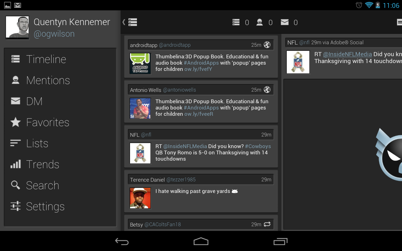
What I did get to play with was pure bliss, though. The spirit of the Holo UI shines through, and Falcon takes things further than most clients have with excellent typography, smooth transition animations and intuitive controls. It doesn’t hurt that the app already has an excellent tablet UI when you load it up on slates with Android 3.0 and higher.
It makes great use of the extra screen real estate by splitting things into two columns — one for timelines and the other for the contents of the tweets themselves. This gives you the ability to preview photos, web pages, videos and more without having to leave the app or be taken to another view within the app.
Things like widgets and extensive notification controls are missing, but the former can currently be had with the existing Falcon app and the latter is surely due to the fact that we’re so early in the beta process. For where the client is, though — version 0.3 — there’s a ton of functionality to be had here, very little bugs to deal with and I might dare say that this has supplanted the likes of Tweetcaster and Plume as my go-to Twitter client even in its current form.
You can currently download the full-featured beta ad-free using this link, and whenever this thing comes out of beta you’ll be able to get an ad-supported version for free or pay for a full version to get rid of them in the Google Play Store. Be sure to leave all the feedback you can at the XDA thread the developer has made, and keep your ears close to this project as it blossoms into the must-have Twitter app of the Android world.









It looks amazing, but I’ll wait for the (hopefully) eventual Tweet Marker support. I pretty much require it switching between phone & tablet.
I was waiting on them to do this. They were missing a lot of things before. What ever happen to Carbon?
Carbon and TweetLanes and Boid etc stopped development due to Twitter’s API limits, as they found no way to monetize their apps in the future. Same as what is happening with that Windows 8 Twitter client, all due to those API limits of 100,000 users
I knew about Tweet Lanes but I didn’t know about Carbon and Boid.
Sad times, man..
I’m currently using Echofon.
It’s actually pretty decent. I’ll give this one a go.
Just downloaded the beta for my Nexus 7. Wow landscape mode is absolutely gorgeous. The notifications are very nice too. They only thing I can’t figure out, is there a way for me to see my followers and who I’m following?
TweetMarker support is coming if/when they get an API key from TweetMarker site. They have emailed them a few times and got no response.
Top twitter app. Have used this for about a week and liking everything about it.