Yahoo Mail upgrade brings much needed redesign
Yahoo Mail for Android hasn’t always been the greatest Android application to behold. It did what it did decently, and looked quite alright doing it, but it quickly outgrew its own skin and was badly in need of a hit of the reset button. Well, it looks like that button was finally pressed today as a new upgrade has hit the Google Play Store that many of you Yahoo faithful will enjoy.
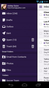
The biggest change in this upgrade will be the redesigned interface. It still has that purplish Yahoo flair you’ve come to expect, but the company has tightened things up with Holo UI elements such as the overflow menu button and context-sensitive action bars. The app features a side-bar navigational system that makes it easy to jump between your different inboxes and folders.
Folks will also be happy to find that pinch-to-zoom is now supported. This is a feature that even Google’s own app didn’t have until just recently so we can’t necessarily be mad that it took this long for them to implement. Oh, and ads have been completely obliterated from the experience — total win, I’d say.
In typical Yahoo fashion you still get a nice set of rich text editing controls at your finger tips. You can change colors, bold, italicize and underline text, insert pictures and attachments and even adorn your emails with those charming emoticons Yahoo has become famous for. Yahoo’s also touting more reliable push notifications, better battery efficiency, SSL turned on by default and more.
If I weren’t such a heavy Gmail user I’d probably make a Yahoo account just to have a reason to use this beautiful app. Alas, I don’t — that’s OK, though, because there are more than enough of you Yahooers out there to give it a spin and let me know how you’re liking it in the comments section below!