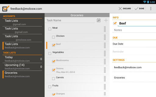
The problem with many task list applications these days is they always seem to have something. Some apps might look great, but exclude Google account sync. Some might include account sync but have a bad user interface. The balance between form and function is tough to manage, but it’s one that developer Myron Lee has gotten off to a good start with. Do It! is a task/to-do list app that features a very nice Holo UI with elements like sliding drawers to make it fit right in with the essence of Android’s design.
Aside from looking great, it also plays nicely with Google Sync, as you can sync your notes and lists between multiple Google accounts. It also includes a useful widget (including a lock-screen widget for those on 4.2+) to get a quick glimpse of your list ahead, as well as built-in DashClock Widget support for those who have fallen in love with that particular app. Here’s a quick look at the full feature-set:
All Versions:
– Organize your tasks by moving them and creating a hierarchy
– Supports multiple Google Tasks accounts
– Set up account specific reminders and sync intervals
– Swipe between task lists and individual tasks
– Quick add to quickly create tasks and set the due date without the need to modify each task
– Quickly move/copy tasks between listsAndroid 4.0+:
– Widget that keeps you up-to-date on your most important lists (includes lockscreen support for 4.2)
– Notification actions to complete a task without the need to go into the app (Android 4.1+)
– DashClock extension added (Android 4.2+)Upcoming Features:
– Widget support for Android 2.3 and 2.2
– Recurring tasksPro Version:
The pro version has the following features:
– No Ads
– Can switch themes (Dark and Light)
– Can select multiple task lists to be displayed on the widget
– Can change the number of days for the upcoming list
– Searching tasks based on title and notes
You can grab the free version here just to give it a shot, and if you like what you see (and the pro version’s features sound enticing enough) you can go ahead and buy the full version for $2.99.


thanks
Here’s my review from Play store:
Does anyone know of any Android todo app that displays a link to the email that was used to create the todo item in the GMail webapp? Nearly all my todos are created in this way, and not being able to get back to the parent email message is a fatal deficiency.
Thanks a ton Quentyn! I appreciate your feedback on my application and for taking the time to post a review on Phandroid. Your review has nearly doubled my pro usage and has given me a HUGE jump in # of downloads of the free version of my app.
This gives me a lot to work with as I attempt to make changes/fix anything that might be broken. Not to mention the pure joy/happiness that I had when I saw that my application had it’s own article when I was reading my news feed. :)
Thanks Again!
Myron Lee
Im one of those downloads myron. I have been using color note before this. The reason i moved over to it is it looked like it had branching for lists, that and google sync. The app looks terrific too. Looks like u put a lot of hard work into it(im a dev too btw). One issue hopfully u can resolve for me, i cant seem to find how to do the branching for my grocery list. If u can help that would be great! Thanks again!
Hi xsirxx – Can you elaborate on what branching a list means? Do you want to duplicate a list and all it’s tasks to a new list? If that’s what you’re looking for, my application doesn’t offer this functionality at the moment, but I can add this to future updates.
No. The screenshot shows an indent for sub items. There are a meat and veggies checkbox, then they branch out into more descriptive items like chicken, beef, mushrooms, etc..
I would like to do that as well but cant figure out how.
Gotcha. Just create a task and then long press on the newly created task to bring up the contextual action bar. From there there’s an arrow to indent and unindent, select the indent arrow and you should be good. Just remember you can’t indent the top level item since it wouldn’t have a “parent”. Let me know if this helps.
Yup. It works! Only issue i have is i cant just add to the parent item. It always adds in the same location at the top. But it works so i cant complain :). Thanks much.
Myron, please take a look below at my review. It’s really a question. Since writing it, I checked the Tasks API and the link I need is apparently available. If you have time to add a feature that uses that link to fire a “display this gmail message” intent, I’ll gladly spring for the Pro version to get it.
Hi Richard – I looked up the Tasks API and it does seem like the URL is stored. However, upon doing some research, it doesn’t seem like it is possible to open a specific conversation in the GMail app. Also, when you attempt to open the URL in the browser, it redirects to the inbox and doesn’t easily go to the specific message unless you are already logged on and have the desktop site displayed.
If this ever changes, I can try to add this feature as I do think this is a pretty good use case that I occasionally use and would make things much easier. I appreciate your feedback and hope that this answers your question.
Looks like Tasks with a different skin by glancing at it. Also seems to have less features for free compared to Tasks:
https://play.google.com/store/apps/details?id=ch.teamtasks.tasks&feature=search_result#?t=W251bGwsMSwxLDEsImNoLnRlYW10YXNrcy50YXNrcyJd
Tasks was part of my influence for this application, but I actually started the application before Tasks was released (it took me close to 15 months to get this app from drawing board to released). Granted, once Tasks was released, I took some features that I liked and modified other ones as needed.
The major reason I think this app stands out a bit is due to the sliding menu, DashClock extension, special tasks lists that gather all tasks that are due/overdue into a single place as well as a special list that displays all tasks that are upcoming, multiple tasklists in the widget, etc.
Being a single developer, I might not be able to iterate as fast as some of the bigger apps, but I’m willing to continue to add functionality to this app as new APIs are released so that people feel like they are getting their time & moneys worth.
Thanks for the feedback, I appreciate it
I just want to mention I am very new to blogging and really loved you’re web page. Almost certainly I’m likely to bookmark your blog post . You certainly come with fantastic posts.