The last year or two has seen a sea of change when it comes to the design of Android apps. Unless the developer has provided exceptional functionality, he can no longer expect success if the app doesn’t look good. In the Design Love series, I’ll share some of the best examples of the growth the platform has seen.
The first thing you notice when you launch Camera Zoom FX
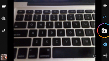 While I typically love the design of everything Google has developed in the last couple of years, particularly since the launch of Google+, I must admit that I was extremely disappointed with the built-in camera app in Jelly Bean. While it’s neat and tidy, and I can certainly understand if people enjoy the immersive experience provided by hiding away controls as much as possible, I have seen quite a few people struggle when they try to deal with the additional settings. Heck, even I make mistakes virtually every time I try to fool around in there.
Camera Zoom FX feels like a throwback in some regards, while still giving the user a lot of controls (which I’ll get to in the next section) without looking complex. Just have a look at the screenshot, and you’ll immediately know which options are hidden where.
OK, it looks good. But what functionality does it bring to my device?
 Everyone loves to take great photos, but most lack the knowledge of the basics of photography. Camera Zoom FX can help you to improve a lot. For example, you can see my typical set up in the next screenshot. It consists of a Phi grid (read more about it here), instead of the more common grid system based on the Rule of Thirds.
I also use a couple of additional overlays, including one called the Horizon which helps you to ensure your images aren’t tilted. The other is a stability indicator which adds those red lines you see inside the centre circle when there’s too much movement.
It’s probably overkill, but I suck at taking photos. I’ve ruined far too many over the years, so I have started to practice when I’m free taking photos of objects lying around, working on my composition with and without the overlays. Hopefully I’ll get much better really soon.
Additionally, Camera Zoom comes with some great set of filters. Before I began using Pixlr Express, Camera Zoom was my go to app when I wanted to add some textures, vignette, frames and the lot. There are also some additional settings including collages, timers and one for voice-activated photography. You can also set it to take photos from your physical buttons, such as the volume buttons I’m using on my HTC One X.
Possible improvements?
If there’s one thing I miss about the stock camera app, it’s the viewpager system to quickly shift from the camera to the gallery, and deleting images via the stock gallery app. In fact, if there’s one thing that hasn’t been really thought out well at all in Camera Zoom FX, it’s the built-in gallery.
However, if all you are really looking for is a good app to replace the in-built camera on your device with a lot of additional features, particularly if you want to learn a few things about photography, Camera Zoom FX is a great option for you.
You can download Camera Zoom FX here. If you would like to suggest an app for Design Love, or give your thoughts on Camera Zoom, do let us know in the comments.










Amazing camera app. I’ve used it a lot and with the add-ons it only makes it better.
does it have panorama mode?
I have the app, I don’t see any panorama mode.
good to know it used to be my favourite app for taking pictures, but I dropped it because of the lack of panorama option and the way they implement continuous shooting. I thought by the time they would add these things.
No, it doesn’t
I think it’s worth mentioning that the current look of Camera Zoom FX was suggested by the Android Developers team at Google. Check it out here in one their Android Design in Action series where they tackled some popular camera apps: http://www.youtube.com/watch?v=OLSa7fErTAM
I think it’s pretty cool and shows the open mantra that is embedded into Android in action.
Also highlights the amazing work of the Google Dev Relations team. I know a few of them pretty well, and they genuinely want to help out as much as possible.
Yeah, it’s awesome. It’s clear from the videos that they really do care about the devs and their apps. Their approach is genuine and they let devs know that they like their apps and care for them so much that they even suggest how they can make them better.
I remember seeing the video and about a month later the team at Androidslide updated their app and implemented almost everything that was suggested to them. I hope the Android team always keeps on working like this and don’t let their lead in the market change their ways. This is what makes Android cool.
Just thought I’d mention that the app is $3 . I know it’s odd to hear me say that, but, unless I missed it in the article, I thought readers should know. I want devs to get paid, but the current test window is just awful. I know the old system was awful for devs, but Google needs to find a happy median. Just a thought.
My wife was set to try it, but the lack of a free version to get a feel for it killed the impulse.
Ah, yes, I missed that. I bought this a couple of years ago and reinstalled it a few weeks ago, had forgotten that it was paid. Thanks for pointing that out.
I actually felt weird even bringing it up, but there are many users who would be more willing to pay for an app purchase if the Play policy hadn’t been opposite extremes since inception. I had hoped Google would find that perfect mean between Dev and user as far as refund is concerned.
Agreed, I’d probably buy more if it were at least half an hour or an hour. 15 minutes quite often means I haven’t gotten to dig deep and given features a full test.
I remember reading about a 24hr return window if the developer doesn’t offer a free/demo version of their app. The user must ask for the refund directly from the developer. oooh I found the link explaining what needs to be done and the basis for the refund: http://www.androidcentral.com/how-get-refund-app-google-play-beyond-15-minute-time-window
Raveesh is correct. I think a two hour window would be ideal. In fact, they could make the time window relative to app price. Maybe 1 hour for $1 or less, 2 hours for $1 to$5, etc
Unfortunately this app doesnt focus properly on the HTC One. Hopefully this will get fixed
How do I go about getting the Phi grid overlay?
Option on top left (bunch of rectangles on top of each other) > last option
I love Camera Zoom FX, use it almost exclusively.
Does Camera Zoom FX have the ability to take HDR pictures?