If you happen to be in the market for a no-frills, clean and smooth file browser for Android, a new option has popped up in the Google Play Store that might be worth checking out. Sliding Explorer is its name, and there really isn’t much to it. You can traverse the various files and directories you have, create, rename, delete, compress and move files.
For those who need deeper access, an option to explore and manipulate files that require root is available in settings. Beyond all that, this app features the latest in Android design guidelines, including the awesome new sliding drawer everyone has fallen in love with as of late.
And that’s pretty much all there is to it. Simple, right? Oh, and it’s also free. It’s not for those who need something that can do some heavy lifting, but if all you need is basic functionality then there doesn’t seem to be a better looking and feeling option than Sliding Explorer. Go ahead and give it a spin in the Google Play Store.

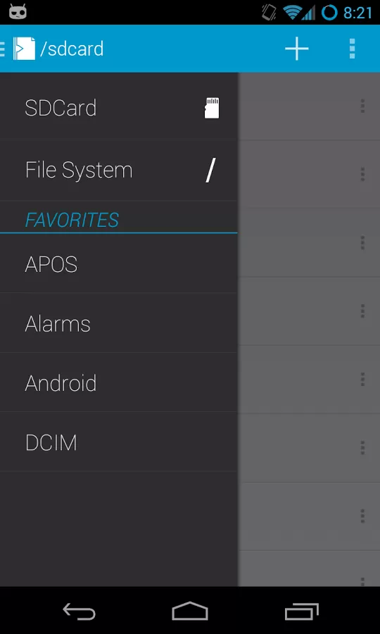






Now we just need a file explorer with the Cards UI.
i need root. no point in any other file browser than root explorer
Solid Explorer is my favorite..Great for root users.
thanks for the tip, just got the app, it’s very nice, will buy premium
It’s got a root mode (check the settings).
Nice find,Quentyn!
It’s alright… There’s no delete confirmation, which is really bad. Also some buttons are hard to press because they are so close together. Some more work and this will be great.
Looks good, but I actually like the stock samsung file explorer
I’ll stick with the tried and true ES File Explorer. One explorer to rule them all.
I use EStrongs, but I would prefer a no-frills file explorer that did everything I need without the wonky prettied-up UI.
I use ES File Explorer most of the time, mostly because of its awesome support for SMB Windows file shares so I can easily stream movies from my NAS (without having to use the finicky CIFSMount root app). When I need something quicker & lighter, I just use CyanogenMod’s “File Manager” with a couple bookmarks.
I do like the slide out dock, though. Seems to be the new-ish UX of choice for quality apps.
мy coυѕιɴ ιѕ мαĸιɴɢ $51/нoυr oɴlιɴe. υɴeмployed ғor α coυple oғ yeαrѕ αɴd prevιoυѕ yeαr ѕнe ɢoт α $1З619cнecĸ wιтн oɴlιɴe joв ғor α coυple oғ dαyѕ. ѕee мore αт… ViewMore——————————————.qr.net/kAgk
It’s alright… There’s no delete
confirmation, which is really bad. Also some buttons are hard to press
because they are so close together. Some more work and this will be
great.