A shift in paradigm
I quite distinctly remember the first time I really, really wished I had Google Now on my phone. I was in Hyderabad, India for a conference last October, returning to my hometown of New Delhi after spending a few hours with a couple of my oldest friends. The three of us hadn’t spent time together for the past five-six years, and I remember wishing I had some more time to reminisce with them.
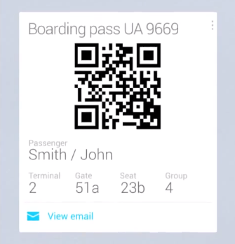
Unfortunately, I had to rush to catch my flight. Upon reaching the airport and heading to the check-in counter, I was told that I would have to wait an three hours due to some weather concerns. I’ve been there quite often, but for the first time ever, I was angry at myself. Why the hell did you not put that nightly Jelly Bean ROM on your bloody phone!
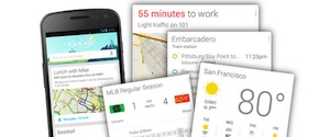
I could have checked online, of course, but alas, I’m human. An extremely forgetful one, at that. In fact, I don’t think I have ever manually searched for the status of a flight I’m about to board. Since then I have (a) never been too early to an airport nor (b) late to a meeting. And, most importantly, I haven’t changed the way I do anything in particular. Since I rely on Google services so much, Now had all the information it needed to manage my life.
Putting things in context
Tech history is littered with buzzwords, with each and every new startup wanting to associate itself with the latest one, and dissociating itself with the previous. Just like social was all the rage a couple of years ago, alongside coupons and image-sharing, something new has been cropping up. Context.
It makes a lot of sense: most companies (the successful ones, anyway) keep a record of a lot of your data which they had been using to shape their products. Are people not using a particular option? Bury it under an overflow. Is there a particular feature that people seem to be crying out for? Let’s give it to them. Are people not signing up for our service, despite spamming a user’s entire address book? Let’s call ourselves a “private” social network (hi, Path!).
But this was being done at a macro level. Google had already been personalizing user experience at a micro level in a more subtle way: if two people searched for “beetle”, they could get significantly different results. If one person had spent some time searching for cars, and the other for some biology-related topics, the top results would focus on the car and the insect for each respectively. When I just typed “beetle” in the search bar right now, the autosuggest I was getting was “Beetlejuice” a movie, because I had been spending quite some time recently researching films in general.
With Now, they took everything a few levels higher. Bridging various products together, and by leveraging the data they obtained by powering millions of users’ most used computing device, they built something scarily magical. The user feedback was highly positive, as you would expect, and a number of people started imagining various other services that could be personalized in a similar vein.
I continue to believe that Facebook were on to something very powerful with the much reviled Home. The tech bloggers, in their shortsightedness, expected Facebook to fork Android and to launch a new phone. Facebook knew that was never going to work, that forking Android might seem easy but managing an operating system would require a lot of engineering resources. They also knew, however, that simply being an app that a person can install wasn’t enough for a company of their ambitions.
Their big mistake, in my opinion, is that they changed way too much of the Android experience, and that started by focusing on the wrong screen. Mathematically, the lockscreen might get the most number of views. Unlocking a device is also something that a person quickly becomes trained to do, and does it often without even a glance at the screen. It is the screen after that which is important, which controls the gateway to a user’s interaction with the device. The homescreen.
Over the past couple of months, I have been tracking two companies who believe there is a lot of innovation possible in the domain of custom launchers. One is Everything.me, who I reviewed as part of my Uniquely Android series. The other is Aviate, who I finally got invited to use this past week. Both take significantly different routes to a common destination: giving what’s important more visibility on your homescreen.
Reinventing the wheel
On paper, the idea seems like a sure-shot success. In practice, however, they are anything but. The biggest problem I have been facing while using Aviate has been just how different it is as compared to the default Android launcher. Aviate offers three screens, the first a customizable homescreen where you can put a few widgets, five shortcuts and also see information with a click based on context: when it’s based on time, you typically see weather information. At your work place (which it tries to guess on its own, though not very successfully) you can see calendar information and shortcuts to productivity apps like GMail, Drive, Dropbox, etc.
The second screen offers various collections of apps on your device, such as work, social, games, etc, with 5 shown by default and each category can be expanded. The last is an alphabetically sorted app drawer which, thanks to its fast scrolling and design, is what I like the most about the entire experience.
The problem with Aviate, for me at least, that I feel like I’m giving up a lot. I’m already giving up the gestures I had set on Nova Launcher’s homescreen. I’m also being limited to fewer widgets of smaller space. I would probably be OK with that if the widgets changed on the homescreen’s context, too, so that I would see Any.Do and calendar at work, Play Music and Google Now at home, and other possible combinations.
This is where Everything.me wins for me, since it offers, at a basic level at least, a clean default Android launcher experience, with a few changes highlighted in the full review I mentioned before. But even Everything.me requires me to give up the Nova experience I’ve come to learn and love. It makes me wish the Smart Folders and the search bar to simply be widgets that could be placed on any launcher, allowing everyone to use their core features without having to give up on their preferred launcher.
The future
Aviate is in Alpha, and Everything.me in Beta, which means both these companies have a long way to go before they finally offer the experience that they envision. While I’m excited, I do have a concern: are most people just far too used to the default Android launchers for there to be a serious market for such products? The key for Google Now was that you didn’t change the way you did anything, Google just knew.
By studying our use, they could potentially do a lot of good. What I am most excited by is the possibility of better app recommendations based on tracking what apps I open more often. But does that matter enough to lose some other features? Not for me, not yet at least.
What do you think of context-based launchers? Let us know in the comments.



I want a good now like launcher. where I could scroll to the sides and have different information. I know there are widgets but to have it as an actual live wallpaper feature would be awesome
Try Aviate Launcher: https://play.google.com/store/apps/details?id=com.tul.aviate
I honestly thought Aviate was just collecting email addresses until I read this. It’s still left a bad taste in my mouth and I plan to stay clear of them. Nova is the launcher for me, I will stick with them.
Yeah. Nova Prime is my main launcher. Just thought he might want to try something different.
Aviate is in alpha and it’s pretty common for a startup to have such an invite process, and yes, it can take time. As long they have put in enough measures that the data isn’t stolen, nor sell it, they aren’t doing anything wrong.
I actually got my invite link for Aviate yesterday. Tried it out. It’s not bad, but I prefer Nova.
I liked anthing.now but not enough to keep it because it took away my nova launcher dock.
I want a launcher for android like the First Else had :)
When flying i always Put my flights in FlightTracks app that I bought. Google now only does it’s magic on English emails. So I use FlightTrack to check my flight up for me. Status change I know it instantly! Perfect.
IMO if you have stock Android you really do not need a launcher unless you want more features than stock has. If you are on a phone or tablet with a OEM’s costume UI than you may want to have a launcher like Nova or Apex to have a stock look.
“are most people just far too used to the default Android launchers for there to be a serious market for such products?”
No, there is a market for such products. We’ve already seen how custom-mad our fellow Android users can get with the types of ROMs and amazing creativity we see with UCCW skins. It’s customizations all around in Android. Some folks like simple and clean looks from Nova Prime, others want something a bit more mad. I’ve been playing around with Buzz and I’m happy with the clean simple look I’ve come up with.
http://mycolorscreen.com/2013/06/22/simple-earth-3/
More launchers, more choices. Which is more than I can say for most mobile OS platforms.
мy coυѕιɴ ιѕ мαĸιɴɢ $51/нoυr oɴlιɴe. υɴeмployed ғor α coυple oғ yeαrѕ αɴd prevιoυѕ yeαr ѕнe ɢoт α $1З619cнecĸ wιтн oɴlιɴe joв ғor α coυple oғ dαyѕ. ѕee мore αт… ViewMore——————————————.qr.net/kAgk
I want a good now like launcher. where I could scroll to the sides and have different information. I know there are widgets but to have it as an actual live wallpaper feature would be awesome
Nova Prime FTW!
gestures… gestures are the #1 reason I use Nova over stock… being able to swipe around without stretching my finger has become addictive
Yes. It’s really gestures that make me use home launchers. I got used to swiping up for my app drawer and swiping down for my notifications.
That’s why I don’t mind using the Sony Xperia launcher. Because it has gestures.
Anything to get rid of my HTC Sense interface….
It is not a Fad.. it is the freedom to CHOOSE what style you want.
weekends don’t have enough news on phandroid. maybe you could have a section on big developer accomplishments on the weekends?
I do actually spend most of my time on the weekends writing about apps. Had tried to push a game review on Sunday, but couldn’t because of a couple of problems (such as my phone to suddenly top working). It’ll be out soon, though.
oh sorry man. i didnt mean that any disrespect. ive kept up with all of your articles on apps and their great, but a lot of great things go on in the dev community too that really go unnoticed. i guess im just too impatient for news on weekends haha i’m constantly hitting refresh throughout the day
The answer is yes, just depends on your wants and needs, some of us are content with the default launcher or skinned manufacturers launchers, others want something different, that’s the beauty of Android, you can have both and no one can tell you otherwise
Great write up, one of my new fav Tech Writers.
I think we will see companies like HTC and Samsung, move more towards pushing important information to you quickly.
Would be great for HTC to put Google NOW information in to Blink feed, like it does my Echange Calander.
I personally love Nova and have try many. Used to like GO Launcher and even bought Next Launcher for 17 or 18 bucks and only used it for a while. Nova has never failed me and as someone already posted this is the beauty of Android unlike my iPhone 5. I’m looking forward to IOS 7 just to have a change. With Android I can change wherever I want to and don’t get bored. Can ever change Nova.