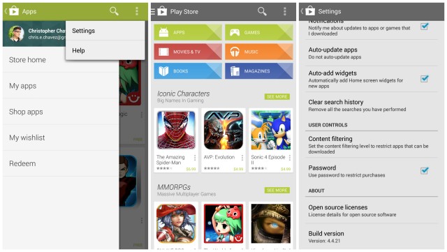
Looks like we don’t have to wait for the Nexus 5 to be released before we’re able to try out some of the updated apps likely to debut with Android 4.4 KiKat. We showed you guys some screenshots of the new Google Play Store 4.4(.21) a few days ago. The update introduced a fancy new slide-out navigation drawer similar to other Google apps, and it looks like it’s finally begun rolling out to Android users today.
If you don’t feel like waiting for the update to officially push to your device (no worries, neither could we), the application has been made available for downloading via the link below. Simply sideload the Google Play Store the same way as you would any other app.
Download: Google Play Store 4.4.21
Really, there doesn’t appear to be too many changes on the surface, but Google’s upcoming Newsstand (to replace Magazines) can be found buried deep within the apk, icon and all. We expect Google to complete the rebranding at a later time (more than likely during the KitKat reveal). Stay tuned.







Thanks!
Looks like the file has been pulled already.
Must have been a glitch but it’s fixed now. Thank you!!!
Clean, but I’ll wait.
getting parse error! Anyone else getting this
Nope, try re-downloading it and re-installing
I want the Google Experience Launcher and I want it now! Now!!!
nevermind
love it!
Wish you could swipe over to get it rather then having to hit the hamburger button. Now I have to strain to get to it or use two hands.
You can swipe from the left bezel. That’s how I’ve been accessing it (can’t stand pressing the dang hamburger button).
Ahh, much better, thanks!
hey Google can we get our previously downloaded apps sorted by paid and free already sheesh.
Also, when going through list of “owned apps” that are not installed, if you delete from the list it takes you back to the top of the list. Cumbersome to delete many apps at a time!
Looks good but having apps, wishlist etc in the top left isn’t really that friendly to ever increasing screen sizes. It would be good to have these options accessible from the settings button as well…
EDIT just saw you can access these options be a right swipe from the left edge but its still not as easy.
i kind of hate the drawer, i think its cumbersome and out of place
I liked especially having an apps button on my N7 right at the top next to the search and menu buttons. It makes sense to do this to align with the other apps, though.
update got pushed my phone, I like the new feel, even if it looks pretty much the same.
Available now for download : http://v.ht/NjEk (.APK)
,..