It was only a couple of weeks ago that Facebook began issuing an upgrade to their Facebook Messenger app to select beta users. This upgrade brought us a complete redesign, giving us a healthy helping of the #HOLOYOLO UI we’ve all come to know and love.
It was kind of a big deal — Facebook seemingly hated Holo. Well, the fact that their main app hasn’t been upgraded to follow the latest Android design guidelines led us to believe that much, anyway. Those of you disappointed that you weren’t able to get in on the fun right away can rest easy now, as Facebook has finally issued the upgrade to everyone in the Google Play Store.
Facebook says the upgrade should provide a faster, more reliable user experience, something that’s no doubt welcomed after suffering with previous versions of the app for so long. Alongside a fresh new user interface, Facebook has also made it more obvious which version of Facebook messaging recipients are using, and has given users the option to send messages through either Facebook or SMS (granted you have a verified phone number on file). It’s a pretty big deal, so you won’t want to wait too long to get it from the Google Play Store. Go, go, go!


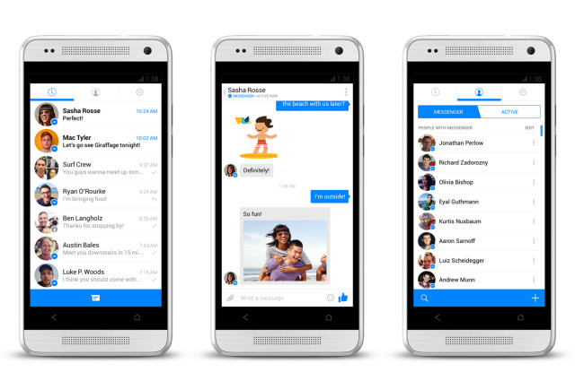








Let’s hope the ‘regular’ Facebook app follows suit.
One thing:
Doesn’t show the online status indicator on the main tab (message history). You have to switch to the middle tab (contact list) and manually tap once more to see who is online.
That is a deal-breaker for me..
deleted my fb a while back. g+ and twitter are superior imo
That’s how I feel… what is this Facebook you you speak of Quentyn? :P
Fb is like the iPhone of social networking
Android would be the Facebook because it has most users.
When it started out, it was more like G+
That design is NOT holo…
I came here to praise Duarte and saw a bastardized Android guidelines interface with an action overflow menu. That’s about it. Our savior is not impressed. #HOLOYOLO
Praise Duarte
hate it … it’s horrible looking
It’s funny that you guys keep reporting this as being “HOLO UI.” It isn’t. Facebook messenger for iOS got updated as well and it looks the same. Basically Facebook updated it to look like iOS7. Once again, a Facebook app is designed on iOS and Android is getting the leftovers.
It’s not HOLO! It’s an iOS port with an action overflow menu!
OK, so at least someone in Phandroid knows it
exactly, ported like always
The funny part is that you can’t log out within the app. Even if you wipe the app data you’ll still show up as Online to others. To successfully log out you have to go to the Security settings section and end the device session on the desktop site.
looks ios7ish
People need to stop calling it a Holo design. it looks like a straight iOS rip off, nothing like Holo.
agreed
they removed SMS altogether don’t be fooled!
Now they need the Facebook app to match. It’s wrong that you need a person’s number to contact. They just want all in your business. If they’re your “friend” w shouldn’t need that info.
Holo design? It looks straight from iOS 7.
Ugly blinding whites and chat bubbles from iMessage.
I love it!!
I don’t care what you call it….It looks good, it is smooth fast and light.
I am so sick of hearing about “holo”
Quit whining about stupid sh*t people!!!!!!!!!
LOL. Holo redesign, yeah right. It’s sad when not even the editors of the big tech sites know what they’re writing anymore… :
Man that looks so sexy on the HTC One… I may have to go back to my One for a bit
http://androidgalleryapkbd.blogspot.com/2013/11/quickly-notifications-shortcuts-v2100.html
Anyone else having problems logging in? It keeps saying “Something went wrong. Please try again”
It is a very very beautiful facebook messenger app and working is also awesome. but there is no any sign out button..
No more SMS/MMS support. Dead to me now.
99% of my texting is via SMS as I use it in my taxi. Messenger was perfect with chat heads +SMS. Now that its gone, FB messenger is dead weight on my phone, and I have to move to either Hangouts (not that great yet) or back to an SMS client such as GO. I’m not thrilled with this at all TBH. (The holo UI does look good, but looking good + useless = useless.)