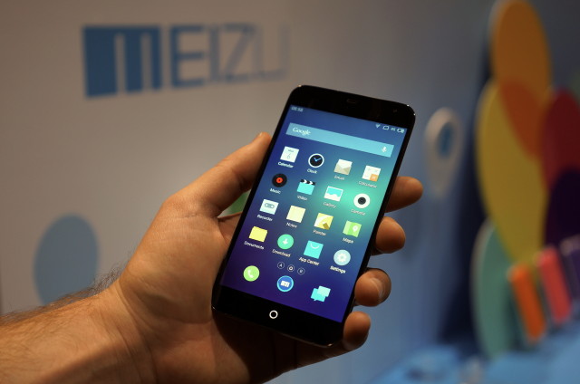
For this year’s CES, we were expecting to run into a few lesser-known Android handsets from various Asian manufacturers. With hardware specs hitting a ceiling of sorts, OEMs are finding out new ways to tweak Android’s user interface in order to differentiate themselves from the pack. Chinese manufacturer Meizu is no exception and with their latest device — the Meizu MX3 — we were surprised to find a completely unique Android experience, unlike anything we’ve seen from bigger named OEMs.
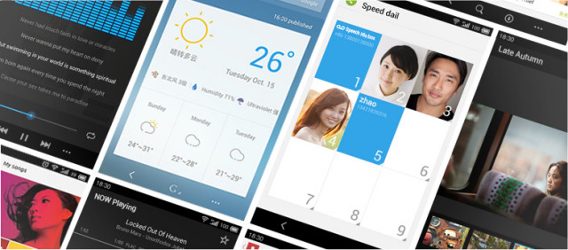
Dubbed “Flyme OS 3.0,” the UI changes just about everything you’ve come to know about a traditional Android experience. Using a minimal, flat interface, Flyme OS is built around 1-handed use. This is an attempt by Meizu to address the trend of ever growing display sizes, while our fingers have remained the same length as they have for countless generations.
The emphasis on 1-handed operation is most apparent in the custom launcher where app are organized vertically, in addition to horizontally, allowing for a “pull down and lock” gesture to access those hard to reach apps toward the top of the display. A swiping gesture from the bottom bezel reveals recent apps for multitasking, as well as favorite apps and brightness settings.
Speaking of gestures, you’ll find there are no back or menu buttons (either on the bezel or software buttons). Instead, the function of “going back” is executed by simply swiping up from the home button. This is even carried to the sleep functions where holding the home button will sleep the device (this can also be done the traditional way by reaching for the power button), or waking the device by swiping up on the home button.
Meizu MX3 quick specs
- 5.1 inch 1080×1800p SLCD display
- Samsung Exynos 5 “8-core” processor
- 2GB DDR3 RAM
- 8MP/2MP – f/2.0
- 2,400 mAh battery
- NFC and HSDPA+
- Available storage: 16GB, 32GB, 64GB or 128 GB
For now, Meizu MX3 availability is limited to Asia and a few European regions. The Meizu rep we spoke with did reveal the company’s to plans to bring the Meizu MX3 to the states in Q3 of this year (we’re guessing via Amazon or direct from the OEM). With the Android space getting more and more crowded, newcomers like Meizu definitely have their work cut out for them. Whether the MX3 will be as much of a success in the US as it is in China remains to be seen. We’ll be keeping an eye out.








Looks like IOS
Or iOS looks like Android. o.O
Meh. A lot more flat. Not round. Design wise, it looks like a blend between Android/iOS 7 but then again, Flyme OS has been around longer than iOS 7.
Guess we know where Apple got their design cues from.
1080×1080 display? Whoa!
1800×1080. Just a few pixels shy of full 1080p HD.
That’s what I thought at first, then I realised 1080p is 1080×1900, for FHD and there are already 2xFHD phones out there. So 1/4 what’s possible, so a cheapie screen, flash is potentially good at 128GB though. I paid an extra $A 50, to get the 32 GB Nexus 5 FHD, with 4G Advanced for $A 450.
the screen is not cheap, it use TOL (touch on lens)
TOL’s production cost higher then regular OGS (one glass solution) screen
The customers don’t care about the technology, they only care about the pixels. If movie look good, we buy, if movie look bad, we no buy. No offence, just pointing out the obvious, Stu14nm64bitUD : ). Oh just to point out where the technology is going this year 7″ UD, 14 nm, 64 bit, 4/6 GB RAM, Nvidia just showed a 192 GPU, K1 mobile processor. That’s good enough for UD gaming, not just movie playback, or recording, that’s 8x the megapixels of this phone.
Ugly asss interface ugh
puny battery unless we’re talking about a very efficient cpu and display.
That 8-core is definitely not efficient from Samsung S4 variants.