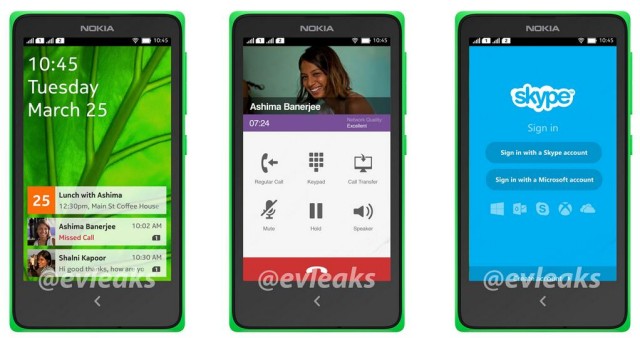
Wondering how the Nokia Normandy’s Android-based software would look if the Finnish company actually decides to launch it? This low-cost Android phone was leaked a while ago, and while we thought there was a slim chance of seeing it released after the sale to Microsoft, newer rumors suggest we might not have heard the last of it.
That must be true, as @evleaks has yet another leak giving us a peak inside this mysterious device. The Normandy’s apparent user interface can be seen in the photo above. What we’re seeing doesn’t immediately make it obvious that this is Android at first glance. The first slide shows what could be some sort of agenda / updates widget, showing you important details about meetings and missed calls.
The second is a typical dialer interface, though the “Regular Call” and “Call Transfer” options have us intrigued. It sounds like something that has to do with Skype integration. Imagine a feature that’ll allow you to pick a call up on your desktop and vice versa in a seamless way? Microsoft does own both Nokia and Skype, so it would sound like the perfect feature to flex those muscles with.
Finally, the last slide gives us a glimpse at the Skype login screen (which doesn’t look far off from what we already have on Android today). If there really is a snowball’s chance that this thing will launch, it’ll be interesting to see who and where it’s aimed. Earlier reports suggested the Normandy was meant for developing markets as a low-cost option for those who want a capable smartphone.
If true, we’re not surprised to see Nokia wanting to go that route. The manufacturer once dominated the world in terms of entry-level handsets. They probably feel like they’ve lost their way a bit with their new focus on Windows Phone, so this could be the perfect way for them to break back into that market and try and reclaim some of the market share that Samsung, LG and others have stolen.
That said, we’d love to hear more than “maybe, maybe nots” when it comes to whether or not this thing will ever see the light of day. Let’s hope we hear more about that at some point down the line.
[via WinSource]







No thanks Nokia.
Naters gonna Nate, I guess.
The second picture is just viber. Looks the same as the regular viber app.
Micro$oft loves money, so why not make some off your competitor at its expense, just makes good business sense.
Couldn’t you imagine a Micro$oft owned company making millions with a Google OS product?
Handsome interface
Yep second screen is viber. The only one that shows anything is the first one and even that doesn’t show too much.
Um, the first picture looks like a lockscreen w/ notifications to me. Probably clicking on one will launch the app, similar to TouchWiz lockscreen “puzzle pieces”, etc.
Why two signal bars?
It’s probably a dual Sim card model.
Let Nokia burn.
this is dual sim, will never come to the UK