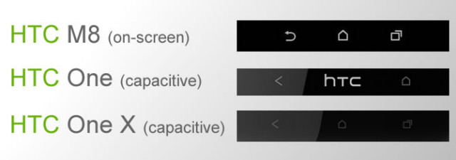
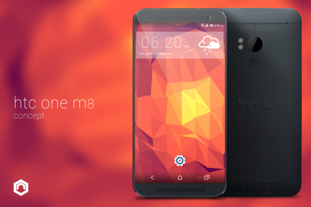
It’s long been rumored that the HTC M8, AKA the sequel to 2013’s HTC One, will be ditching hardware capacitive buttons in favor of on-screen ones. While we had no problem using our imagination to figure out what the simple configuration would look like, we may have gotten our first look at an actual design.
As you can see from the image above — where the M8’s supposed on-screen buttons are compared to the HTC One X and HTC One — the M8’s virtual buttons take after the design of the hardware buttons almost to a T. The only exception is the back button, which has a curved arrow pointing to the left rather than the “less than” symbol HTC has used in previous iterations of their smartphones.
While on-screen buttons may seem rather uncomplicated at the user level, it does impose fairly uncertain complications for HTC’s overall software package. On-screen buttons would do away with the need for an ugly, context-sensitive menu bar in apps which don’t implement overflow menus for settings, though that row will now be permanently and prominently displayed throughout the entire experience (except in cases where the device is in full-screen mode, such as during video playback or games).
At the end of the day, it’s still eating up screen real estate, and there are bound to be some folks who aren’t happy about that. For what it’s worth, those with phones such as the LG G2 and the Moto X haven’t had many complains with the on-screen buttons.
It’s particularly telling for the latter phone, which employs 720p resolution at a screen size of just 4.7 inches. Here’s a leaked spec sheet for the phone:
- 5-inch full HD 1080p display with Gorilla Glass 3
- Qualcomm Snapdragon 805
- 2GB LPDDR3
- 6MP or 8MP “UltraPixel” camera with possible dual-lens
- 2.1MP front facing camera
- 2,900mAh battery
- No capacitive buttons (software)
- Android KitKat with HTC Sense 6.0
- Micro-SIM
- NFC
- SD card slot
It sounds like the buttons wouldn’t take up a large amount of space on that display, but that’s yet to be determined.
We’d need to see and use the phone for ourselves to give final judgment, but it shouldn’t take long for that to happen. HTC is expected to reveal the HTC M8 later this month, presumably at Barcelona’s Mobile World Congress. We’ll definitely be sure to revisit this matter once that announcement is made.
[Weibo via HTC Source]







I would only consider using virtual buttons on a two-handed device like a tablet; I have no interest in them anywhere else.
I prefer them because I can add a search button. I’m not too ready to give that up yet. Though I’ve been doing fine without it for the past approximate year, I would still catch myself looking for the search button because I would *forget* how to search within the app.
Springpad, a note-taking app I use, allows you to search, but you have to click about 3 different menus. You can press the search button and initiate the search from anywhere within the app. This has usually be true and all other apps that allow you to search, like Youtube.
Looks beautiful. I would definitely jump from my One to the M8 with those specs and the on-screen keys.
Here’s hoping they launch a GPe version of this and that the Carrier versions come with an unlockable bootloader.
I stopped buying phones that didn’t use on-screen buttons.
Am I the only one seeing the mention of the SD card slot? That’s a huge deal in the phanboy wars haha.
I’m very happy to see another major manufacturer include them in their flagship.
Where are you seeing the SD slot being mentioned? Guess you are the only one.
I’m all for this, they shrink the bezel, lose the capacitve buttons for software buttons, it’s like in reality the phone will be the same size as the one except for in landscape mode when watching videos the buttons disappear and you have more screen for viewing pleasure, sounds good to me. Plus sd slot. Boom, that’s a win
That’s what I was thinking. If they remove the soft keys, make the screen larger, remove a little bezel, then the phone would be practically the same size.
i see some A-hole down voted for agreeing to something that is obviously a factual comment, shoot if they wanna keep it a 4.7 inch screen like it is now, just remove the hardware buttons, that way they can still have a nice screen size, boom sound and shrink the overall size of the phone. IMO i call perfect.
And only 2GB RAM?
LOL.
What’s so funny? Since when is 2GBs not more than adequate? Don’t be a tool all your life.
And I was just about to add “awaits the obligatory ‘why do you need so much RAM’ comment”.
More RAM = better multitasking, fewer redraws and a generally faster interface. It’s pretty simple. How people are still questioning the utility of more RAM on a tech site is beyond me. That infamous Bill Gates comment springs to mind.
I expect a 2014 flagship to have 3GB of RAM.
I won’t argue with that logic, and you’re definitely right. But I think HTC Sense UI will be even further optimized to create a great experience either way…. High five?…
“That infamous Bill Gates comment springs to mind.”
You mean the one he denies saying, and that nobody can positively source?
Inconsequential. The principle behind the statement, regardless of whether or not he said it, is what is important here.
HTC One had 2gigs of ddr2 and look how well it flowed, imagine a better optimized version of sense and sense 5.0 was dam good, with 2gigs of ddr3 ram do really think HTC is going to need 3gigs. It’s not all about numbers bruh, Samsung has better ram and don’t flow as smoothly
Nobody said it was, but optimisations + more RAM is undoubtedly better than having last year’s spec + optimisations.
‘Need’ has nothing to do with it, which is obvious in a discussion about a top-end smartphone. I want it for all the reasons I specified. Unless you believe less multitasking capacity and more redraws are better?
This ‘let’s keep the same old specs’ mentality is hilarious. There is no upper bound to the utility of RAM or storage (in that more = better) so I want to see both increasing as much as possible.
But here is the thing, a phone with it’s designed skin on top of android will only do as it is programmed, if sense UI is designed to handle multitasking in it’s own way, and it can do that perfectly with 2 gigs of ddr3 ram why not, and calling two gigs of ddr3 ram for a phone last year speccs is insane, if thats the case iPhone is destroying android with it 64bit processor, if we as an android community don’t utilize 64bit processors this year then we might as well buy Apple products to stay current and leave 32bit in last year
It is still fundamentally limited by the amount of memory available. If I open many apps Android will remove background apps from memory faster on devices with small amounts of RAM than it would on devices with large amounts of RAM. Therefore, multitasking is better on a device with more RAM (unless you like redraws).
dude the one currently can run up to 9 apps in the background, like what the heck, i tell you what, you are the impossible type, no pleasing you….welp 2 gigs of ddr3 better than ddr2 will be perfect for me, and last year when samsung had all the power, there nasty looking UX and added software that barely gets used and horrible sound quality made it a nasty experience for me. enjoy yo sammy, ill enjoy my new one, unless sammy really give there UI a overhaul and it becomes attractive to me
Not in the case of Samsung. 3GB of DDR3 RAM and the interface is still not nearly as smooth as Sense on 2GB of DDR2 RAM. Once again, Samsung has people like yourself believing that more necessary all the while still being out performed by other devices with less. 3GB maybe on a tablet, but a phone not so much.
This is not an attack on Note 3 owners/fans.
As I said to DDroid45, the concept of ‘necessity’ in a discussion about top-end smartphones is irrelevant. It is all about desire, and I desire better multitasking, fewer redraws and a generally smoother/faster experience. No matter how optimised the interface is, more RAM is conducive to my desires. Android will start removing apps from memory earlier on devices with small amounts of RAM than it would on devices with large amounts of RAM; therefore, devices with more RAM are better for multitasking.
When it comes to things like memory and storage, more is always better, so I don’t see why you are against it.
2GB of RAM would be enough worth optimised software and/or hardware. Moto X and G run very well with less than 2GB. Only reason you’d want more is for UHD/4K video output and/or UHD displays (when they come around).
*enough with*
if Google play edition comes out I will jump from my nexus 4 to this.
Will be my next device, no doubt. I’m hoping they extend the screen out to about 5.2 though, but everything else is a go
OMG!! Who cares? You wrote an article about this?…. and when it is not even confirmed anyway. Seriously, stop posting articles just to post articles.
If there was better more interesting news I’m sure they would post it. Not to mention about 4 other android blog sites I know of have posted this. I think for them not to post something about this would probably seem like they aren’t “In the know” about this.
So, again, they are posting “news” that is noooot news just to post it? Or they are just following the herd?… so following the herd is better than just standing still? In the world of information, lack of garbage is a good thing (in fact, in today’s modern era, it is absolutely necessary and a benchmark of good reporting.)
I think a OEM finally following Google’s recommendation and abandoning the horrid 2 button capacitive system they had on the one (which is the reason I didn’t buy one) is news.
It might not matter to everyone, but for people who love the multitasking button most importantly and on screen buttons, this is news
And good news at that :)
1) its news because they are reporting a change that many people complained about in their previous phone
2) there were 18 comments outside of the 2 that you made… so obviously some people do care. Just because you don’t doesn’t make it a waste of a post.
A fact is a fact (i.e. this is not news, moreover, it is fact that this supposed news is not even a fact.. it is speculation.) And like I said, who cares?? Read the article, yo. We all know what onscreen buttons look like, yo. Moreover, the article is NOT about whether or not HTC will make a move to onscreen buttons. THAT is not what the article is about (that would be news). No, THIS are is purely about what those buttons might look like. Look like. Hell, who cares?? The back button is slightly more square than Samsung’s?? Who cares. Other people posting comments doesn’t make it a valid news story… you give social media/comments way too much power and credit.
i’m not giving social media comments way too much credit, i’m giving them the credit that they deserve. You specifically said “omg who cares, stop posting this crap.” there are currently 53 comments, only you seem to be in the complaining fashion, so that leaves 50 comments of people who in fact “care” enough to click on the article to generate revenue for the site which in fact means…. it wasnt a waste of a post. Its fine you dont have to care. I dont care when gs3 will get kit kat… but you know what… that wouldnt be a waste of a post because it will probably get the same amount of comments.
This is not news. It is nothing but speculation. This article is not about the decision to put buttons on the screen. it is about what it miiiiiiiight look like if they did. Read the article.
OK but here is the thing… this is NOT the new york times. This is an android tech blog. So news, speculation, rumors, polls, all of these things are common article types for this kind of media outlet. You complaining that a tech blog has an article about a rumor of an upcoming device would be like me complaining that ESPN shows so many sports.
And the fact that this article has so many posts means that you are incorrect in your assertion that they are posting things just to post things. People are interested. Sure it may be beneath you, but PEOPLE are still interested. Look at the 63 comments, and i’m sure there are many more views on top of that. Its not your kind of article and that’s ok, but that doesn’t make them stupid for posting it.
Haters gonna hate, I guess. Pay him no heed, Quentyn.
I have the One now and the only phone i would probably ever replace this with would be the M8…cant wait to see this in person.
Dedicated multi-tasking button, Ok HTC your a contender for my next phone.
The main reason I love on screen buttons is they are the only phones with the dedicated multi tasking button, which I find makes my usage so much more fluid. double tap doesn’t cut it.
Honestly I wouldn’t care if it was capacitive or on screen but I want those three buttons I’m used to on my nexus back, home and multi task.
the fact that it has it in the right order is a big positive too , I like :)
so double tap or hold is such a big deal? seriously? you double tap
everytime you want to open a file in windows. is it so difficult?
seriously? (ironic) you’re bothered that much that I prefer a dedicated multitasking button. It’s called user preference and I notice that I don’t use the multitasking feature when I don’t have a dedicated button because it’s annoying because often you don’t get the timing right and it doesn’t register. So I buy phones that have one :-)
I had this kernel on my phone that was messing it up. So I didn’t have double-tap for recents. That was the worst day in my life. I had to wait until I got home to reinstall everything on my phone.
I had to remap my press-and-hold to open an app, Recent Tasks (An app in the playstore that does the EXACT function of multi-tasking. How convenient?)
no but he is saying why does he have to double tap something he uses more often and single tap something he’ll barely use.
recent app button is leagues better than the stupid double tap… don’t get me wrong, i got use to with my HTC One but I’ve always preferred a dedicated multi-tasking button
They mad, bro. Don’t take it personally. They are truly lazy if it’s too much effort to double tap the home button.
I prefer the press-and-hold or dedicated button. Why? Because if I double-tap, I would think in between those taps and freeze up and the activity would register as Home. I would end up wasting more time. *First World Problems*
This is truly the only time double-tapping is an issue. LoL!!
Buy an LG G2. LG lets you customize the number of onscreen buttons as well as their order on the screen
thanks for the suggestion, but I’m happy with the default order on this device and my nexus 5. back, home and recent apps.
with a small menu button creeping in when I’m running an old app that still uses a menu key.
U wot m8?
Hey, the painfully bad button layout, lack of sd card slot and smaller than desired screen are the exact reasons I don’t have an HTC one. I hope this phone lives up, I <3 HTC but the last few generations haven't done it for me
Ditto that.
It’s almost as if HTC took the time to (*gasp*) ask people what they didn’t like about the HTC One, and are fixing what they can in order of priority.
1) Didn’t like the buttons
2) Didn’t like the “huge” bezel
3) Didn’t like the missing SD slot
4) Crappy camera
5) Didn’t like the small non-removable battery.
6) I don’t like snobby metal
(Okay okay… HTC will never “fix” 5&6, but 1-4 are doable :))
1) Yes. Those buttons could have been better. That menu bar is just atrocious. They get no cool points for that. Thank you rooting. It’s because of them that I forget how to multi-task on my Nexus 7. I keep double tapping home.
2) It is a tad too large. So I can’t type in landscape. My hands can’t comfortable reach the center keys. =.[
3) Not necessary for me. Mainly because I have 32GB onboard and rely on streaming for my music and videos. If my onboard is 16GB or less, I WILL need an SD card.
4) The camera is only bad when it came to cropping photos. Other than that, I didn’t see anything wrong. I don’t have an artist eye, though. All I know is the FFC is horrible compared to the rear camera. But that’s obvious.
5) My reason I don’t like it is because I can’t take my battery out to see if it’s time to replace it. Regardless if I’m going to keep the phone for 6 months, or a year. I wanna know if my battery is bad.
6) I prefer metal actually. And that’s because it makes the phone heavier. Plastic phones are too light. I feel like I’m going to throw them when I pick them up. But my OCD with things shining makes me keep my HTC One out of a case. But if I drop it… =.[
I want physical buttons. i’m tired of accidentally hitting the back button!
im the opposite, i hit more buttons by accident when they were capacitive.
I think he means physical as in the way the Motorola Droid X had them. Solid hard.
That being said, I really hope the new HTC One has on-screen virtual buttons.
oh jeez, i’m not trying to go back to 2009 lol.
I had a Nokia 5310 from early ’09 until mid 2012. Your life was not that bad. Problem? ;D
lol i had a palm pre…
I miss the track pad on the Incredible.
i miss the kickstand from my old evo
I miss a dedicated camera button on the right side of the phone
Nope. I do more accidental presses on my Nexus 7. Maybe that could be because of the larger screen though. Well, when I’m texing something I do accidentally press Menu (kernel remap to HTC Logo) on my phone instead of space. Hmm…
I will take this in a GPE version, please.
could look like? give us the real thing already htc!
IKR!? I’m mad at how good they’re keeping this phone hidden!! >=.3
the black appearance with litle blury make this soo lux
http://appdotapk.com
my Aunty Grace got a nearly new blue Kia by working part time from the
internet. look at this now Jump999.ℂom