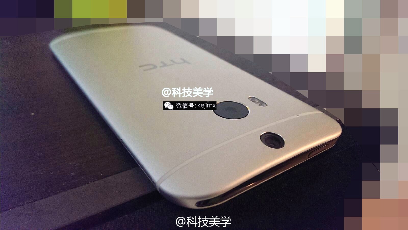
It’s only been 3 days since the now infamous 12-minute hands-on video of the “All New” HTC One made the rounds. While we’re not sure exactly what became of the kid that leaked the M8 early (or his parents, for that matter), that’s not stopping the new One 2014 from leaking elsewhere on the net. The folks at NoWhereElse have dug up some new photos of the device as it appeared on the Chinese blogging site Weibo.
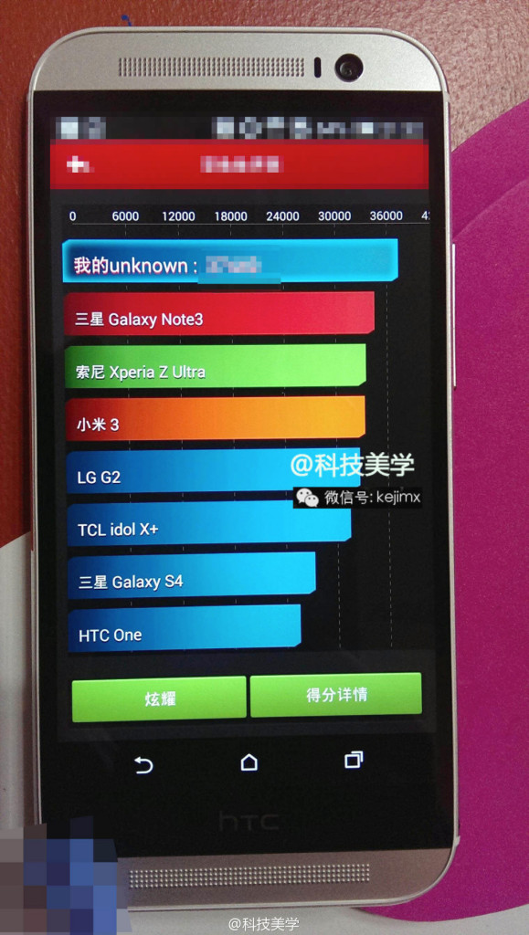
Really, there’s not much here we didn’t already see in glorious 720p last time around. But if that video was a bit too nauseating for you, here’s a few high-resolution stills. Oh yeah, the individual who nabbed the photos also captured the new One just after it completed an AnTuTu benchmark, scoring a little over 36,000 (and besting the Samsung Galaxy Note 3). You know, for those of you into that sorta thing.
With the recent string of leaks, it’s clear HTC’s security department has their work cut out for them. We fully expect even more leaks to come out of the woodwork the closer we get to the actual reveal date, currently set for March 25th in New York. Of course, Phandroid will be in attendance, so be on the watch out for our own hands-on in the near future.
[Twitter]







Oh dear, what are they thinking with that HTC logo bar. Idiotic.
That they needed the space for the components inside the phone. It is ugly though… and I wont be buying it, not that its a bad phone, its just to long to fit in my pockets right.
The more I look at it, the more I like it…
But that huge bottom bezel with the HTC logo bothers me too much.
Love everything about the phone aside from that huge black area at the bottom. :/
It’ll be fine. The back of the phone looks so nice in that first picture. I can’t wait to get my hands on it!!
I know that they are trying to get their logo on there, but I feel like they could have possibly had an opportunity to get the best of both. First, remove the black bar completely. Hardware logos are so 2013. Let’s go with software logos! Replace the “home” button with an the HTC logo and give it the same functionality. Does it get in the way? No. Does it reduce the bezel? Yes. Does it show off their brand at all times? Yes. Will people complain? Probably. Is it bloatware? Extremely minimal. Oh and it would frickin glow whereas you can’t even see the current one because it’s not backlit.
Honestly, I wouldn’t even be mad if they scrapped the software buttons altogether, putting the back and home back on the bezel. Wouldn’t take much effort and it would stop a majority of the complaints.
But then you would have people who want those on-screen keys :
I personally have the “All New [Older] HTC One” and I don’t have a problem with the capacitive buttons at all. That’s where I got the idea from. The current HTC logo is in between both the back button and the home button. Figured they could just implement that with on-screen and increase the size of it.
This is probably the only time I’m hoping for capacitive buttons… lol
Just give us back the hardware, home, back, recent keys on bezel
bezels? smezels.. I was playing with a Xperia Z1 today.. talk about Bezels.. getting a heads start for when the Z2 is out.. and whether to go for that or this all new HTC One.
yes but at least on the z1 the screen is in the centre of the handset. The reason why this looks so fugly is that the huge bezel at the bottom in order to include the HTC logo results in the visible display being off-centre…..which looks ridiculous.
The z1 though, like the iPhone and gs4 etc has a centred screen…which is how it should look
good point.. I didnt like the NExus 7 because of the large “chin” bezel
Yeah and talking about chins don’t even get me started on the nexus 5. Might have got it otherwise :(
I think they could also have put the logo on the actual speaker grill. Whether its through a paindecal or through embroidered relief design. There are quite a few options.
I was thinking that actually.
Just put the logo in the upper right corner like they used to.
I agree. This phone was almost perfect if it wasn’t for that damn bezel.
Take away that gawd awful black bar and the extra bezel above the top speaker grill and you might have a winner here.
the HTC logo clearly doubles as a heart rate monitor
I was really hoping they would replace the metal with bandages this year, looks like Samsung is one step ahead
I honestly don’t understand the thought in wasting space by putting that HTC logo where they’ve put it. If I’m buying the phone, I obviously already know it is HTC. You already have a big HTC on the back. It probably won’t be THAT big of a deal for me, but just why? I’d love for HTC to tell us why that was absolutely necessary.
Three bottom bezels. Virtual buttons… not even once lmao.
Peter Chou, if thats how ya spell it, man what is wrong with your brain. What makes you release a phone in this day in age with such a waste screen space. Like just remove that crap black bar thats useless. Come on dude, look at the web. See what people are saying
Prob have to wait for the new new ONE next year. lol. Theres no way this phone is changing now.
Oh gosh not benchmarks. I’ll admit I used to be obsessed with these things back in the day on my overclocked single core devices. If it runs smooth then that’s all that matters.
Yes, they could remove the bottom bezel and possibly all of the bezel, but it is greatly exaggerated from people who don’t even own the phone yet. The current HTC One has it and all of HTC’s phones have had that famous black bezel around their screens. It’s about time they remove it, but get over it for now. It really doesn’t ruin the phone.
It’s not the fact that the bezel there. Its the fact that the bezel is useless, before the bezel had a purpose, the buttons were there. Now it’s a waste
I wouldn’t really call it a waste, it’s there to balance the top and bottom. It’s not as though there is empty space inside the case, I’m sure they are using the space efficiently. But yea, it still seems like the bezel is a bit much.
Remove the bezels and you likely will have to deal with less room for components such as battery. Not a good call IMO. Google htc one teardown and see how every bit of space matters.
This is true, but if they have to make the phone this big, they should at least give it a bigger screen. Make it a bit wider and a bit shorter, have the same room, slap a bigger screen. HTC phones are too long for me as it is.
Dude it has onscreen buttons. The bezel is pointless. It ruins the phone period.
Agreed. But good luck convincing the masses of people mindlessly against it. Im cool with it. These people angered and outraged need to realize its just a phone, a phone they dont have to buy if they really dont want it.
I gave up on this phone bec of that useless black bar…I can’t wait to see the oppo find 7, Hopefully it impresses..:)
Not buying a phone just cause of the bezel is lame.
I hate to keep beating a dead horse, but my god that’s alot of bezel. At first I was like “man people are just being whiney pooh’s,” but the hate is justified with these high res photos. This thing has a Jay Leno chin on it. That bottom bezel is ridiculous looking.
I am pretty sure you are staring at that pic and (intentionally or not) counting the black navbar as part of the actual bezel. Theres your mistake.
No mistake I’m aware of the navbar. In conjunction with the HTC bar it’s just too much imo.
I think the bezels are fine. If there is anything in there that needs to be fixed is the navbar. But yeah, i agree with you, its too much.
I agree it looks odd, but if the navbar is translucent (as I’m hoping it will be) then it probably won’t bug me much.
Looks nice to me
I think I found my next phone ^^
Not trying to start anything here, but I find it interesting Nobody is blowing up about this phone’s design. The S5 has copped it for being too similar in design to past models and supposedly disappointing everyone because of that (doesn’t help when people leach on to every rumor that surfaced about the S5 that wasn’t realized in final form)
By no means is this design ugly, far from it, I’m just finding it strange! Maybe the metal casing on this makes it all the better than the outgoing model!? Either way looking forward to the launch.
i think people were upset werent upset because samsung used the same design, they were upset that they used the same design they didnt like since day one
I’m one of those that didn’t like the design from day 1, and I can’t agree more with this comment.
But – what would rather : More bezel or more Verizon logo? Or are you one of those kinky devils who likes both? :-P
Exactly
That’s because people were expecting samsung to change the design more dramatically so it doesn’t look as cheap. For the HTC one, people are more than happy to accept “if it ain’t broke, don’t fix it”. At least that’s what I think.
I just can’t stand how much rounded it looks… It just doesn’t have that bold look the original One had… It looks “softer”
What I can’t stand is that lip around the front bezel. It doesn’t look nearly as clean as the original One. I’m going to withhold any major criticism until I see the thing in person, but the photos I’ve seen have me unenthused. I may still get one though simply for the fact that it’s a freakin’ HTC One with an micro sd slot.
It has a function though.. that lip keeps the screen slightly off the table in case you lay it face down so it doesn’t scratch.
what about the 32GB std size too.. that’s an attraction.. now that KitKat has different ways of managing app data!!! Oh man
– so many things to consider these days on these devices
I know what you mean. I’m not getting that same “umph” feeling or whatever from this one. (No pun inteneded)
I don’t know how to explain it, but hopefully, seeing it in person would change my mind. I seen the back looked real shiny, and I like shiny things. But I have very oily hair. Finger prints. =.[
Since HTC continues to persist with that extra bezel it tells me that they don’t know how to engineer a phone, and before you get started, I don’t mean they can’t make a nice phone.
What I’m saying is they don’t know how to engineer smaller components into their devices to maximize the real estate efficiently. I’m pretty sure the extra bezel serves a purpose, maybe part of the interior speaker assembly, I dunno. They need to start going with different suppliers on their components, maybe plant a mole in the Samsung camp and see how they achieve their nearly bezel free devices. If you notice, Samsung is always introducing smaller and more efficient technology that goes into their devices, something we rarely hear about with HTC.
Something is amiss and this is partly why their sales continue to tank year after year. Probably time to clean house and hire some better innovators.
The bezel isn’t really that bad, I think what is throwing it off for most people are the front facing speakers. which will obviously take up quite a bit of space. If they go with a standard design and skip the front facing speakers and place the main speaker on the rear then the bottom bezel as it is right now would be smaller than any other bottom bezel on any other phone on the market right now.
Now you talk about samsung, just imagine a galaxy device with front facing speakers then add the home botton(which they will never get rid of) on top of that, it would look just like this if not worse, a lot worse.
I would agree if HTC hadn’t already been in the business of making redundant bezels before they introduced the front facing speakers. Either way there has to be a more efficient way to engineer the speakers, it’s up to HTC to figure it out.
If it were Steve Jobs he would have said, No I want it smaller, make it happen or I will find somebody who will. That’s the kind of direction they need.
Really? If you’re going to hold the way ‘Steve’ would have done it up as an example, the answer is simple. Go get yourself a damn iPhone and leave us alone. I don’t want my phones the way Jobs would have them, thank you very freaking much.
You do realize that the black bar is necessary, right? Beneath it, the amp for the boom sound speakers sits. I’d take the better speakers and the bezel over no bezel and speakers that become muted or muffled just by picking the device up.
The All-New HTC One: “Bezels….Betcha cant have just one!”
Looks like the spaceship from Flight of the Navigator.
I understand why HTC would want their logo on the front of the phone, but since they don’t have buttons anymore couldn’t they have just worked the logo into the middle of the speaker grille instead of taking up a giant bar all to itself?
If they can get something similar with the download booster that Samsung has on the S5. That is the greatest thing I have ever heard come to smartphones..like finally what have they been waiting for….I am sold with HTC if they can get it on their phone as well, I have always like their build quality over Samsung.
enjoy the bezel.
I will my friend….I will
Leaks…aka Marketing. I think they are building buzz
Based on that it’s probably Snapdragon 801 or Snapdragon 800, neither is a surprise.
I don’t like the bezel, I doubt i’ll like the dual 5MP camera and I don’t like the logo.
Looks good … The edges look mote rounded and smooth than the HTC One … The bezel is the killer isn’t it …. Don’t need it … Paint the logo on the grill … It’s already present on the back HTC should be smarter than that …. All companies by now should know people hate the unnecessary bezel
Be smarter guys … LG G2 surely looking like the phone for 2014 now
with its specs…Im still considering the LG G2….
That. Black. Bar…… Ugh. Why? Makes the on-screen keys actually a drawback. If they are keeping that stupid bar, might as well keep the capacitive keys