We’ve finally been able to get our grubby little paws on the Moto 360 smartwatch. It’s one of three of the first Android Wear smartwatches, though it won’t be headed to Google Play later today like the LG G Watch and the Samsung Gear Live (hands-on) will. So what’s up with this thing?
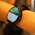
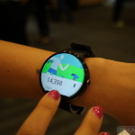
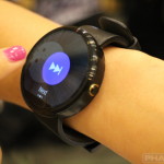
Beauty, that’s what. Immediately we can tell you that no smartwatch has quite the same good looks that the Moto 360 does. We don’t know if it’s due to the natural circular build or just the fact that Motorola designed it so well, but it looks and feels like something we would want to wear in a wrist as a fashion accessory as much as a smart utility.
Motorola still isn’t revealing much about the watch’s innards, though there shouldn’t be many surprises under the hood. It’ll contain hardware necessary to run Android Wear to the best of its ability.
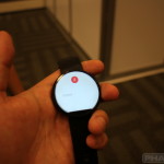
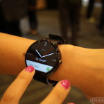
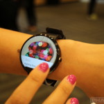
Speaking of which, we were able to get a rather swift look at the UI in action, with one of Motorola’s product managers taking us through various bits of the UI on her wrist. It looked about as smooth as you could ask for on a device that doesn’t necessarily concern itself with excruciating power.
We’re saddened that this won’t be on the way today, but Motorola says we won’t have to wait too long as they look to have these in your hands (or on your wrist, rather) by the end of this summer. Take a look at the photos and hands-on video above.






what is the battery life.
That might be part of the “Secret Sauce” she was referring to. ahhahah!
Can you guys afford a video cam that can focus properly? All of these Phandroid videos fade in and out of focus.
I have an idea! Why don’t you buy them one?
I almost wish they never announced the Moto 360 months ago. With such a long “tease,” this darn watch better be worth the wait. I do like the sound of chrome stainless steel though.
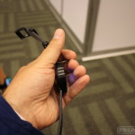
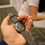
That’s a strange texture on the back (the side touching your wrist). Any ideas what it might be for?
Oh, man. That black steel has me reconsidering my LG G Watch purchase…. :/
Don’t reconsider Chris, the impulse buyer in me needs to live vicariously through you until the Moto360 comes out.
oh, come on, Moto. get this to market already! I was totally anticipating an “actual” release date (and pre-order) rather than more clock-tease.
The Gear Live has a heart rate monitor. Do we know if the 360 will have this sensor as well?
it wont
What does Moto 360 do different than the LG or the Samsung ones? beside the design…
Wireless charging is the only difference that I have read about so far.
Well we don’t know the specs yet. But we do know it has wireless charging.
They can keep it, I wouldn`t wait for something half information unknown. I have the Gear 2 and it`s doing what I want to do, as a battery live goes it hold three days on one charge and I`m happy with it. So Motorola can keep their secret as much they want.
I managed 4 days on my last charge… I was shocked.
The Gear Live has a heart rate monitor. Do we know if the 360 will have this sensor as well?
Worth noting, they said the heart rate monitor was the same one as the Galaxy S5 and that one only works when you are at rest so pretty useless from a fitness perspective.
This should be water proff
They announced that all of the ones they “were talking about today” are water resistant (I hate saying water proof because usually they aren’t)
yea it doesnt plug in for a charge so i would think water proof is possible. how cool would it be to have a smart watch that could go underwater with you!
They did say it will be water resistant.
That bezel just looks so damn bad. I’ll wait until they figure out how to actually pull off the circular screen. What a shame. This thing is almost beautiful.
the bezel looks fine to me but damn it so thick.
I like the bezel. And if the build quality is as good as my new Moto G LTE I will definitely be buying one.
You don’t like the bezel. There’s no way you think that looks better than a clean circle would look. Come on.
You need to realize that not everyone sees things as you do. I like it too. And much prefer it to the other option which is a bezel around the entire device.
This is where the thin line between tech enthusiast and fanboy is drawn, I think. To me, this watch looks like something that’s 90% baked. Not half-baked — much closer to being finished than that — but also not ready for release. They’re jumping the gun in order to be able to claim to be the first ’round’ smart watch.
This will look sooooo much better once they figure out how to get rid of that bezel. It’s an eyesore. It’s a lot easier to ignore if you’re a full on fanboy, though. I don’t mean to use ‘faboy’ as a pejorative, really, either… I just think that’s what’s happening in this case. :P
Again, different strokes for different folks. Beauty is in the eye of the beholder, and it’s always strange to me when people can’t realize that others see things differently. It also is very funny to me that in the tech community, certain individuals deem anyone who has an opposing opinion to theirs a “fanboy.” From the time the Moto 360 was announced, that black bar has ALWAYS been there. I was always aware of it, and it never bothered me. If it bothers you and you are not capable of seeing past it, that is fine for you, but your views and aesthetic preferences are not law and others are not fanboys simply for seeing things through different eyes than yours.
The bar wasn’t always there, and a large number of renders have always shown it without.
They were clearly going for the full-circle effect. This is an obvious shortfall. You gotta at least admit that. It’s going to be better when they finally get it right.
Sorry, but the bar was always there. It was there in their renders, it was there in their promotional videos, it was there in their promo shots, it was there in their email sign up page. And it was there (and still is there) on their website which is unchanged since it was published. There just weren’t a bunch of people who noticed it who started crying about how “bad” it looks, to ingrain it in people’s heads. But I think that’s a sign that it must not be that bad, if you’re only starting to notice it now, when I saw it from day one.
They figured out how to pull it off. And I think it looks great. The other alternative was to have a bezel around the entire screen. I think they made the right choice.
They didn’t figure out how to pull it off, hence the bezel at the bottom.
Once they figure out how to get around that, these things will be super nice.
It’s a matter of preference. They figured out how to create a mostly edge to edge circular screen, by putting the sensors at the bottom. Which is disguised when using dark watchfaces and other black backgrounds, and which flows organically with the design language used in the light colored Android Wear screens. I, along with them, and along with many others are happy with that decision. Those of of us who will be buying the watch think it is gorgeous. They could have done huge bezels all around, but they “figured out” a way around that (no pun intended).
My God this is sexy watch
Anyone know how the screen is in sunlight? A real watch (TM) and a Pebble are both great in sunlight, so the 360 needs to be at least OK otherwise it loses much of it’s utility for me.
Also, any word on battery life with the screen always on?
did you get the chance to measure it, especially the thickness?
He asked in the video and she said they weren’t revealing the “secret sauce” and other vague crappy responses like that.
More like a hands off video.
looks too thick imo, I wouldn’t wear this, not a fan of the black plastic either.
Where did you get the idea that it’s plastic? Looks anodized to me.
looking at it more closely I think you may be right, still don’t like it, but that’s just my personal preference.
I plan on getting both the 360 and the gear live… One for casual wear and one for those dressy occasions. That way weather I’m in a tuxedo or jeans and a t-shirt I’ll be connected.
TAKE MY MONEY MOTOROLA AND WITH MOTO-X1
Will it work as a stand alone device, or just mirror information from a connected phone? Would’ve like to see something with GPS and WiFi, like the MotoActv, as well as a media player for the times I’m working out and don’t want to be inconvenienced by carrying around a phone with me. I agree that its a good looking device, but if all it is is an extension of my phone, then I’m out.
This is the only smart watch I’ve seen that looks remotely wearable. Wireless charging is key, makes it as easy as taking off the watch every night. Well done moto.
I still won’t buy it, I like my watches to be lightweight and not bulky. I imagine in time as battery tech, or other tech catches up to the idea of a smart watch this will happen.
What does the button on the side do? I don’t think the others have it but maybe its just a screen off/on?
Why oh why did they go with the “chin”? I don’t buy the excuse that the sensors and displayable screen area are mutually exclusive. Even if that were true, they could pack all the sensors into a thin circular “bezel” around the edge; it would allow the screen to be truly circular and would look a lot better.
All I see is input lag, input lag.