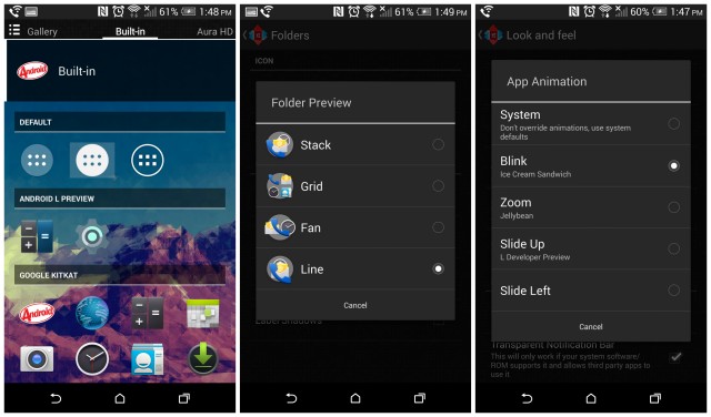
TeslaCoil developer Kevin Barry is back with another update to the world famous Nova Launcher Beta. Announced on the app’s Google+ Community page, Barry lists off some of the new features now available in the Nova Launcher 3.0.2 Beta 1 update, many of which bring a few Android L goodies to us non-Nexus users (as well as better compatibility for those running the Developer Preview). Here’s the short list:
-“L” Folder Preview (Nova Settings – Folder – Folder Preview – Line)
-“L” App Drawer Icon (Long-press app drawer – Edit – Tap Icon – All white icon under “Built-in”)
-“L” App Animation (Nova Settings – Look and Feel – App Animation – Slide Up)
-Minor tuning for running on Android L Dev Preview
-Optimizations and bug fixes
This should help those of you without the gall to run the new Android L Developer Preview, which really isn’t meant to be used on a primary Android device (although we found it to be more than stable). You can either join the Nova Launcher Beta community to get in on the latest betas as they arrive in Google Play, or download direct from the developer here.


Having to give up the Google Now left pane is a deal breaker for me.
Too hard to set a gesture of swiping up to open GN? I mean swipe left or swipe up? Same difference.
Exactly. Maybe people just forget about it.
See my reply above.
No is not too hard. Nor is it the same. The user experience is totally different. You do not have those smooth transition when panning to the left, where the home screen fades out and blends into the Google Now pane. Adding a swiping gesture is definitely not equivalent.
I guess transitions are that important to you that you’re willing to give up the drastic increase in functionality of a 3rd party launcher. I set my transitions to lighting fast so I don’t ever notice them anyway. To me, the user experience of things opening fast is more important than a visual transition. But hey, that’s why we like Android. Everyone can set things up the way they want.
Transitions and everything possible always set to fastest in Nova for me. I don’t wanna see fancy animations when changing homescreen or opening my app drawer, I want it to just happen! That is an increase in user experience I can’t give up. Nova over any other launcher.
I’m assuming your device doesn’t have a software navbar because if so, you can press/hold the home button and slide up to enable Google Now. That functionality works from any home screen too, not just the second from the left.
I do have on screen nav buttons but it is not the same. The user experience is totally different. You do not have the smooth transition when panning to the left, where the home screen fades out and blends into the Google Now pane.
If you want that stock experience, i understand, but i think it looks equally as nice when you swipe it up. Nova launchers Android L update has this slide up animation now which looks quite nice when you swipe up for Google Now.
has a pretty bad screen flicker when you close the recent apps page using the slide up animation
Until Nova allows the left pane to have Google Now, this won’t get me back on Nova Launcher. Plus with the Sense 6 launcher every other launcher kinda pales IMHO
Love HTC’s launcher, but I need more customizability so I always switch to Nova.
Check out the M8 forum Tips and Tricks thread. I run Nova and still have Blinkfeed as a Nova action shortcut. Pretty decent.
I don’t quite understand to need for a left pane for Google Now. I know its more stock -like, but how is this better than having to swipe up from the bottom to access Google Now? If anything, it just takes up an extra homescreen that could be used for more icons/widgets.
Tried it. Decent start towards Android L aesthetics. Nothing of any functional use though. Would be great if the notifications and multitasking screen from Android L could be implemented, but that’s probably not realistic without rooting. or installing Android L preview itself.