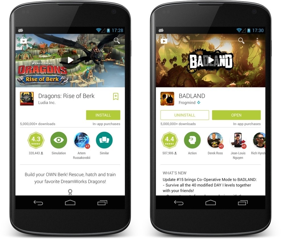
A few moments ago Googler Kirill Grouchnikov announced via his Google+ profile that an all new version of the Google Play Store is currently rolling out to Android devices. Still in the first phase of its rollout, Google Play 4.9.13 brings a whole new fresh can of paint to the former Android market.
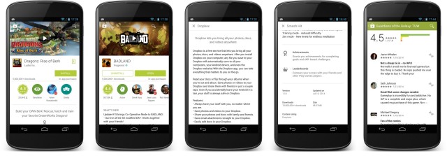
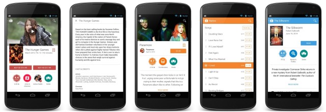
Featuring Google’s recently unveiled Material Design, app, game, and other listings have been revamped enough that you’re going to want this. Now. You’ll notice huge featured banners are once again making their return with embedded video trailers where available.
Other changes include Google+ recommendations from friends and buttons for reviews or similar apps/games all lumped into the same section. Wordy text for listings has also been cleaned up, hidden behind an additional button press in order to view full app or game descriptions (once installed, only the changelog will be displayed).
For those that simply can’t wait for it to roll out to their device, a 3rd party download link has been provided below for manual installation. Enjoy!
Download Google Play 4.9.13: MediaFire
Thanks, Tito_01!



I like it!. thanks for sharing
Me download… Me download right now!
Edit – downloaded but my Play Store looks the same, I checked the version number and matches the one posted in this article. What gives??
Double Edit – I only see the new material design when I actually tap into an app, not on the homepage… So far anyway
Same here
Seems like some updates are being done of the server side. Give it time.
I like it, thanks for sharing!
Assuming you need Android L to see the new material design version?
Nope.
Thanks
I don’t notice any design changes.
Beautiful…
Looks great. Even if I side load this apk, the store should still be able to upgrade itself for later updates right??? The 5 years I’ve had a Galaxy/android device I’ve never actually raced ahead to get a newer version of the play store loaded on – For the first time I’m compelled to!
yes
Thanks :)
The layout looks nice. I noticed you can’t add anything to the wishlist anymore. I hope that is a oversight and is corrected soon.
It’s still there for me. Just no longer on the top.
It’s next to the name of the app.
I see it now.
Thanks Chris! Is it just me or are the icons for “Photography” and “Similar” tabs under the Install button really pixelated? I’m looking at it on a 4.7inch 720p screen and they don’t look good at all.
Oh God, google those badge labels. ” personalizatio
n”
#cringeworthy
wow I’m still like 2 versions back, I’m pretty sure I saw a post somewhere about another 4.8.xx version that I still haven’t gotten yet, despite the trick in “Settings” to check for new versions.
It’s 4.8.22, and that rollout was halted once Google started pushing this update. If you’re still on 4.8.20 (like me on both of my phones), you’ll be getting this update instead.
Google’s app updates take 1-2 weeks for complete rollouts with most being updated inside of a week. The Play Store affects more than most apps (because it’s installed on any device with Google Mobile Services), so expect a slower rollout than your typical app.
Matias Duarte = Material Design
Thanks for the link! Now it’s time to play around.
Don’t really like the new look of it. Guess I get used to it.
Google Play update is here with a new image and rich design, recently unveiled.
http://goo.gl/En47Sw
Because Google needs to drastically change every few months.