We’ve already gotten more than a couple really good looks at the rumored Samsung Galaxy Alpha (SM-G850F). In fact, so much about the device has already leaked out, we’re wondering how much more could be left and spoiled by leakers before it officially goes public. A few weeks ago, we saw the black version of the device compared against the Samsung Galaxy S5. While the phone showed some of this “aluminum” everyone is so stuck on these days, the chrome finished made it look identical to the plastic chrome frame found on the GS5.
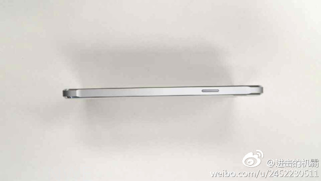
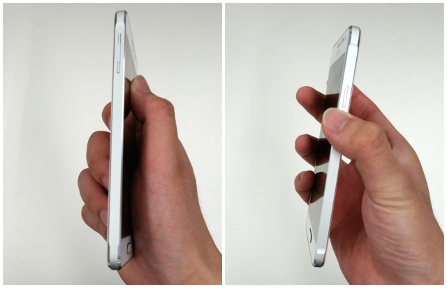
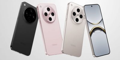
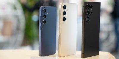
Today, we’re getting yet another good look at the Galaxy Alpha, this time as it appears in a white variant. We know. That probably doesn’t sound too exciting and while the device does look largely similar to the black version we saw a few weeks ago, the white version is showing a more chiseled aluminum frame, complete with chamfered edges as found on the HTC One M8 or iPhone 5s. None of that smooth, shiny chrome stuff as found on the Galaxy S5 (and a big gripe I had about the phone’s design).
Of course, whether or not these chamfered edges have also been cut by diamonds remains to be seen, but it’s definitely the more modern design we’ve always wanted from Samsung’s mobile department.
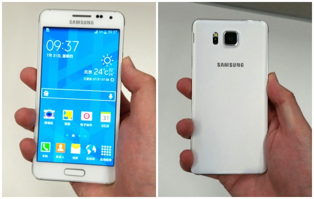
Unfortunately, aluminum enthusiasts craving more premium metal from their Androids, the buck stops there. On the back, a similar soft touch finish can be seen, only with a smaller perforated faux leather pattern. This should put an end to comparisons of the Galaxy S5’s back cover looking more like a band-aid than high-end leather.
All we can say is if this is hint of what we can expect of this year’s Samsung Galaxy Note 4 — expected to be unveiled at an Unpacked event during this year’s IFA 2014 in Berlin — sign us up. But seriously, why couldn’t the Galaxy S5 look this good?
[via Nowhereelse]






Eeeeeeeew
Really? I think it looks super nice. This is actually the kind of design I was hoping Samsung would go with since the Galaxy S4.
reminded me a lot of galaxy S2 design(which was the last samsung phone i liked). though, i prefer the home button to be lower, with slimmer bezel and the front Samsung logo need to be redesign and relocated to make the top bezel slimmer too. for the back, i think they should lose that “3d button” look and go for a flatter design.
Yeah, would love something a lot cleaner and more minimal for sure. But I’m sure in Samsung’s eyes, they don’t want to veer away too much from their current design. It’s what they’re known for.
It obviously comes down to personal preference, but I dont think this is an attractive phone at all. The edges are nice, but I feel like it doesn’t mesh with the rest of the phone.
There is a bit of dissonance between the front/back view and the edges. I like it, but it’s weird. I’d have to see it in person.
Look this good? Surely you can’t be serious, are you? This still looks like garbage. Samsung’s issue isn’t materials used, its just the boring design of the phone itself. The g2/g3, desire 816, E8 are all plastic but you can tell they put some actual thought into how those phones should look.
Baby steps. They’re finally heading in the right direction…
Just looking at the phone from the side then yes the chamfered edges looks nice but when I look at the front and the back and see that it looks exactly like the countless other devices samsung has released in the last almost 3 years then yeah, it looks like a turd.
It still does not impress. It’s there best design yet, but it’s not good enough.
The new iPhone, brought to you by Samsung. That’s a pretty terrible looking device right there.
Was just coming to say that it looks like an iPhone…
Other than the fact that it’s a touch screen phone, it looks nothing like an iPhone.
You’re right. It definitely looks nothing at all like this.
http://img.gawkerassets.com/img/18txnp33pn7dcjpg/original.jpg
I’ve never been a fan of Samsung’s designs, but this is honestly pretty nice. Now, about that physical home button…
I love the physical home button. Back in the Galaxy S2 days, I imported an international version just for the physical home button. I hated the ways carriers used to molest great phones when they made their way to the USA. I am glad the manufacturers are starting to grow a pair and stand up to carriers. That Apple for starting that trend. Now… Android OEM’s need to stand up against bloatware.
I can’t use physical buttons anymore. I’ve gotten way to used to capacitive and onscreen buttons. When I help my mom with issues on her Note 2, I always barely press the button and nothing happens. LoL!!
I’m afraid to press to hard.
A metal rimmed s2 design with decent internals. . . . Hardly anything special really in design terms, but definitely a damn lot better than the s3, 4 and s5.
At least they are trying to copy Apple without getting sued.
I’m sorry, Samsung is just embarrassing. They really, really need to quite blatantly copying Apple. Android fans don’t want a faux iPhone, and replicating Apple design elements (again!) isn’t going to get iPhone users to switch.
i agree they need to change their design language but this phone looks nothing like an iPhone, you sound like an apple fanboy where they see a rock and they think that i looks like an iPhone.
LOL! I love the internet. I’ll spell it out for you: AS AN ENTHUSIASTIC ANDROID USER I’m embarrassed for Samsung when they blatantly copy Apple like this. Personally I wouldn’t take an iPhone for free (well, actually I would, but only to sell on eBay).
So are you saying their GS2 looked like the iPhone? Because that’s what I see when I look at this. The GS2.
You’re absolutely right. But don’t worry, some trolls will just say ‘Apple didn’t invent chamfered edges just like they said Apple didn’t invent fingerprint tech when samsung brought back fingerprint tech just after the 5s launched, and o yes, they put it in the exact same place on the device, the home button.
Looks good to me. Not great but good. Definitely a step in the right direction.
Too much bezel. Would also prefer a capacitive home button over the physical button. That was the only good thing about the carriers getting their way on the s1 and s2.
Galaxy S2 2014 edition
Those edges may be aluminum, or they may be a metallic finish on plastic, but the previously leaked images clearly show a phone that’s almost all plastic. I don’t really care about that, but I do care about a 720P display and no SD card.
I like Samsung devices just fine, but I think they missed the boat on this one.
This device doesn’t intrigue me at all! Happy with my S4.
Maybe there best design, but no way the best when compared to other Android phones.
There is little to no aesthetic appeal to this device. And I hate to be the guy that says this, but if Samsung has ever given Apple a reason to sue them over likeness issues relating to the iPhone, this device is it.
Lol more copying from iPhone.
Come on be mad, tell me Apple didn’t invent chamfered edges. xD
Who invented the first square television? How about the first square laptop? Aesthetics are definitely important but the idea of being able to patent a shape is fucking ridiculous.
it’s not that, it’s the fact that at Samsung they don’t have designers, apparently. It seems that all they can do is an ugly copy of an iphone! I think their approach is not good for the android ecosystem and identity
The only way to not copy the iPhone is to have more rounded edges. Sadly the M8 has rounded edges and they would be copying HTC. The LG G3 has a rounded bottom, so they’ll be copying them. So what type of design is left?
If this thing’s an ugly copy of the iPhone I can’t imagine what that makes the iPhone. Probably the bastard child of Steve Jobs and 14-year-old’s phone, judging by the screen size and it’s blind religious following.
Go troll somewhere else.
This phone is still not really sexy.
Generally, visual design just isn’t all that important to me. Really the only phone I can think of that was visually unappealing was the Motorola Droid X. But physical design, I like the micro-USB charging port to be on the bottom, and the headphone jack to be on the top of the phone.
It simply looks like an S2 or note 2 with an eBay aluminum bumper installed.. Thats almost exactly how my note 2 looks. So for me its not a wow factor at all.
i prefer Kevlar backing like the Droid MAXX
Kevlar is horrible for heat dissipation
I’ve never had a problem with heat and kevlar. Metal backs though seem to get really warm.
That’s the the whole point of a metal back. It acts as a giant heat sink and dissipates heat from the internals. Kevlar is actually used as an insulator to hold heat in which is not ideal for a phone.
I prefer not to be holding a hot phone and my phone has never overheated so I will stick with Kevlar.
Oh!! That makes me happy. My M8 be gettin’ hot. LoL!! I be like “NO my phone is going to burn!!”
As you can see, I’m not the greatest engineer. I’ll stick with software. =.P
i repeat…if the phone never has heat problems….why is this relevant?
The phone will probably never shut down from over heating, but not dissipating heat properly can affect the life of the battery.
if the phone never has heat problems….why is this relevant?
Until Samsung drops the bloatware and gives their touchwiz and major overhaul, there is no way I am going back to them. The last straw was the far to noticable lag on my S4 running Nova/Apex.
Loving my 3/32gb G3 at the moment. So light and breezy… and lasers!
Should have gone titanium — more premium, more scratch resistant, and not much of a cost issue for bumper material.
fugly massive bezels makes it almost as ugly as the iphone it resembles, no thanks Samsung. Come to 2014 and have on screen buttons and smaller top and bottom bezels and a 1080p screen for that price point and they’d have made a winner.
I agree with you, Although about the button I’m not sure of a work-around if they want to keep that print scanner but definitely remove the redundant Samsung logo at the top, extend the screen up more, remove button ( actually I don’t even need a print scanner) just leave it at on screen buttons and extend it further down. easy.
It looks nothing like an iPhone.
That looks terrible.
my fav phone build was my droid hd…lovveddd that phone except for the side bezels and camera…if the next droid looks similar id buy it lol trade in my moto x