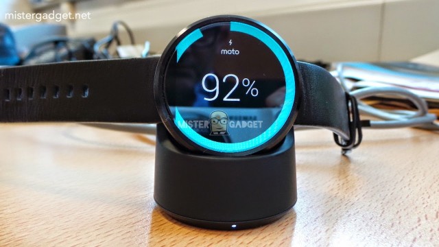
While the first couple of early Android Wear smart watches have opted for charging solutions that require a pin-based cradle (which are often bulky and non-intuitive), the Moto 360 decided to bring wireless charging into the foray. We’ve known that since the watch was made official, but Motorola has been hesitant to show off anything in regards to how that will work. Thankfully we have our first taste of that in the latest set of leaked photos.
The stylish cradle — pictured above — seems to hold the smart watch up at an angle so that you can quickly check the time from a desk or nightstand while it’s not sitting comfortably on your wrist. The device will seemingly pop on and off of the cradle with ease, so charging it at night shouldn’t be nearly as cumbersome as some other units out there.
With that, the folks who were able to handle the watch early have given us some new details about its build and features. One big detail is that the watch is confirmed to be IP67 certified, so using it in rain shouldn’t be an issue. That also makes it resistant to dust and should be able to survive a light fall or two. We also learn that the smart watch boasts a very respectable 2.5 days of battery life (just over a day seems to be the norm for the LG G Watch and Samsung Gear Live), and that it has a built-in heart rate sensor for all you fitness and health buffs.
It sounds like the Moto 360 will set the bar in almost every way once it finally comes to market, though we’re still waiting for Motorola to bless us with details on pricing and availability. We imagine they’re simply waiting to be able to release it alongside the Moto X+1, a follow-up to their flagship smartphone from yesteryear. Should their “late summer” estimations hold up then we should be hearing a lot more toward the end of this month or early September. Hold onto your hats, folks.
[via MisterGadget]





Credit card in hand… just waiting for a buy button to smash.
This is the time to be setting aside a few bucks so you don’t take the full amount in your credit.
Well they aren’t exactly going to be letting me pay in paper currency so a card is indeed needed to pay them.
Exactly. CC has been in hand for months now.
Even with the artificial light in an office that screen is pretty bright….Im hoping in sunlight it goes even higher.
This just gets better and better. Even the dock looks awesome and practical. The team delivering this are in a league of their own. Other companies should take note. Love the IP67 and 2.5 day battery life too! I’m not convinced about the usefulness and accuracy of a heart rate monitor yet, jury’s still out on that one.
I hope that they still plan on using high end materials. The entire plastic.rubber watch does not appeal to me like the idea of a metal watch and band.
You can see in the photos here and the ones not shown in this post, that it is not plastic. It kinda sucks that people were believing that random rumor over what Moto has been preaching.
Dummies of a feather..
My wife was just complaining that I wore a “sport watch” to a fancy event because I left my nicer, style watch at home. With this, I can just swap the clock face and go from sporty to fancy instantly. Think that will let me justify dropping several Benjamins on it to her?
Not unless you buy her something first.. ;-)
awesome…your soo bought
Man it’s so beautiful. I’m just going to have to find a way to get past the black bar.
The reason it has the black bar is for the ambient light sensor, which neither the Samsung or LG smart watches have.
They couldn’t put the sensor anywhere else in a less obvious spot?
It’s just the watch skin they’re using. If they didn’t have that blue bar going across and just had the time in the middle with a black background, you won’t notice it. Well… Others won’t notice it.
It’ll be like that scratch on your shiny watch. You see it every time you look at it, but others won’t.
It’s no different than on a smartphone. If you had light shining directly on the face, you’d need the sensor on the face. If it was say on the side, the sensor wouldn’t pick up the same light that the face is seeing. What if they put the proximity sensor on the side of a smartphone? It wouldn’t work correctly either.
I’m aware but it doesn’t make any less of an eye sore
It makes a hell of a lot less of an eyesore as the screen brightness adjusts automatically for your surrounding conditions.
The black bag contains the display drivers. It’s the reason that there is no bezel around the watch.
That was a quote from a Moto rep that many are saying doesn’t know what he’s talking about. Where else would the ambient light sensor go? It’s no different that a smartphone, that sensor, along with the prox sensor is on the face.
Wish this article also noted that this put those RIDICULOUS plastic rumors to rest. It is stainless steel, per the writing on the back of the device (which is a photo not included in this set but can be found at the source.)
I never thought I’d want a smartwatch as much as I want this. I think its practical look is what push me over.
Is it just me, or does the Moto 360 seem to be missing it’s infamous ‘chin’?
It’s on the left since it’s sideways.
Aye, thanks for sorting that out. I see it now.
It’s pretty cool that it doesn’t immediately catch your eye. I think it’s totally worth it if it kept the bezel down.
Wow… This just made me want this watch more.
Graduating soon.
Getting a new job.
Super Smash Bros Wii U coming out.
Zelda Warriors
Sprint not buying Tmo.
Wow. It’s a really good year.
And best of all, my birthday is at the end of the year so I can celebrate after all the goodies come out. =.D
They need to make up their mind regarding how this eyesore of a ‘black bar’ / ‘chin’ / bezel works.
In this photo, it’s transparent. I thought it would be opaque…
Maybe you are talking about something different than what I am thinking but I see a black bar on the left side where the blue ring is missing.
He’s talking about the same thing. He thought the reflection being cast on the display made the dark bar appear transparent, but it obviously isn’t.
You just proved it’s not as much of an “eyesore,” as you spend every waking hour claiming it to be. The black bar is the same as it has ALWAYS been.
On my phone’s screen, I couldn’t tell that was the camera guy’s reflection.
Still an eyesore. Also, it hasn’t always been there. Original renders from Moto showed no black bar.
We’ve been through this before. ALL Moto released renders had the black bar. You just didn’t notice it.
The original announcement video shows renders without it.
Um, no it doesn’t, it shows someone designing a watchface without it. The SAME video shows 3 different actual Moto 360 renders WITH it. Here’s a still from that same video you posted a link to:
That is absolutely false.
https://lh4.googleusercontent.com/-0_Qtd1EcHnk/U-Lp4tqsVAI/AAAAAAAAHkg/LrnLV9-6nIA/s1533-Ut/14%2B-%2B1
Are you kidding right, now? Honestly, are you actually serious? What you linked to is NOT a Moto released render of the watch. That is a still from a video regarding the design process of the watch. And that particular still is of designers designing watch faces for the device. You do understand the difference, don’t you? THESE were Moto released renders of the actual watch:
Way to reply three separate tines ya weirdo.
You’re right. It’s absurd to look at the watch face being designed and think that’s what the watch face will look like…
You’re an idiot. No one said anything about it being “absurd to look at the watch face being designed and think that’s what the watch face will look like.” My original point made, which still stands true, is “ALL Moto released renders had the black bar. You just didn’t notice it.” A screenshot of a computer screen with a watch face being designed, is not a render of the watch itself. And to further prove my point, the same video you linked to showed actual renders of the watch itself, with the black bar intact, and like I said, you either didn’t notice it, or chose to ignore it. I love how you continue to ignore that fact. What I DO think is absurd, however, is that you would see a 1-2 second glimpse of a watchface image in the design phase on a computer screen in a video and think THAT’S what the watchface will look like, as opposed to EVERY other image of the watch itself in every other advert, promotional clip, mock up, and in that very same video itself.
As for the multiple replies, my posts weren’t showing up on my end, so I thought they hadn’t gone through. What’s YOUR excuse for your multiple replies on the same topic…”ya weirdo.”
First off all, if you’re going to start with the name calling — “idiot” in particular — you might want to avoid misspelling “your” at the end of your rant. :P
Secondly, here’s another example (from the same video) of the watch being shown without the black bar: https://lh6.googleusercontent.com/-TQdQS4ZmbCQ/U-T8JAiH-dI/AAAAAAAAHmE/16HI8ERukdU/w1118-h590-no/moto-2.jpg
That’s a full render of the watch, released by Moto, without the black bar at the bottom. The red second hand extends all the way to the edge, and the 6 o’clock line comes up from the bottom. At the very least, Moto has doing their best to hide the bar and shrink it as much as possible in the early renders.
They very clearly wanted to make this thing without it. Obviously. In their attempt to be first out of the gate with a round screen, they had to cut corners… And that sucks a little bit. 2 or 3 generations down the line this thing will be awesome and my only complaint about the design will be history.
The black bar is THERE in this pic. AGAIN, like I said, you just didn’t notice it. Try again.
The person who wrote this sentence: “Way to reply three separate tines ya weirdo,” is now giving out spelling tips. Rich. LMFAO.
I didn’t notice this until I saw it on a larger computer monitor, but the part I thought might be transparent is just the reflection of the photographer coming through. Derp.
Isn’t that the ambient light sensor?
http://ydfgg.com/2014/07/24/motorola-moto-360-ambient-light-sensor/
I’m so excited to buy this! Everything about it is amazing!
The Moto 360 has to be one of the longest teases, from initial announcement, that I’ve seen in a long time (last one I remembered being this long, until the device was actually available for purchase, was the HTC EVO…initially known as the Supersonic). It’s 5 months, and they hit us with another “tease,” without any definitive information of launch or price…hahahaha
2.5 days of battery life vs 1 day for the LG and Samsung watches? Yeah, OK, believe it when I see it.
Oh man please just come out now.
Oh. Hell. Yes.
Its pretty hilarious how the sheep all hate the black bar once they were told that there’s a black bar on the bottom that they should hate, but turn the watch sideways and they don’t even think to look there because they haven’t been told to and are all celebrating that its gone.
EXACTLY. Just like how they didn’t notice it at all for 4 months, until someone told them about it, despite the fact that it’s been in all of the renders since Day 1.
The dock looks nice and like the idea of it’s side mounting. I reserve final judgement until I see it on my wrist but I’m worried the face is too big. Fingers crossed I’ve just see it to date on girly wrists :)
Why dont they just let the watch head pop out so you can charge that directly instead of having to unlatch the watch every night… seems like having to take it off all the time would be the annoying downfall part of the watch.
I take my watch off every day. A detachable watch face does not scream premium to me.