There hasn’t been too many changes in the way Android fundamentally behaves since Donut. You have a home screen, apps, and basic button setup that typically involves the frequent use of the home and back buttons. In Ice Cream Sandwich, we saw Google ditch the menu button in favor of a recent apps button, putting the focus on Android’s greatest strength: multitasking. Since then, not even Android L has done much to shake things up, sticking with the same button setup although spiffing up recent apps with a card-like interface and now including web pages from Chrome.
Android multitasking takes time
You see, the problem is that in most cases multitasking your way around Android using the recent apps button (providing you even have one) takes time, no matter how minimal. Pressing the multitasking app button, waiting the UI to load, selecting the app — that’s 2 taps with a lot of down time in between. This process is even more excruciating when using one of the many popular Samsung devices which don’t even have a recent apps button, requiring users to waste even more of their precious time by long pressing on that silly home button. Enter LAS: Last App Switcher.
LAS is multitasking efficiency at its finest
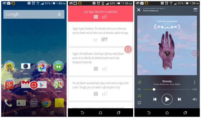
It wasn’t too long ago Google added the ability for users to swipe up from their virtual home buttons to quickly access Google Now. Unbeknownst by some, this can gesture can actually be configured to launch other apps (like the Camera app on HTC devices). LAS: Last App Switcher can replace Google Now, enabling users to quickly switch back and forth between their most recently used applications with the same gesture. It’s probably best described as the “Last channel” button on your TV remote. There’s no thinking involved, just swipe and you’re instantly inside the last application you had open. Swipe again, and you’re right back in the other app. It happens to quick, we were almost taken aback by the speed at which we were app switching. Also, it’s a great way to pick up chicks.
As we mentioned earlier, because not every manufacturer has included software buttons on their devices (read: Samsung), the swiping gesture may not work for you. Instead, the app can use a semi-transparent floating bubble similar to Facebook’s Chatheads. The bubble can be thrown around anywhere on the screen so it’s always out of the way, but just in reach. It’s probably not the most ideal, but it’s a great work around and leaps n’ bounds quicker than long pressing the physical home button.
Is an app like this even necessary?
It can be argued that an app like this is really that useful and that making 2 taps to access a previously opened app is hardly time consuming. But the same can be said about recent apps at all. Why not just jump back to your homescreen to access a previously used app? Better yet, why not bypass the homescreen altogether and jump back into the app drawer to find the most recently opened application? Well, the answer is simple. There is nothing wrong with any of that. And for those not bothered by it — more power to you. As for me and my Android devices, I want to streamline my efficiency by any means available and LAS does just that.
You can download LAS: Last App Switch via the Play Store link below.




Great idea but not gonna try it. I am cool with multitask window and select the one I want :)
I like the concept of it but it would be much more useful if swiping up revealed 4 or 5 of your last used apps instead of just going back to the last one that was used.
You mean, like……. the regular recent apps button? O_o
No. As you said yourself in the article some companies such as Samsung don’t have the dedicated button for multitasking and instead relies on a long press. Swiping up and to the app of your choice would be much more convenient. Hell even on phones with software buttons it would be faster.
https://play.google.com/store/apps/details?id=com.fb.looprtaskswitcher&hl=en
Oh, sorry. You said “instead of” and I thought you were referring to a phone with software buttons for some reason. But yeah, there are a bunch of apps that will open up a quick folder for switching between recently used apps. I was using this before LAS: https://play.google.com/store/apps/details?id=net.ebt.appswitch
This is actually a cool app,a nice alternative for those not wishing to go the rooting route.
Reduce the size & visibility of the floater to the minimum settings & you hardly notice it’s there.
I just use the recent button to switch back and forth. What’s the big deal?
This should be the default function of doubletapping the multitask button
For rooted users who use Gravity Box, you can assign this exact function to almost anything. I use the long press on the back button to perform this action and it’s super useful.
I know this hasn’t any bearing on the topic (for which I apologize) but I was wondering what music app that is in the third screenshot? …and also whether it is available for the majority of Android devices (say, the Vzn Galaxy Nexus?)
It’s the spotify app.
Awesome, thanks for the info.
Oh my goodness. That UI is terrible. I’m still qualifying Android as trashware. What kinda junk do you guys program on. I can program on DOS but do I want to?
Yup, you’re truly the Great and Powerf.
I wish that Clutch Pad Dev would start having less kids and release a new, improved Clutch app switcher.
He bad.
I know people complain about Samsung, but with Kit Kat and the animation scale turned down, it is really fast. I don’t think a 1 second long press on the home button is excessive.
It’s annoying. There is exactly 1 time during casual use of my phone that I need to long-press. That doesn’t make sense.
“Pressing the multitasking app button, waiting the UI to load, selecting
the app — that’s 2 taps with a lot of down time in between.”
Freaking hilarious.
“Also, it’s a great way to pick up chicks.”
Really? Was that jab really necessary? (Roughly 50% of the population is more interested in picking up dudes. Does it work for that, too?)
I bet you are fun at parties
As a matter of fact, I am.
Those 2 clicks you talk about Chris, are exactly the reason why I use the SwipePad launcher.
https://play.google.com/store/apps/details?id=mobi.conduction.swipepad.android&hl=en
You can swipe onto the screen from any edge/corner (which you can configure) to instantly switch between 12 of your favorite apps. It wont show the “last used app”, but if you care about saving those milliseconds switching to an app, its safe to assume you use that app often and it would be wise to set it up as one of the 12 apps to switch to in SwipePad. It has all the benefits you talk about, with the added ability to switch between more apps. You can also choose the app drawer as one of the 12 shortcuts, to open other apps if need be.
One of its coolest features is the Context Panel. Say you are using some app which your friend likes and asks you to share the app’s play store link. You would either need to search through the help/share section of the app if it has the share-with-a-friend option or you would need to open play store and search for the app and share the link from there. Instead, with SwipePad, you can set the Context Panel as one of the 12 shortcuts. Then when you are using the said app your friend is interested in, just swipe from whichever corner/edge you have configured to open SwipePad and lift ur finger over the Context Panel. This gives you options to Share, Open Page on Play Store, App Info, Force Stop and Uninstall.
Its become so deeply ingrained in the way I use Android that I cant think of using my phone without it.
You can also create deep links to apps and set them as shortcuts. You would need another utility to create deep links. If you add Evernote as a shortcut, it always opens the app and you then need to click on new note to start typing. Instead, by creating a Deep Link to the New Note Activity in Evernote and setting that as a shortcut in SwipePad, all it takes is one swipe to instantly start taking notes down.
Similarly just set the torch as one of the apps to instantly open the torch app, etc.
Sadly the Edit comment feature doesn’t show the Attach Images option, so attaching below as a reply.
I prefer hardware buttons (i don’t have a Samsung). It makes the useable screen bigger, a 4.7 screen is more like 4.3 with all the room wasted. The on screen bubble seems kinda odd, so have it using the upward swipe and it does seem to work quite well, I might actually keep this. I like that it’s simple and to the point, and doesn’t seem to affect the phone in various ways. Using it this way does replace the Google search up-swipe, but I don’t use it anyways because “OK Google” works fine.
Thank you for sharing this. I hate the swipe up google now as I always accidentally trigger it when I don’t want to and switch to the last app far more than use google now.
iPhone has the best multi tasking
I already have my toolbox floating button, which I use all the time, but also gets in my way all the time, I don’t need another gumming up the works. Although I do like the idea of LAS. GS5.
The “Android multitasking takes time” section reads like an infomercial lol. I’m envisioning some lady fumbling around trying to hit that pesky recent apps button and accidentally dropping her phone down the garbage disposal.
Just reading the second paragraph of this article made me realize the severity of our first world problems.
Shout out to Robbie Swan, he made a video a couple of days talking about this app.
I just use gravitybox to set long press on the recent apps button to switch to the previous app.