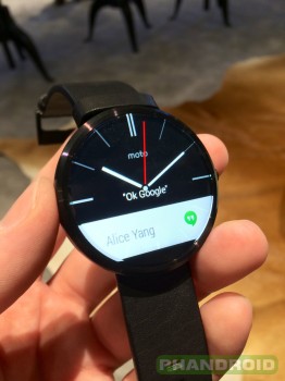
Moto 360 unboxing and first impressions [VIDEO]
We couldn’t wait to get our hands on the Moto 360 following Motorola’s big event in Chicago yesterday, and we were just as anxious to give you all a close look at it. We were fortunate enough to receive a retail copy to unbox for you folks so you can see what you’d be getting into should you purchase one for yourself.
The packaging of the Moto 360 is quite symbolic in that it’s circular, no doubt a move Motorola made to highlight the watch’s circular form factor. It’s the first smart watch we’ve seen of its kind and it certainly does stand out against its squarish competitors. The device’s stainless steel exterior is the first thing that jumps out at you — something about that shimmer that you can’t quite get from other materials.
Also adding to that premium look and feel is genuine leather provided by Horween, the same brand that’s going on the back of the new leather-backed Moto X. The model we received was black with black leather straps, but you can also get it in silver with gray leather. It makes for a much nicer touch than that of, say, the cheap rubbery material used on the LG G Watch. None of it looks as good as the premium versions with metal bands Motorola’s planning to sell for $300 later this year, of course, but it still looks quite nice.
One thing you’ll notice right away is that the thing is light — so much so that you would probably forget it’s on your wrist throughout the day. “Light” is typically associated with “cheap and flimsy” in the smartphone world, but it’s a trait that you’ll definitely want on your smart watch. Doesn’t matter how good a watch looks on your wrist if it’s weighing you down all day.
Motorola provides a wireless charging cradle in the box so you can prop the smart watch up on your nightstand and have it charging — say hello to your favorite new desk clock. There are no external charging pins to be had. Whether that’s a good or bad thing is up to you to decide, but we’re sure glad folks won’t have to deal with cumbersome clasps and copper that could be susceptible to corrosion. The charger Motorola gives you a wall outlet to microUSB setup. Unfortunately the cable doesn’t detach from the adapter so you’ll need to use an actual USB cable if there’s no wall outlet present.
On board is standard Android Wear, and that piece of software is being powered by 512MB of RAM and a TI OMAP 3 processor. All of it is displayed on a round 1.56-inch display with 320 x 290 resolution, and it should last up to a full 24 hours with its 320mAh battery. It remains to be seen whether the TI OMAP chipset can keep up with the Snapdragon 400 found in competing models, but considering you don’t need a ton of power for a smart watch we’re not too concerned.
We’ll be getting our hands dirty with this thing in the days to come so expect a pretty full plate of coverage. In the meantime the unboxing video above should satiate your appetite (unless, of course, you decide you can’t wait and go out to buy one for yourself as early as today).