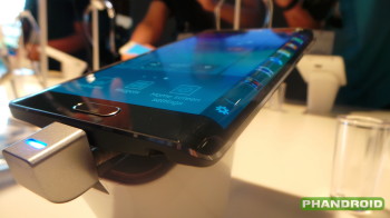
Is the Galaxy Note Edge doomed to the same fate as the Samsung Continuum?
The year was 2010 and Samsung was riding the high of their debut Android flagship, the Galaxy S. That Galaxy S spawned a smartphone line that has since gone on to sell millions of handsets; the sales figures growing exponentially for each new iteration. The most recent, the Samsung Galaxy S5, garnered sales of over 10 million units in its first month alone. But back in 2010, before Galaxy devices carried the banner for Android, Samsung’s strategy was quite a bit different.
At that time, carriers still depended on device differentiation to draw customers to their network, and the policy was that each US service provider would receive a unique version of the Galaxy S. In the end, consumer desire and other factors in the smartphone industry that favored a unified device experience led manufacturers and carriers to ditch the strategy for future generations of Galaxy devices, but not before the DNA trickled down to one of the most disastrous Android releases of all time: the Samsung Continuum for Verizon.
The Contiuum, which did or did not carry a Galaxy prefix depending on the marketing materials you reference, was released several months after the original Galaxy S. The specs for the phone aren’t even worth mentioning today, but they were mostly identical to the already popular Galaxy S and among the best you could get in an Android phone at the time. What set the Continuum apart was the presence of a secondary ticker display — a gimmicky second screen placed below the phone’s navigation keys and measuring 1.8 inches and sporting a whopping resolution of 480×96 pixels.
This ticker showcased notification info, the date, time, weather and updates from your social feeds among other things, but it ended up looking more like a constant banner ad on your smartphone. It could be awakened independently to quickly access info without tasking the Contiuum’s larger primary Super AMOLED display. The benefits were touted as battery saving and distraction reducing — don’t interrupt the meeting by waking your bright smartphone display, discreetly check the Continuum’s ticker. Perhaps the idea was ahead of its time.
Perhaps its place as a one-off feature on a Samsung device running Samsung’s version of Android meant developers weren’t too keen to take notice. What we can agree on is the fact that Samsung utterly miscalculated in launching this phone and believing that a ticker gimmick would be enough to get consumers interested in buying a different version of a phone that had already been available for months.
Four years later, why are we talking about the long-forgotten Continuum now? Earlier this week Samsung announced the Galaxy Note Edge, a device that is reminiscent of the Continuum in both its unique functionality as well as the strategy surrounding its upcoming launch.
The Edge, like the Continuum, offers users a secondary display that will act as a notification ticker, shortcuts drawer, and information hub. The secondary display can be awakened independently of the main display. Samsung is hoping once again that developers will buoy the idea by introducing novel uses for the “Edge Screen.”
The Edge, like the Continuum, is also a repackaging of another Samsung device. In this case, it’s the upcoming Galaxy Note 4. Slightly different this time around was Samsung’s decision to announce both devices simultaneously and launch them concurrently across several carriers (including the big four in the US).
So how is the Note Edge different from the Continuum? For starters, the technology has evolved since 2010. The Edge utilizes flexible display technology developed by Samsung to present its secondary display as a curved portion sloping off from the primary Super AMOLED pane. It’s an impressive technical feat, and Samsung has fleshed out functionality to an extent that wasn’t seen on the Continuum. The screen’s placement, higher resolution, and larger surface area help it blend into the overall design of the phone. Moving frequently used shortcuts to the Edge Screen frees up space on the main display, adding precious real estate for multitasking.
The question we must ask again echoes the Continuum: does the secondary display functionality provide reason to choose this phone over the standard Note 4? Maybe that’s a bit of a loaded question. After all, the Continuum’s chances for success were hampered by availability limited to a single US carrier. The Galaxy brand wasn’t a household name in 2010.
As a counter, we might look toward the Galaxy Round, another device designed to showcase Samsung’s curved display technology. The Galaxy Round also was limited in release, but folks weren’t exactly clamoring for the device. The device’s namesake roundness seemed to exist only as a neat parlor trick not as a form factor that added any particular useful functionality. With the Note Edge, Samsung seems to have found a much more novel and useful way to deploy flexible AMOLED tech, but we’re still not sold.
The Continuum, Round, and Note Edge seem to highlight Samsung’s insistence on making available to the general public devices that should have never left the R&D department. In fact, the Note Edge is nearly identical to a prototype device Samsung showed off nearly two years ago at CES 2013. We’re not saying the Note Edge will be the next Continuum or Galaxy Round, but you can’t blame anyone for making the comparison.
We applaud Samsung for pushing the boundaries of what the smartphone can be, and devices like the Edge certainly seem refreshing in a market that has seen plenty of stagnation lately. One handset won’t do it, however. Proprietary form factors are not favorable to developers and hardly ever last more than a single generation. Is the Galaxy Note Edge just another of these oddities? We’re as eager to find out as anyone.