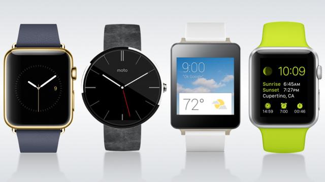
Apple has long been praised for their clean and simple software interfaces. This has especially been true for iOS. For a long time the Android design wasn’t even considered to be in the same league as iOS, but a lot has changed in recent years. Google has shown they can create beautiful and clean interfaces with the upcoming Android L, and the current version of Android Wear.
Earlier this week Apple finally took iOS to the smartwatch market, but the results are not as nice as people expected. In fact you can make a very strong argument that Google did a much better job at designing a smartwatch interface than Apple. Don’t believe me? Let’s take a look at some side-by-side screenshots painstakingly put together by Ars Technica.
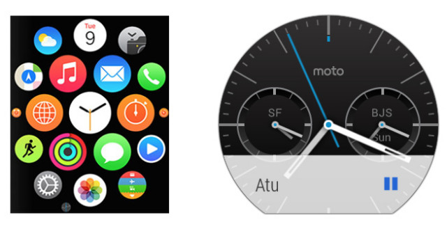
First up is the “home screen” for these devices. Apple goes the standard route with a launcher made up of circular app icons. You can zoom in and out with the “Digital Crown” dial to open the desired app. Apple uses the watch face as more of a lock screen. Android Wear doesn’t really have a home screen. The watch faces are more a part of the UI. There is technically an app launcher for Android Wear, but it’s well hidden in the settings instead of front and center.
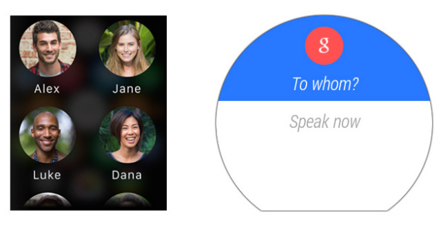
Next up is “Contacts.” Once again Android Wear doesn’t really have this “app.” The Apple Watch displays a standard list of contacts complete with name and photo. Four people are displayed at a time, and you can use your finger of the Crown to scroll through the list. To send anything to a person from your contact list on Android Wear you will need to use your voice. Sometimes you might want an actual list to use, but for most cases this is much quicker and simpler.
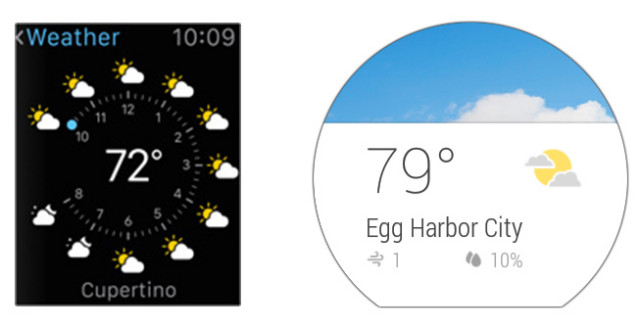
In the weather app we can see Apple has packed a ton of info on one screen. The clock-like dial shows the weather forecast for the next 10 hours, current temperature, location, and the time is displayed up top for good measure (even though the dial also shows the time). Android Wear shows the temperature, location, wind speed, and humidity. The text is much larger and the use of a background image conveys the conditions nicely.
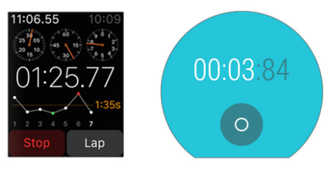
The stopwatch apps tell a similar story. Apple has jammed a ton of info on the screen, and remember, this is a 1-inch display we’re talking about. Android Wear simply has a button to start and stop, and of course your time. Simple as that.
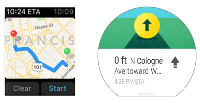
Let’s take a look at directions. Apple actually displays your route in a top-down view (don’t ask me how you’re supposed to read those street names). Android Wear just skips right to the directions, and you can swipe horizontally through the steps. Even with an image taking up half the screen it is easier to read.
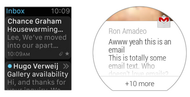
Lastly we’ll look at the email apps. Apple shows information about attachments, favoriting, and the time of arrival (not to mention the clock taking up space at the top). How are you supposed to tap that tiny star? The Gmail app on Android Wear strips everything away and leaves just the sender and email text.
So what do you think? Has Google created a simpler smartwatch interface? Is this a big Apple fail? Let us know in the comments below!
For more screenshots of these UI’s head over to the gallery at Ars Technica.






I am sure Apple fans would argue the opposite.
But most of iOS is a big Apple Fail.
Thanks Joe!
you can bet on that!! if it was reversed they would argue with the same points but now , of course it’s aaaaaaalll fine and logical and clear and easy and usable and and and xD
The apple watch doesn’t “just work.” It’s overly complicated and requires a jog dial. Steve jobs is rolling over in his grave right now.
And the UI looks like it belongs to the 3GS era of iOS.
Haha, agreed on that… I remember watching the live blog thinking “Steve Jobs would have never let this product out the door”
this make me laugh,…but at the same time worry about serious review…
http://www.hodinkee.com/blog/hodinkee-apple-watch-review i never heard about hodinkee so far but it seems like a good watch reviewers hmm… no…not anymore… #nofanboyism
Google has done almost perfect job here. Moto 360 has more visual appeal than that of Apple Watch.
There’s no way anyone can say with their right minds that Apple’s Watch UI is better than the Android Wear UI.
Apple’s UI is incredibly busy, and it would require the user to take a good glance at it for a much longer time than the time period needed to glance at information of Android Wear users.
And plus zooming in with the knob… really? 10/10 I would open an app while moving around by mistake.
Top it off with its uninspired look, and the Apple Watch is a major flop in my eyes.
But because this is an Apple product, it will gain some ground in the smart watch market. Perhaps that will be a good thing, and inspire more competition for a better smart watch among manufacturers.
One thing I do like about the Apple Watch is the interchangeable wrist bands and the ease of switching them out. I wish LG or Motorola did that with their watches, but I’m sure we’ll be seeing that feature in next gen Android Wear watches.
of course it can, check http://www.hodinkee.com/blog/hodinkee-apple-watch-review
Being in a fanboy-ism state of mind isn’t what I call in their “right minds”
#nofanboyism
He’s pure fanboy.
make things clear. have you read the article? i doubt, wasn’t bashing the apple watch, but the article….why’m talking…makes no sense at all… uff… such a pain.
I read it two days ago – he seems to be missing the point, his Patek Philippe is a world away in pricing terms (and therefore what is achievable in terms of finish, craftsmanship, etc) compared to all smartwatches. He should be comparing it to the very low end Oris watches, Seikos, etc. in a broadly comparable price bracket.
But I digress. When you have phrases like:
“They tend to want things that are beautifully made with great purpose – in a nutshell, Apple products.”
And:
“Apple products have a way of making someone not want to live without them”
He is unquestionably, without a doubt, pure 100% fanboy caught in the reality distortion field.
a watch isn’t meant to view photos. it isn’t meant to show you a map (full map, turn by turn directions are of course ok). it’s meant to do the littlest of things well. notifications have to be the backbone of the os and google nailed it with android wear. apple said that they didn’t want to take the iPhone’s interface and shrink it down, but that is kinda what they did. K.I.S.S. Keep It Simple Stupid
You’ve hit the nail on the head – if you want to view photos, or maps, you have your phone. And yes, you will definitely have it as neither of these watches will work without it!
Android wear would look much better with a dark theme the light theme works well on a phone size screen but on a watch it make the watch cheap looking.
waiting, waiting,waiting, rumors and when it comes it isn’t what i have been expecting. i think it’s going to be a major flop of Apple. if i compare Apple UI with Google’s it is far behind on track…..
naa they’ll still sell millions simply because it’s Apple. That will continue as long as they’ve not been caught killing puppies.
We know but we’re just talking ease of use and aesthetics. A little more refinement on android wear and less clutter for apple watch is where these watches should be along with longer battery life (somehow) and slimmer.
yes… i agree with you. the bigger name you have the bigger opportunities you have to play around.
The google design looks more mature and clear. It follows the latest Material guidlines.
The Apple design looks like it was developed while a far older iOS version were prevailing. Therefore it looks old and inconsistent like old iOS apps where every single app had their own custom layout and graphics.
Edit: reminds me of the layout from an old Pioneer car stereo with a navigation system..
I really like the design of the Apple Watch, but that UI is a hot freaking mess. The parody sketch artists will have a field day with it…can’t wait.
How is the iOS interface clean? The grid of random apps that never seem to be where you left them is messy as… To change an apps settings you have to leave the app and go hunting about in system settings.
The watch interface looks even more rage inducing.
App-organization in iOS is as random or tidy or logical as the user makes it, with or without using folders. Nothing random about the way my apps are organized and categorized into different homescreens and folders.
Changing an iOS-apps settings is done within the app in many cases, but some developers prefer to put their settings icon under iOS system settings, where they are easily found at the lower part of the main settings menu. These are not settings intended for everyday use, they are mostly checked once right after installation, and that’s it. If this is “rage inducing” in your mind, the real problem is not within iOS…
Being insulted by a fanboy for having a different opinion. How quaint.
Oh, and thank you for agreeing with me on the messy interface. It takes me exactly 0min to keep my apps in order.
PS: I don’t like the OSX interface either.
Ohh, the other F-word! How original! You “win”.
Thank you, and good day to you, sir!
I am sorry, I missed your reply. I use Fanboy as a colloquial term for people who have a passion for Apple products. I am sorry if being grouped with these people is an insult to you.
Tim Cook is having an oven season in the boardroom, I can tell you!
I’m sure they have a central heating system in Cupertino, so no need for an oven in the boardroom.
What I don’t get is why the Apple Watch is getting rave reviews? Is it just fanboyism? I’m really turned off by what they put out. didn’t even think about what should be on a watch, just put a damn mini iphone on there and said done.
I’ve seen a lot of “fanboys” who praised the iPhone 6 say they weren’t sold on the Apple Watch. It’s much more polarizing than the iPhone.
good to know, although I’m pretty tepid on the iPhone 6 as well. I think the 5s looks great, but not so much for the 6.
Too bad they kept the resolution of the 4.7 inch one to 320+ again. To get retina HD, you’ll have to get Apple’s phablet. My iphone toting friends aren’t thrilled about that, they like 4.7 inch but disappointed the resolution is the same. Still, at least they get to enjoy what we android users have been enjoying for a while. I think 4.7 to 5 is the sweet spot unless it has almost no bezel like that Sharp Aquos to keep the overall size manageable.
Sounds just about the same as the ANDROID crowd,not everyone is sold on a smartwatch.
Rave reviews? Only in your imagination. There isn’t a single review of Apple Watch out there yet, because it won’t be released or put in the hands of reviewers until 2015. So far there are a few first impressions based on a few minutes “hands-on” time after the Apple event, and these brief impressions are far from reviews of a final product. So you could at least hold your “fanboyism” accusations back for a few months, and wait for a few real reviews.
Settle down Sparky, I didn’t say they were full reviews. Lots of tech journalists are giving it “rave reviews” based on their initial experience with it. Don’t split hair with me, I’m not interested in arguing semantics.
Lot’s of tech “journalists” rave about everything Apple does.
Well, the journalists who did the _previews_ have something that you don’t. You said the words yourself: experience with it. So, maybe they know better than you and I? Maybe some raving journalists thought it looked and felt awesome in real life, maybe they had a great experience with it?
Anyway, a brief preview of a not quite finished product is only that, a little hint about what’s coming, and I’ll wait for the real thing, then make up my mind about it.
You’re correct, they have experience with loving Apple, that’s it. Now go about your merry way, buy an iphone, and stop getting defensive every time someone questions your preferences.
So, never trust a review done by someone who loves Android, or Google, or anything made by Samsung or Motorola, or any gadgets at all. Make sure the next reviews you read are written by people who are completely indifferent, with no passion or deep knowledge, or maybe even better: true haters. Makes sense. Thank you for pointing that out. ;)
#applefailsAGAIN pretty much sums it up.
Android Wear should’ve been much more in my opinion and that’s basically where my frustration is..
Instead of focusing on the Apple Watch (worst name ever) I feel it’ll be more constructive to focus on how Android Wear needs to evolve to make it the must have companion accessory that Google should’ve made it:
– Battery life could’ve been much better (no one wants to have to charge this nightly).
– Higher resolution (yes on a smaller screen having a higher PPI count makes a substantial difference in quality).
– The GUI definitely should’ve been more polished and had more animation to make it feel more special (dare I say it – magical)
– Although Google doesn’t really have much say in how others will build their watches there needs to be a higher quality of end product to not let this feel like / look like a collection of cheap watches. Watches are very personal accessories as a way of choice for the wearer – makers need to up their game in this department.
– Google should’ve allowed for some form of personalisation for the wearer (be it in terms of simplified solutions such as choices of colours / light & dark themes etc).
“No one wants to charge it nightly”? What the sh*t does this mean? Everyone charges their cell phone everyday. Why not their smartwatch too? Before smartphones came along we charged our dumbphones about once a week.
Lol.. It means exactly what it says – this is a watch NOT a cellphone
I Agree, while the nightly charge doesn’t make for a problem on an urban daily basis, a 3 or 4-day battery charge would be appreciated for whoever is traveling and have limited access to an energy source.
“Although Google doesn’t really have much say in how others will build their watches there needs to be a higher quality of end product to not let this feel like / look like a collection of cheap watches”
Eureka!!!!!!!
Nexus Watch!!!!!!
Heck if the rumours of HTC looking to release a premium watch next year are true wouldn’t it be poetic if it was the Wear One?
The battery situation is NOT going to change anytime soon. If you don’t want to or are unable to charge nightly, then none of these devices are for you (including the Apple watch), the functionality they provide requires power.
The only other option is the Pebble – which can give you up to 5 – 6 days per charge.
Like I’ve said above my comments don’t relate to nor do they have to relate to the crap Apple will release in the spring.
Android Wear has A LOT of potential and hopefully soon someone will release a smartwatch worth buying.
Same, I’ll be waiting till then, I like the moto but I want it thinner, no bottom bezel and longer battery life through an e-ink display or a hybrid display.I am not going to charge two different things every night when sometimes I even forget to charge my phone.
I think that when Android L is released, we will see some improvements in the Android Wear software. During the Google I/O Keynote, there was some specifics about Android Wear for Android L. Android Health would be one of these. I think once L is released, we will be happy(ier).
Just by the looks of it the Apple Watch UI looks like a “toxic hellstew”. Yea I said it. I can only imagine how long it will take to explain to my parents, aunts, uncles, and cousins how to use it. I feel like it would take me a solid 2-3min on how to use Android Wear UI.
RIP Steve Jobs
On the Apple UI, can you use voice commands to do anything?
There is a button beneath the crown that activates Siri or voice commands.
I watched the apple keynote..I was confused with the watch as was the writers from Verge who covered the keynote.
What’s the difference between pressure touch and capacitive? Pressure touch is like right-clicking? How do you use the crown to zoom in and out? Why not pinch to zoom?
And the worst part…… It has to be used with an iPhone whereas AndroidWear can be used with all Android phones with Jellybean!!!!!!!!
The said no pinch to zoom because your fingers would block the display and you couldn’t see how much you were zooming. But they’ve got swipe actions all over the place, and your finger is going to block the display then, too.
Okay, so I wasn’t the only person confused by that either? It was the following sentence after they mentioned not blocking the screen.
I’m not saying this because I’m a Phandroid…. But the Moto will take my money before the AppleWatch.. Apple better watch its back!!! (Pun Intended).
I am loving the Moto 360! Horrible launch but damn this thing is beautiful!
Egg Harbor City? As in South Jersey?
I am in S Jersey too
I think you could show those pictures to someone for the first time and they would guess the right is Apple and the left is Samsung. Sending doodles and hearbeats to another watch? A homescreen that uses a dial for zooming in?!
You are missing one comparison – on the left there should be the picture of the Apple Watch with the hundreds of tiny photos, and on the right a blank picture with the caption “why the hell would you want to browse your photo collection on your watch” :) When that appeared on screen I thought it was a demo fail – it really looked like the display had glitched.
Whenever there’s an Apple announcement I’m always wondering if there’s going to be something that makes me feel like I’m missing out by being on Android. I think the only good thing about the watch is the customization – different sizes, different styles, easy to change bands. It will be interesting to see how high the price jumps from $350 when selecting anything other than the base option.
So far, after a few days, I am liking Google’s approach of the phone still being the star but the watch is the companion that brings Google Now and the small interactions to the wrist.
I call BS on the easy to change bands. [Once again] Apple made their own proprietary system, so you’ll need to buy their bands (or licensed ones). The first thing I’ll do when I get my Moto 360 is take it down to the watch store and get a nice band for it.
But I can’t imagine the bands for the Apple Watch would be cheap. the metal band for the Moto 360 is going to be going for $80, and probably the/any metal band for Apple’s watch will be a lot more (just guessing, not stating).
Excellent article – I had the same opinion of Apple’s efforts when I saw the launch.
I think apples is better. But refuse to but apple devices. Or a smart watch for that matter….
I have to say googles UI design is very nice to look at. I think they really outdid apple here. It seems apple didn’t know exactly what they wanted on the screen so they just packed a bunch of info on there which makes it look messy
Mind that we are looking at these pictures on a watch! Definitely Android wear design makes more sense.
Apple’s weather app display is way better. I would prefer an option for their stopwatch as a variation in Android Wear, integrating pulse readings, and analog counters.
Wow what is that Apple stopwatch NOT doing?
I think the eventual “right” answer will lie somewhere in between. Current Android Wear devices don’t do enough, IMHO, to really be useful. The Apple watch, OTOH, tries to do too much, and the UI requires way too much swiping, tapping, clicking and dial twirling.
http://phandroid.s3.amazonaws.com/wp-content/uploads/2014/09/stopwatch-640×329.jpg
Stop. Please. Make it stop.
What’s the problem? They are smartwatches, right? Just install a really, really simple stopwatch-app on the Apple Watch, or install a more useful app on the Android watch, if that’s what you want.
Agreed. For example, the Google stopwatch is too simple. Consider a bog standard dedicated stopwatch with a dial or digital readout and 2 buttons. Adding a second button would not clutter the UI and would add lap functionality.
Oops, meant that to be a reply to meyerweb
I can honestly say I’ve never used the lap timer function on any stopwatch.
I haven’t used Wear yet, but wouldn’t it be smarter to “swipe to left” to mark a lap and add it to history, and then once you’re done with the stopwatch just swipe left/right to navigate through laps?
Looking at these (not final) UI-examples on a big white background on a webpage seems to be far from doing them justice, compared to watching and using the UI on the watchface on your arm.
You’re right. Blown up on this webpage, Apple’s ui is far too easy to read, as opposed to how it actually looks on a 1″ screen on your wrist.
Why would anyone look at it on a 1″ screen? The Apple Watch screen sizes are approx. 1.3″ and 1.5″. Two different sizes, got it? Yes, people do have different wrists, something Samsung and Motorola, among others, obviously didn’t think (or bother) about.
Yea, because 1.3″ is SOOO much different than 1″. Got it? Apple made 2 different sizes, but did they think (or bother) to make 2 different ui’s so the smaller of the 2 is easier to see and navigate? Or how about did they think that their “digital crown” is not ideal for left handed people. Got it?
The smaller version of Apple Watch has an estimated screen size of 1.32″, which would give a 75% larger area than a 1″ screen.
The larger version has a screen size of 1.53″, which is 134% larger than a 1″ screen and 34% larger than the 1.32″ screen.
So, you see, there’s a significant differnce between a 1″ screen and Apples two screen sizes, and a more insignificant difference between Apples chosen sizes.
Also, people with smaller wrists, those who would buy the smaller Apple Watch, tend to have smaller/thinner fingertips and shorter arms. Holding it closer, operating it with thinner fingertips…got the idea?
The watch can be put on the right wrist with the crown facing to the left and the UI can be rotated 180 degrees to accomodate for left-handers. Got it?
Looking at a 1.3″ screen vs a 1″ screen does NOT make a significant difference. They both are tiny screens and cluttering them with detailed, excessive info is not a smart idea.
OK, if you think 75% difference is insignificant, good for you.
Then I’m sure you’d agree that there is NO significant difference between the screens on iPhone 5s and the Samsung Galaxy S5 which is only 63% larger. They are both very small screens, right? :P
If you can’t tell the difference between “small screens” on your wrist, and the screen on the Galaxy S 5, there’s no need to continue this asinine conversation with you.
Sure, but i can, which is why i never mentioned wristwatch-displays and smartphone-displays in the same sentence or made a direct comparison between the two. I can also tell the significance of a 75% difference in display size, unlike you. i have made my valid points, so I agree, your asinine conversation is not needed.
“between the screens on iPhone 5s and the Samsung Galaxy S5 which is only 63% larger. They are both very small screens, right?”
And? Was anytning unclear in this smartphone screen versus smartphone screen comparison? Is it wrong that the SG S5 display is 63% larger in area than the iPhone 5s display? Both smartphones can easily be said to have very small screens, e.g. compared to a normal or average desktop display…or a TV for that sake. Agree?
Just ask your dad or someone who can explain very basic math to you if it’s too hard for you to comprehend…
LOL. Coming from someone with an animated avatar. Priceless. Maybe you missed this part: there’s no need to continue this asinine conversation with you.
Oh, I see now…you’ve been smoking some really weird stuff and see my avatar moving around in addition to all your other misconceptions. Sorry to disappoint you, but it’s a still image. Don’t tell your mom what you’ve been smoking.
PS. Remember there’s no need to continue your “asinine conversation”.
And watches are worn on the left wrist. Got it?
Speak for yourself. It’s obviously better to give people the possibility to choose which hand to wear their watch on, which hand to hold their phone in, or which side of the keyboard to place the mouse on for that matter.
LOL. Watches are worn on the left wrist. A boutonnière is worn on the left lapel. Wedding bands are worn on your ring finger. Shirts are worn on your torso, and necklaces are worn around your neck. Got it?
LOL, indeed. You forgot to say “pencils are held in the right hand”. Every left-handed person would surely agree, yes?
A boutonnière is worn wherever a suitable buttonhole on the lapel is, hence the name boutonnière Normally this is on the left side, because buttons and buttonholes are generally adapted to what’s more conveinient for the right-handed majority, with buttons on the right side. If left-henders could buy shirts and formal jackets made for left-handers, with buttons on the left side, they would place the boutonnière on the right side.
Wedding bands are worn on the ring finger. Bravo! But…maybe you didn’t think about this…for some that is the ring finger on the _left_ hand, and for some (like me) that would be the ring finger on the _right_ hand which is the custom where I live. In some countries you will find people weraing their wedding ring on either left or right hand, because customs are gradually changing from left to right.
A smartwatch I would wear on the hand that is not my preferred hand for writing with a pencil. It’s the only practical and natural choice, in my opinion. Then I can use my preferred hand to operate the smartwatch, For most left-handers i think using the fingers on their “pencil-hand” to operate both smartphones and smartwatches would be preferrable.
So i’d say screw outdated conventions, let each and everyone decide which wrist to wear it on according to their own preferences. If someone wanted to wear a necklace wrapped around their wrist or ankle, I’d have no probems with that either. Got it? ;)
I think it’s too soon to say, currently android wear looks better ( and this is coming from an apple user ) but I don’t think apple watch is even being manufactured yet which means they could always hammer out some changes the tech bloggers complain about.
Cook said himself this is pretty much the first device Steve jobs had no input on so we will just have to see how they tweak it. And if it doesn’t live up to the hype then maybe they will learn from it and get it right on the next one.
I wouldn’t switch to android for a watch but if Moto 360 had even some iOS functionality I would totally buy one over an apple watch. Yes I said that lol.
My biggest hold off from any smart watch is that I could only wear one at night as my job invokes me running heavy machinery and any jewelry is a occupational hazard so I sadly have to watch the smart watch wars from the side lines.
My best guess is that Google Wear will support other platforms as well, that seems to be Google’s strategy in general (Glass supports iOS).
So there’s still a good chance you’ll be able to enjoy Moto360 with the rest of us :-)
All this smartwatch talk over the last couple weeks has made me seriously question why I keep wearing a watch at all.
I spend all day staring at a number of screens and they all have a clock in one corner or the other.
The only watches I have are $1000 dress watches that maybe get worn once a year at weddings and such. All this smartwatch hype is making me sick. Since when did watches become cool? This stuff is such nerdwank.
I replaced my rolex with a 360. Got more compliments on the 360 in the last two days than I have on the Rolex in the last 10 years. Plus it’s actually useful.
Strange. If your “Rolex” actually worked it would actually be quite useful for keeping time, i’d imagine… :P
YES! That Apple Watch and it’s cluttered, horrible interface is ridiculously bad.
You forgot about the almost unusable touch screen. They had to develop a scroll wheel for it. That’s pretty bad.
Just the fact that they have a photo app where you pinch and zoom on a screen barely big enough for one finger shows how desperate and clueless Apple is.
Do they just like saying “first” so much they’ll even say it if it’s something dumb?
They seem like they are just tossing crap at the wall to see what pieces stick.
That last reply about tossing crap at wall, Samsung does pretty much the same thing. Hense the Note Edge.
I can’t disagree. This is why I stick with stock Google products.
Until smart watches are super super cheap… Not worth it given their functionality.
I’m sure Chinese retailers are going to jump on the bandwagon and start selling these things for under 100$, considering they’re selling smart phones that start at 120$
Android’s got it right. The interface on a watch should be as minimalist as possible. Leave the more complicated stuff on the phone, which has a bigger, better interface. I can’t imagine Steve Jobs ever allowing such a vanilla design and cluttered interface, let alone phones that he considered to be too big.
But until these companies can fix the “epic” one-day battery life, they’re just for show. The watch needing to be charged more often than the phone… that’s sheer lunacy!
I don’t know about you, but I charge my phone every night. Even if it doesn’t need it, I would feel strange going to sleep without plugging in my phone O_o
Issue is these things also want to be your health monitor. How useful is a health monitor that cant even measure a single sleep cycle?
Also, if I forget or cant plug my phone in overnight its a simple affair to plug it into my car or use a cable at work, etc. You gonna take your watch off while at your friends house to charge it? (that’s IF they even have a compatible charger.
I’m getting 3 days and a bit with the Xperia Ultra Z (when not playing games). I don’t even think about charging it until it falls below 20%.
The whole point of a watch is that it is more _convenient_ than pulling out the phone. The last thing I need is a watch that’s dead half way through a road trip or long flight. More charging, more cables, more power outlets, and more hassle!
The Apple Watch will be the product that marked the beginning of a decline for Apple.
This was supposed to be “the next big one” and is the first new product category since Steve Jobs died. It’s ended up looking more Samung than Apple from every angle.
If they’ve been working on this for 3 years, they must have been really upset when the 360 showed up in previews earlier this year.
I don’t really buy the “we have been working on this for 3 years” line. I think that is just an attempt to say, “No, we weren’t behind everyone else.” Everyone has had concepts of a watch but nothing I would call working on (aka prototypes).
If that was the result of 3 years of actual prototyping then, well, someone should be fired. Its ugly, its busy, and the interface seems to be a bit of an afterthought.
Being said, this wont mark any sort of decline. Apple is a marketing machine with a cult of personality behind it. Apple is a person and its followers love it. Just look at how the reviews have shifted since its announcement.
You’re probably right – the 3 years may include “thinking about wearables”.
The marketing machine is based on a foundation of solid products. The latest iPhones are a bit meh, and the watch is not the breakthrough expected. Apples year long product cycles mean their competitors in the smartwatch arena can be multiple iterations ahead.
Not the end of Apple, but a slow decline in mindshare, followed by market share.
With Apple’s “tick-tock” yearly releases, the “tick” (this year) is always more focused on new form factor with incremental technology advance, while the “tock” (the S models, so next year) is when they do their big technology leaps. I’m not sure why they intentionally stagger it that way instead of just putting in the best they can each year, but that’s how it seems to be.
The “3 year” line was interesting to me. It means that Steve Jobs was either still alive when they started thinking about the watch or it means they started thinking about it right when he passed. Basically, Steve either loved or hated the idea for a smart watch. Maybe Steve didn’t want this product to happen because he knew that technology wasn’t ready for a smart watch, but Apple continued on with the project anyway after he passed.
Just something to think about. Maybe this is truly the first post-Steve thing Apple has come up with, seeing how “eh” the device is.
Moto 360 is s turd wrapped in a boring steel case, compared to the Apple Watch.
http://arstechnica.com/gadgets/2014/09/moto-360-review-beautiful-outside-ugly-inside/2/
It’s easy to believe that Apple worked hard on their watch for 3 years, considering the amount of attention they paid to every aspect, from setting up dedicated large-scale sapphire production capacity, to the custom-made Apple-designed SoC inside the watch, to the custom-made OS, apps and SW developer-tools, to the beautiful, exclusive wristbands, etc, etc.
Read the views of this guy, Benjamin Clymer, who’s used to wearing and testing super-exlusive watches costing more than a good car…maybe this piece explains a bit about what Apple has achieved (and not):
http://www.hodinkee.com/blog/hodinkee-apple-watch-review
Do you think we’re so insecure that reading about how some fancy pants watch guy drooled on the iWatch is going to make a difference?
I personally think the iWatch looks like a tween girls bracelet from the 80s.
I love the classic simplicity of the Moto 360. If Apple had made it, you’d be fawning over how perfect and minimalist the design is. Pure fanboyism.
I think some minds are so locked up that nothing is ever going to make a difference.
Your straw man is like your other “arguments”; pure bullshit.
iPhone has only 1 physical button for navigation. Super-easy.
To use Apple Watch, you have to use a button, a rotating crown (which is a button too), touches and force touches. Super-not-easy.
I’ve watched a video showcasing all these navigation patterns. You really should read a user’s guide before using Apple Watch – UI is not intuitive at all.
This article proves an argument of mine from about a year ago. Its that Google would hace the best watch interface in part because of their leading edge work in voice recognition. They can depend on voice in a way apple cant. Google voice recognition even understands thick accents. Don’t try that with an apple product.
On top of this, go read the design guidelines from Google. http://Www.google.com/design. I’d argue that Google has far surpassed apple when it comes to thoughtful and meaningful design decisions. Apple is floundering without guidance or governance in my opinion.
Sure, let’s “forget” that Apple has provided UI design guidelines both internally and to developers for decades, and developed the multitouch UI and UX that every modern smartphone basically were based on and measured against…
https://developer.apple.com/library/ios/documentation/userexperience/conceptual/MobileHIG/index.html
With Android being all over the place, going seemingly random in all directions design-wise during it’s short history, and Apple keeping a steady course through an incremental, gradually evolving design language, it’s pretty clear that Apple has a better and more consistent grip on design.
Looking at the screens above it would appear your argument is lacking.
Looking at the screens in their right context – that is: on the device – it would appear my argument is still valid, for the Apple Watch as well:
http://www.apple.com/watch/features/
Also keep in mind that there are options for different needs and preferences, like: “Stopwatch. Apple Watch presents this popular watch function in digital, analog, or hybrid view.”
And, it’s still work in progress, a few months before release. Some fine-tuning of some of the apps, before hitting the market, can be expected.
So i have to resort to options to make the ui better? Or you’re assuming all the things that they did that don’t make sense will be changed later?
Seems a bit weak doesn’t it? Apple got schooled by Google here. Pretty obvious.
Yes, options are common in all sorts apps, as a “resort” to make it better for individual needs and preferences. One would think that most users in an Android-forum, of all people, would understand and appreciate why options in apps and UI exist…
If Apple really did something that don’t make sense at all, whatever that might be, I’m sure they would change it later. They’re not stupid, or amateurs, you know.
No, relentlessly improving, perfecting and fine-tuning a product in the months before release is not “weak”, it’s professional, responsible and respectful towards future customers, and what in the end makes some products greater and more desirable than others.
Apple got “schooled by Google”, the master of releasing unfinished betas and throwing every idea indiscriminately at their users? Sure, in your mind I guess that’s a reality… in the real world…not.
Noticed the return of skeumorphism in a sense with that stopwatch app. I dont need little dials telling me the seconds, especially since i have massive numbers right below telling me the same info. That is putting watch-like elements in there for the sake of having watch like elements and its just, um, busy.
I would say its un-apple but that has actually been their hallmark. Only with the last iteration of the OS did they really start going the other direction (remember, the recorder app was a tape reel).
I would say it’s un-Jobs, I always thought he was the one pushing usability to a level unseen anywhere else at Apple and I think the changes in direction since his demise really show this as an accurate opinion, at least android is keeping his legacy alive but oh the irony
there’s actually an option to use digital, “analog” or hybrid (displayed). only the hybrid is going to be that cluttered.
Confirmed? Because this thing doesn’t actually exist yet.
if you go to the apple website that’s how they say the feature works currently; though, of course, it’s subject to tweaking before they actually release it.
Well, every “analog” watchface, on iOS, Tizen or Android, is skeumorphism by definition.
Apple has several cues in their hardware design pointing to classic watchmaking and design (the Digital Crown, Milanese Loop wristband, etc), and also in their software, with analog watchfaces and astronomy references… not that long ago the sun and the moon were the primary sources for time-keeping, as you know.
This is also very Apple-like; modern design for the future, while paying subtle tributes to the past…like the reference to Dieter Rams’ tape recorder design in the iOS Podcast app.
LOL. ‘modern design’. It looks like every other smartwatch out there. That’s why everyone was disappointed with it; they expected more.
Maybe Apple should have used that stolen clock face they stole?
http://gizmodo.com/do-you-love-apples-stolen-clock-design-then-strap-o-1080324325
So you think “every other smartwatch” does not have a modern design? In the context of classic watches, the past and the future, a smartwatch like Apple Watch is a _very_ modern design and certainly made for the future, by any definition.
I don’t know what “everyone” really expected…a miracle, perhaps? A watch that could project a hologram into thin air while solving the Ebola crisis? A smartwatch that runs a year on one battery charge? The design and concept is excellent, the software will be improved and fine-tuned, and Reviewers and other people will test end use the Apple Watch. After that, we will se the full picture, and conclusive and informed opinions on Apple’s merits should be made.
Maybe Apple will also use the clock-face that they licenced from the Swiss Federal Railway after that little misunderstanding. It’s iconic and quite nice, so why not?. Time will show…
I can read the titles of the articles and know who wrote them. Lol
I’m afraid to ask if that is a good or bad thing lol
It’s almost backwards, all things considered. Most of those Apple screenshots look extremely reminiscent of the Android Holo UI. Yet the Wear UI is this unusually clean and simple affair.
Apple ui is more elegand and made for all people to easily understand , google ui is made for kids and grandparents ..
Elegant? Apples watch UI is cluttered and broken. It’s going to be a pain to use with tons of tiny things on your wrist.
Have you even taken a slightest glance at it?
You’ve got that backwards. I don’t think kids and elderly people will be using these first generation smart watches.
Apple’s UI looks cooler on first glance. High contrast, lots of color, lots of detail. But on a 1″ or so screen, actually seeing all that detail is going to be nearly impossible.
I think Apple’s use of color is better, though. Androids new color scheme is dull, boring and too bright. You can bet the first thing advanced users are going to do once “L” is released is theme it to tone down the display.
For sure, all those with super-vision, everyone who mock Apple for not having 600 ppi displays on iPhone, will have no trouble at all, perceiving every tiny little detail on Apples 1.3 and 1.5 inch watch-screens… :P
Watch = Small screen, begging brevity. Minimalism makes sense.
Phone = Larger screen, more functionality, true PC-abilities. Complexity makes sense.
So, why does Apple go for basic icons based on a mobile OS that’s essentially an APP LAUNCHER versus a true PC function such as a file system for a bigger screen
but
Goes complex on a small screen?
DUH.
Wouldn’t the crown dial thing hard to use for ppl who wear watches on the right hand?
Oh.. right. Apple will just tell you that you are wearing it wrong =P
Ha. Didn’t even think of that.
Just flip it over. I’m sure there is a setting for orientation.
Apple’s attention to details on every aspect of the watch didn’t fail on that one either:
http://www.businessinsider.com/lefties-can-use-the-apple-watch-too-apple-says-2014-9
Every detail…except it’s a rectangle with a huge stem on the side, an OS that looks like something folks in the 60’s imagined the future would look like and the fact it won’t be out for several months while Android is already here. It’s an afterthought. That’s why there was a collective “lulz” on the internetz.
The world must be very simple for you when there are som many things that you can simply dismiss as a two-dimensional “rectangle”, ignoring all other characteristics and details.
Sure, Samsung has already done 6 attempts at making a successful smartwatch in a year, like randomly throwing spaghetti at a wall to see what sticks, and Android is alreday here. The playfield is reversed this time compared to 2007-2008. Android watches were first to market and Apple will launch their watch when they are ready and they got every detail right. How much does it matter who’s first to the market? Was Google doomed when they launched Android in 2008, with the entire multi-touch-interface as an afterthought bolted on top of what was intended as a Blacberry-clone, more than a year after iPhone? Thnik about that, while choking on your “lulz”…
Haha you’re so funny. Wearing it wrong.
You do know you can flip the device around and have the crown on the other side. They did try to make it usable for left handed people.
Android did it better, in my opinion as ui. One thing that is better on Apple’s though is the battery life and the pay with nfc
Battery life? Apple specifically did NOT mention anything about that, so no comparison can be made there. NFC, yeah, that’s nice and would be great to see on future iterations of Android Wear Devices. I’d like to see more sensors in general. The more that this class of devices can do, while not requiring constant user interaction, the better the long-term chances of success beyond tech enthusiasts.
Expect every next gen Android Wear smartwatch to come with NFC. Mark my words.
Of course, Google would have to add support in the OS, which I’m sure they’re already working on.
And I’m sure Verizon is already working on how to block it and force you to use ISIS/Softcard.
Android clearly has the better cleaner interface
If I saw these images scaled to size, it would be clear how cluttered the Apple Watch is. If I ever got one of these things, I’d want a watch face the size of my current one, about an inch in diameter. The Apple watch would suck at that size for sure.
The answer is yes…yes they did.
You’re obviously not familiar with Betteridge’s law of headlines: “Any headline which ends in a question mark can be answered by the word no.”
http://en.wikipedia.org/wiki/Betteridge's_law_of_headlines
And you’re obviously not familiar with the fact that you have way too much time on your hands.
Oh, but yes I am… and I try to use it well, among other things by educating those who obviously need it. ;)
Maybe you should spend less time trying to educate people about useless info, and more time educating yourself about the use of proper grammar. I recommend you start with run-on sentences.
Thank you for your advice. Yes, Batteridge’s law is completely “useless info”, in an answer to a completely uselsess comment with no fun, facts or reason in it. So shoot me, if I’m the only one writing useless stuff or using “improper” grammar in here…
Like I said: I’m using some spare time “educating people who obviously need it”…including myself, by using foreign languages like english. Can’t really see where i failed with a run-on sentence, or why it matters so much that you felt compelled to point it out. Grammar-nazi? ;)
I point it out because of your attempt to “educate” me in the field journalism, yet you cannot even write a proper sentence. Quite ironic isn’t it? If you cannot find your grammatical mistake, maybe you should ask Siri.
Sure…I didn’t write one “proper” sentence in this thread. You got me there. I’m so ignorant that I could have written “in the field of journalism”, not your proper way of writing; “in the field journalism”.
Also, I fail to see the irony pointed out by someone criticising me for haviing “way too much time on my hands”, yet spending time on nit-picking on my improper grammar, even after I pointed out that I’m writing this in a foreign language (for me). Well done, you’re the man!
I think I’ll go back to having a more meaningful and intelligent chat with Siri now, maybe in one of the other foreign languages I sometmes use, like french or german. Bon soir, et merci pour le poisson.
There’s a big difference between my typo, and your ignorance. Maybe you should go back to a different language because English isn’t working out too well for you. Remember that before you try to school somebody next time you idiot.
Yup, I’m sooo ignorant…and wondering how many foreign languages you, obviously the forum genius and future Pulitzer Prize winner, can speak and write with 100% “proper” grammar.
If I had in fact been trying to “school” you (or “educate”, to use the proper word) in English, you could have a point, but that’s not what I did. It’s rather sad that my tongue-in-cheek quotation of “Betteridge’s law of headlines” could trigger such a stream of insults from a gloomy grammar-nazi. Oh well…
Why are you arguing with users who either don’t need, don’t want, don’t care, won’t accept your so-called wisdom? Those of us who legitimately understand processing are never going to be persuaded by your links or any other paid articles of misdirection and/or half truths. Use whatever platform makes you happy and stop being a poster child for a company that has been doing very well without your help. That last bit goes for both sides.
You say that you are here to educate others, yet you still don’t realize that the main advantage of a 64bit chipset is to use more than 4gigs of ram… not the marketing bull that you wrote that actually doesnt apply at all. So Apple has future proofed their operating system but has not actually put in the technology so the operating system could take advantage of it. You should know if you actually knew anything about 32 and 64 bit hardware.
I answered a question about what “to do with a 64bit OS when the new iphone 6 has only 1gb RAM”, which implies not utilizing the memory adressing advantage of 64-bit computing.
I’m obviously totally aware of this important advantage to 64-bit systems. However, excluding this advantage for now, there are a lot of other advantages shown in Apple’s move to a modern 64-bit architecture, like more registers, better floating-point performance, new and modern instruction set – and starting the transition to the future that everyone knows are coming.
This modern architecture “happens” to have huge performance benefits, even when not utilizing the increased RAM-ceiling – yet. There are obviously a lot of valid reasons for Apple to make their move to a modern 64-bit architecture, other than increasing adressable memory, and the huge performance gains from iPhone 5 ti iPhone 5s says it all.
Anandtech: “There are definitely reasons outside of needing more memory to go 64-bit.”
http://www.anandtech.com/show/7335/the-iphone-5s-review/4
http://www.anandtech.com/show/7335/the-iphone-5s-review/5
Looks like Betteridge was wrong. It happens.
Hey Balthazar – you are an Apple fanboi – what are you doing on an Android site? Not enough to do on Cult of Mac today? Or do you just want to be where the development happens, in stead of experience it from Apple two years later?
Hey Android fanboy named Jean. Why I’m here? The weekend is a nice time for a visit to the zoo, that’s why. :P
PS. Good luck trying to find my username anywhere on Cult of Mac, it’s not my cup of tea and not even in my bookmarks. Try again, better luck with your lame stereotypes next time. ;)
PPS. While you’re at it, looking for non-existing things, where are all the two year old Android phones with 64-bit SoC running 64-bit Android? Oh, right…guess you’re the one who will experience it a year or two after.
Waste of time responding with 3 paragraphs…only to say nothing.
64 bit…oooooo, 64 bittttttt. How about useful, meaningful features? Like sharing data between apps. 2010 = Android had it. 2014 = iOS launcher just got it. HAHAHAHAHAH
I’ve been sharing data between apps for years with iOS. How else could I take a snapshot with the camera, save it in the image library and send it from the e-mail app back in 2007? How else could I copy formatted text from a webpage in Safari, paste it into a text document without losing formatting, and store it in the Dropbox-cloud back in 2010?
2014 = iOS is getting _code_sharing_ between apps, like the standard iOS image library app being able to import more advanced image-processing functions from a third-party app that i’ve got installed. App A can expand its capabilities by “borrowing” functions from app B and C, so i can do everything within app A, rather than switching between app A, B and C while having to move the data from one app to the other. This is far beyond what Android can do with data sharing.
Still funny?
No, you’ve been sharing data with Apple applications…
3rd party apps on iOS could not communicate with each other yet.
Since wen did the Dropbox app which I mentioned become an “Apple application”? In iOS 7 I just download a video to my Dropbox app and from that app I can choose to open it in VLC, and it will switch over to VLC for me, where I can view the file. That is two third-party apps communicating and exchanging large chunks of data. Your answer is nonsense.
What are you going to do with a 64bit OS when the new iphone 6 has only 1gb RAM?
I will use the extra bandwidth, move data faster, utilize a vastly improved and expanded instruction set, among other things.
To sum it up; Apple’s in-house designed A8 SoC with two CPU-cores running at 1.4(?) GHz, combined with huge optimizations in iOS 8, will wipe the floor with Androids running quad-core 2+ GHz 32-bit SoC’s, while also being more energy efficient. ;)
The extra bandwidth has nothing do with 64bit. Since you have to move more data, it could be slower if the pipes are not larger. The instruction set could also be expanded without moving to 64bits. To sum up, there are tradeoffs in any design and considering the history of computing, it seems that Apple did the change to 64 bits before it was needed.
When you only have 1GB RAM, you don’t want to consume more memory on a larger instruction set. I own the last iPad, it’s a great device, but I can’t open many tabs simultaneously in the browser without start seeing redrawings of the entire page when switching tabs, something that a nexus 7 can handle without a problem.
Considering the performance benefits and efficiency of this hugely improved next generation architecture I think Apple knew very well what they were doing. I’m sure they weighted every potentional pitfall, tradeoff and backside of a 64-bit SoC against the advantages they could gain. It’s obviously also a move with future development and upcoming products in mind.
Yup, I’m sure you will see a bit more web page redraws on iPad considering it has half the RAM and 50% more pixels compared to the Nexus 7. Apple should raise the bar to 2GB in the next iPad.
You do realize that 64bit is mainly so they can run apps that need greater than 4 gigs of ram right? So on the mobile space it is negligible since nearly zero devices have that much ram. You brought the marketing speak. In reality there isn’t much difference.
One of the main advantages is that the system can address more than 4 gigs of RAM, that can be utilized by the system itself together with all running apps. Apart from that I emphasised a lot of other benefits from the same 64-bit architecture, which in turn give Apples 64-bit SoC-designs other benefits, in addition to preparing for future products with 4 gigs or more. The difference isn performance, comparing the old 32-bit architecture and the new 64-bit architecture, is huge:
http://www.phonearena.com/news/Apple-iPhone-5s-performance-review-CPU-and-GPU-speed-compared-to-top-Android-phones-benchmarks_id47739
It looks like Google sold Apple the old ICS UI it had laying around, and Apple is trying to squeeze it onto a watch face. If you removed the captions, and this was 2012, I would have thought that all the pics on the left were Android, and the pics on the right were Apple. They are playing catch up even worse than I thought!
Because Google sucks at marketing campaign, even if Apple puts out shitty iwatches, the people and the apple fanboys will buy them, and they will in turn influence the masses. Look at the Apple watch, it is the last to the party but the media can’t stop talking about it.
I am totally satisfied w Google experience on my Moto360. I don’t care what Apple is doing, period!
Ian. B
I think the simplicity of Android Wear makes it better, even my Apple Fanboy friend thinks so though it pained him to admit it. I do wish there was a contacts list on Android Wear though, maybe we’ll see a dev put one out, much like the Wear Launcher is very handy for launching any app or get to “quick settings”.
Its impossible to know until we get some hands on with it. Android Wear so far is a huge disappointment.
wow. Iwatch interface looks like android 1.0 of 2007. Android wear looks like modern, 2014 modern. Crazy. Always been an apple fan but with the 6+ and the iwatch i decided to stick with my lg g3 and got myself the moto360 yesterday. Love the setup i have right now.
the battery life on the moto though. 100% when unplugged at 8:30am today. 11:31 my time and it is down to 76%.
That is rough… cant get rid of my fuellband just yet.
Yes, Google’s smartwatch interface is way better than Apple. As is the Moto 360 actually being round. Regardless I have no interest in a smartwatch… yet. Maybe eventually when it’s more mature and useful.
I’m an Apple lifer (with a bit of a hiatus when the original Motorola Droid dropped) and I fully planned on buying the iPhone 6. However, between them bring larger screen for their boring rows of icons and the hunk-of-junk known as the iWatch, I’m dunzo as far as mobile devices is concerned.
Motorola has so obviously done better than just about anybody from an aesthetic standpoint. Apple should be embarrassed, but aren’t. I hate accusations of fanboyism, but I think it’s fully on display with all the hype surrounding the Apple Watch. It’s horrible.