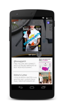
Google has just announced a great new upgrade to their Newsstand app, a one-stop destination for access to more than 2,000 publications (whether they be paid digital magazine and newspaper subscriptions or content from online blogs). Basic functionality remains as it always has — you open the app and read content that interests you. Today’s update makes it a lot easier on the eyes, though, as Google has incorporated Material Design into the app’s user interface.
This means images are bigger, text is easier to read and it’s easier to find all your favorite stories and topics. Google also added more refined topics such as Game of Thrones or Star Wars for folks who don’t fancy the broad swath of topics one publication might cover. Not too shabby at all. The upgrade is already rolling out through Google Play so give it a shot and let us know how you’re liking the new changes.
[via Google]


Mmmmm…. Material. *rubs face in it*
This is beautiful. I was able to add a Playstation TV topic so I can follow all its updates, without fiddling with all Sony/Playstation news.