Despite inconsistencies in design language between their current apps, we fully expect Google to update most of their major Android apps with a Material Design coat of paint for Android L’s release. We may have gotten our first look at one of those apps today. A Googler inadvertently posted the photo you see below to Twitter, which appears to be a shot of Google Now loaded up with traffic cards. The Tweet the photo was posted in has since been deleted.
Evidence of Material Design exists in a couple of different areas. For starters, we now see a hamburger menu button on the left side of the Google Search box. That button is nonexistent on the current version of Google Now. We’re not sure what Google will use it for (easy access to different types of searches?) but it’s there.
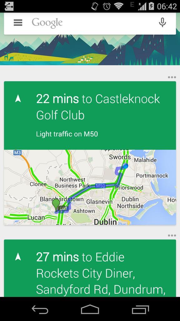
We also see that the overflow menu buttons for individual cards are now placed on the outside of the card at the upper right corner, and are placed in horizontal orientation. Finally, the voice icon looks a bit different — this one has a hollowed microphone as opposed to the solid one seen in the current app’s design. [Update]: Looks like the hollowed microphone icon has always been there, and serves as a reminder for microphone input being disabled.
Some may think that the green-hued cards in the screenshot above is also another element of Material Design shining through, but it may just be that Google’s using green headers for traffic and navigation cards and will stick to the white that we’re used to for most other things. Of course, with so little to go on anything is just as good as a guess so we’ll have to wait for more details or the official update to rollout before getting a better idea of what’s in store.
[via Reddit]




As for the green cards, I’ve had a few apps update over the last week that included a green theme.
Poor guy is using T-Mobile. I feel your pain, dude.
T-Maybe
The hollowed out mic exists now, and displays when voice input isn’t enabled.
Ah OK, didn’t realize that. I never have mine disabled.
It’s not that you would disable it.
It happens for example when you play music – during playback, voice inputs are disabled. Once you pause music, the microphone is solid again.
Odd, mine remains solid when playing music (voice input is disabled as it should be, though).
Strange. What phone do you have? I have a Nexus 5.
HTC One M8. Playing music through Google Play Music.
“this one has a hallowed microphone as opposed to the solid one seen in the current app’s design.”
Are you saying solid microphones can’t be holy or divinely blessed?
Lol, thanks for the funny correction.
Eww…. I don’t like it.
Green could be like on the current traffic cards and mean that the time displayed is for smooth traffic. This is in contrast to the orange and red for bad traffic and “forget it, just stay home” traffic.
This would actually be very thoughtful.
That would be what I’m thinking, and it ties in with the traffic on the screenshot
The text is way too large.
The Hamburger icon is for previous searches, etc that you have performed
Where are you getting this info from?
Some times, I just think “material design” is just a bad idea…
I know… some people just don’t like chance. But if we didin’t change we would all still be looking at a greeen terminal.
That’s true. Some changes are good, others can be really bad. I just don’t like the floating buttons on the bottom right corner of apps in material design. Even though that’s an optional feature for devs to add, it just seems silly to overlay that on top of other content nor does it make sense.
Some times you just have to get used to it
We also know which branch of Eddie Rockets the “Googler” in the Dublin office, likes to have their lunch in !!!
I have yet to see any added functionality to material design… it’s just a change in look at this point. No idea why everyone is going all crazy do to a change in the way the information is being displayed.
Agreed. Guess just the chrome tabs in recent and notifications on lock screen
The idea of Nexus 6 being a huge phablet is dissapointing. I won’t buy that size phone
I’m not sure what else you were expecting from material? I thought it was purely a design change, aka, visual?
The design was supposed to create a seamless integration of information between separate programs. Like taking one stack of paper and putting it in another pile. They demo’d it over the summer.
My impression from that demo was that it was just for looks.
Some of the Material Design Apps More is coming
Where is the Maps icon from? I am not sure I like it.
https://developers.google.com/products/
go here
Oh, I hope that won’t be the app’s actual icon.
It is
:(
So far it’s Chrome, Newsstand, and Google+ for me.
Where did you find that Maps one?
https://developers.google.com/…
Material Design Apps Mo
Is it just me or does Android L feel like a reskinned Kitkat?
Just release it already.
Hamburger menu lol I’d like fries with that, please! :D
Who cares about Material Design, fix Maps.
Thank you for saying this….