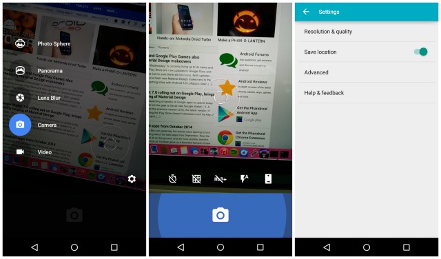
Buried inside the Android Lollipop Developer Preview was an updated Google Camera app (2.4.008), complete with Material Design elements. It was nothing too flashy. Just some new icons and animations to complete the already very minimal look.
Today, this update is now officially rolling out to the Google Play Store and for the most part, is exactly what we saw in the L preview. You can either find it waiting for you in the Google Play Store right now, or by downloading it here.


Material Design elements=lolipop, we getit
At least on my Nexus 5 (4.4.4) I don’t see the material design styles with this update. Still shows the Holo styled title bar and toggle, although there are definitely nice animations (that might’ve been there before?) when switching between camera, video, etc. Also, I think the slide animations on camera settings, such as flipping between front/back cameras, are new, but not positive.
My S5 needs Android L like now, not later.
That would be great for all the S5 owners but sadly I doubt it won’t be for a while and definitely after Nexus 5, 7, 10 etc devices
Yeah, I get that, but I am just wishing.
My guess is the second half of December. January if you’re on a us carrier
Back when this 4.4.? camera update first received that gawd awfully HUGE shutter-button display,I had taken one look and said “oh hellllll no” and have refused to update and have been rocking the original look when KitKat first hit the N5! It’s looking like ‘the old school look” days’ are numbered!
I read online that people with a Nexus 4 have quicker HDR shots & that HDR was added to the Moto G with this update. I don’t have either phone to confirm or deny that though
HDR on my Nexus 4 seems the same to me.
They keep calling this crap Material Design. It looks ugly to me. Just took the idea out of Windows Phones did we?