Everyone wants to reinvent the home screen wheel, but the latest comes from a gang who knows a thing or two more about it than anyone else. Larva Labs, the company behind one of the earliest and most radical home-screen replacement apps Slidescreen, has come back with a new concept.
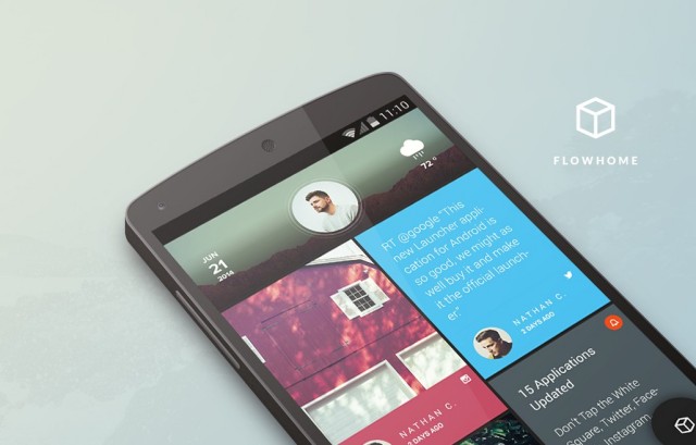
It’s called Flow Home, and its goal is to deal death to the age-old wall of icons. Their goal is to show the the stuff often hidden beneath said icons, using information from your notifications to give you a look at all your latest happenings at a glance.
Photos coming in from the likes of Facebook and Instagram would show, and you’d be given a quick glance at who posted them (and any caption they might have written alongside it). The latest Tweets show up showing you 140 characters of your friends’ mindless musing. Or perhaps you just want to see the contents of your latest email without having to jump into the app. That’s Flow Home’s proposition.
Some might liken it to Windows Phone’s Live Tiles or HTC BlinkFeed, and that wouldn’t be an inaccurate way to put it. Flow Home’s biggest challenge will be to provide a comprehensive launcher experience worth getting rid of your usual freedom for. That is to say you won’t be freely arranging widgets and icons to your hearts’ content if you decide to give it a go as you’ll be sacrificing freedom for a home-screen that aims to be informative.
Apps are still easily accessible using a pie button on the bottom right. It’ll show a handful of your most used apps, though anything else you need can be found by swiping to the right and performing a quick search.
Flow Home is a bit light on extensive customization options (you can change between a few different layouts for the home-screen but not much beyond that), though the team is quick to remind everyone that it’s still in beta and they’ll be doing their best to add many new features where and when they make sense. You can give it a try now from Google Play if you’re interested in trying something a little different.






If I wanted my phone to look like a Windows Phone I woulda bought a Windows Phone.
This was my first thought exactly.
Nobody bought a windowz phone.
Too bad you need an invitation
Battery life hogger.
How is it a battery life hogger? It’s no different than apps normally refreshing. They just show up front now verses having to dig a little more. Essentially a widget. That’s not much different than the functionality of how Android works now.
I still miss Slidescreen…
Anyone have a code?
TWTR62, that one worked for me
I went essentially icon-less with Nova and GMD Gesture Control. My most used app icons only appear in a two single rows/launchpads with two different gestures. Otherwise my home screen is usually all wallpaper.
If I don’t use instagram, facebook or twitter, is this app worth anything to me?
Nope
Not one bit. All that I use is instagram and it’s still pretty useless to me.
Can’t hide apps from the app drawer. Killer.
Well using invite codes as a tactic to get more followers on your twitter account is pretty petty if you ask me.
It’s like Windows Phone but without the crappy apps.
So what happens to my all important calendar widget? That’s always what makes me uninstall these launchers, and return to something ‘normal’. Gotta be able to see my calendar widget.
Swipe to the right and search for my apps…nope. Looks annoying and inconvenient to me.
Are they just pretending that widgets don’t exist? I know that this isn’t doing exactly the same thing as widgets but they talk about icon walls as if they’re using a whole other mobile operating system. Wow, information from *inside* the apps? Not just icons? Well done, welcome to Android 1.5 in 2009.