When Google announced Android L, now Android 5.0 Lollipop, at Google IO nearly 6 months ago, they also announced the biggest visual change for Android to date. The new user interface and experience dubbed Material Design, aims to provide a unified system of visual, motion, and interactive design that adapts across different devices and are inspired by tactile materials, such as paper and ink. Since then, Google and other application developers have been moving towards these new design practices.
If you’re like me, you’re a fan of the latest Android design guidelines, you’re often found praising the word of Matias Duarte, and you just so happen to love when apps are updated to follow Google’s Material Design language. Today, I bring you the latest app to partake in Materiyolo, our Phandroid News app.
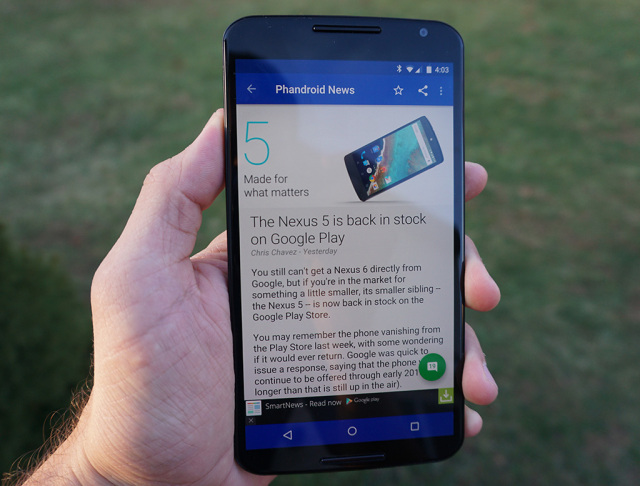
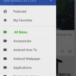
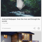
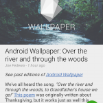
As you can see below, we’re rocking the Material Design goodness, applying Phandroid blue to the status bar, navigation bar, and even Phandroid green for the brand new refresh animation, category highlights on the navigation drawer, and for the new FAB (floating action button), which takes you to the article’s comment section when tapped. We’ve also added all of the required animations and transitions that just make moving around the application a thing of beauty. In addition to the visual makeover, we’ve added an easy share icon and favorite icon to the article cards on the main screen. Wallpaper enthusiasts will be happy with our last addition, as you can now easily set any image as your wallpaper directly from the app.
Check out the video below where I go hands on, covering all of the visual changes and new features in our Phandroid News app. Be sure to let our Android developer Steve Albright know that he’s a baller below in the comments below, if you are experiencing any issues, or if you have any feature requests that you’d like him to bring in a future update. And remember, you can always disable the ads via an in-app purchase of $3.79 a year.
The app is currently in beta, but will be gradating out of the beta channel come Monday when it’s uploaded to the Google Play Store for our official launch. If you can’t wait until Monday, you can always check out the official Phandroid Beta community on Google+.






I hope this one fixes the app crashing literally every time I open it (just once, then it works) and the random refusals to scroll.
Mine crashes quite a bit too. I think its from loosing signal or transition from WiFi to Mobile Data.
You are correct. This was fixed… New error handling implemented. If the new version has any issues that pop up I will be sure to fix asap. ;)
And when he means ASAP he means it. He is really quick at fixing any issues. Great job Steve
Nice job.
tinting the navigation-bar is really horrible! Besides that (and the comment sections and settings) it looks really nice ;)
I’m not a fan of the font used for the Settings section myself.
This is system driven but the settings need updated to the new framework. It’s just they don’t make it convenient to do so which I put this on hold until functionality is all complete. This is sort of a polish thing which will eventually get updated.
What would you like to see for the comments to make them look better? Curious. The nav bar some love, some hate…I personally don’t mind either way.
I like the tinted nav bar…another plus of having on screen buttons (for those that like it as well).
I pray this one has less crashes than all of its predecessors but I will not be holding my breath.
I haven’t see many and I’ve been using it for a while.
Someone didn’t properly test this on non android 5.0 devices. The floating comment button is almost invisible on android 4.4.
Wow wow wow. Still currently in beta ;) No one has reported this and I tested on 4.4 myself. I will do another test before it leaves beta. BTW, what device?
Xperia Z3 Compact running 4.4.4. Instead of the floating round button, it’s just a gray comment icon with text.
Have a strange feeling youre still on the old version.
Works fine for me on 4.4.4 (Note 4)
Is it out yet
It will be soon. You can get a head start if you join the beta.
How do you join the beta?
Sorry, I just updated the article to reflect this information. The app is currently in beta, but you can get an early look by joining the beta here: https://plus.google.com/u/0/communities/111336304998284946329. The app will graduate from beta come Monday, but you’re welcomed to an early look right now.
Ok, thanks.
Good, I can drink more tonight.
This article just screams sponsored…
Edit: I really should have made my sarcasm a little clear, in mock of the people always decrying such, with a “/sarcasm” notation.
Well of course it does. It’s called self promotion.
I think Amazon sponsored this one.
So, I should ask Amazon for a check then? Dear Jeff…
It’s not sponsored if it’s the same party :p
Material Design looks so good on this app and any app for that matter !!
Now give us a apk please
https://plus.google.com/u/0/communities/111336304998284946329
Gotta say.. This feels polished. I’m digging it
Liking what I see so far. Keep up the good work!!!
Holy crap! The play store version is the stable version?! Sorry guys, but got to be honest, the Phandroid app is buggy as heck! And that’s running on a Note 2 stock/rooted. For as long as I can remember, half the updates were buggy so every update was like, “well, is going to make things worse or actually fix something today?” I don’t know jack about making apps, so I understand if there is some ironing out to do, but dang!
Not really. The beta is more stable with all the improvements. The beta will be pushed public tomorrow. If you find any issues please let me know… I see all support emails.
Beautiful app! Big improvement!!!
When I refresh by swiping down while at the top, I see the round thing with the rotating arrow animation. But when I refresh by pressing the menu button and selecting “refresh”, the little round thing pops up for second but without the rotating arrow animation. Made me wonder at first what that little round thing was doing there, until I refreshed the other way and saw that there is supposed to be an animation in it.
The scrolling stutters a bit. This is on a stock Verizon Galaxy Note 4.
Am I missing something here? There are a few things that look different on my phone compared to what is shown in the video. For example, my nav bar stays black, the “fab” isn’t green, and I don’t have that button to set a wallpaper directly from the app. I’m using a fully stock Note 4.
I believe that some of that requires stuff from Lollipop. Specifically, the nav/status bar stuff.
Are you using the beta? It’s not public yet.
Version: 157 (Build: 2.6.3b1)
Do you have the dark theme set in the settings?
I’m using version: 160 (Build: 2.6.3b5) now
Can you charge for it and get rid of the freaking ads?
There are in app subscriptions for ad removal
no there is no permanent in-app unlock option. Like many developers, they are taking the route traveled often with the “subscription model” Because you can’t hack it. If there was the IAP model would be cracked (or an IAP unlocked APK would come out) and they would see no money
So now I will see two articles per screen page instead of six? You didn’t have to crop the images 4:3. May I suggest 4:1 or something. You don’t have to show the whole image on an overview.
In settings you can change the list style from card view to a regular list.
Oh, that’s great. Thanks!
Love the new design and dark theme… No issues so far :-)
Link goes to the Sep 10 version.
Join the google plus group to get access to it, it hasn’t hit the play store yet.
So far haven’t had any crashes using Moto X 2014 running Lollipop. Smooth and lag free, I’m impressed. Good job Phandroid team
When it will come to play store?
Soon
We had a large amount of new beta testers and some new bugs were reported that I am addressing today. I don’t have an exact ETA but you can count on in by EOD.
?????
Just to be clear here, “we” is Neverstill Media (http://neverstill.com/).