Talk about it at AndroidForums: M9 | M9 Plus

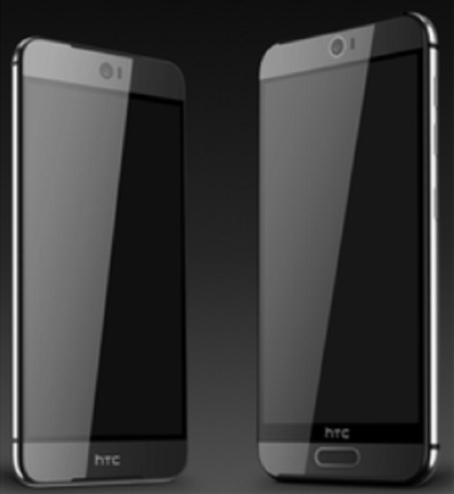
After it was revealed that HTC slyly used decoy prototypes of the HTC One M9 to throw the blogosphere through a loop, we’d heard details of a new design for the upcoming flagship smartphone. Those details have finally been illustrated in a purported leak of the device’s official renders.
As the latest report suggested, HTC has taken a new design approach for the HTC One M9 instead of recycling last year’s model. The front facing camera is more profound and gets prominent placement in the middle of the frame, while the dual BoomSound speakers are presented as small slits at the top and bottom of the device.
Oh, and what you’re seeing isn’t a mirage — there are two different devices there, and one of them is bigger than the other. The device on the right is apparently the HTC One M9 Plus, and it has a pretty awkward button-like slab placed on the bottom. It’s possible this could double as a home button, but its main function is believed to be for fingerprint scanning.
HTC is likely to continue using a metal unibody form factor, though unlike their previous two models this one looks to have a sheet of glass draped over the entirety of the front.
Also of note is that HTC opted to put their logo on the bottom lip of the device instead of adding unnecessary bezel for it (this is likely thanks to the new design for BoomSound speakers). Unfortunately the bezel still does exist on the Plus version of it thanks to the likely fingerprint scanner occupying that spot.
And that’s about all we can gleam from these new photos alone. We still don’t get a good idea of how the rear of this thing is going to look — rumor has it the M9 Plus will have the same dual camera setup as the HTC One M8 — but as often as these leaks have rolled out we wouldn’t be surprised to get a full look soon.
Oh, and if last week’s events taught us anything it’s that everything is to be taken with a grain of salt until HTC dishes out the details themselves. We’ll be trotting to Mobile World Congress in March to see this thing unveiled, but let us know how you’re feeling about this possible design in the meantime.
[via Twitter]





Ok, HTC. This could be the start of something.
Looks strangely familiar…
HTC, fulfill this design and I will buy M9 for sure! My M8 is getting old :/
how does the back hold up against scratches??? I’m really considering the M9 but am not sure how it would hold up after a year or so
I have dropped mine (silver) a lot of times and only a few dents, but no scratches or anything. It is the first phone, that holds so strong.
Get a case and you dont have to worry.
hmm, yeah there is that too. good call.
i know some like to show off the sexy phone, id rather it be in one piece too. Ive been using cases on all my devices since my HTC G2.
nah for real. I’m with u, that was not sarcasm….I always have a phone. Now i’m wondering why i asked that haha.
I usually have a case on only for few weeks, when I get a phone. I don’t use any cases or screen protectors on my M8, yea, it has scratches, but what the hell, it is still sexy and I like to show other people what an incredible looking phone I have got.
LOL, Galaxy S M9. Oh dear.
Much, much better looking galaxy, I suppose.
i am getting one of each.
why ? You need to have 2 phones that are essentially the same ?
I’m not a big HTC fan, but this design looks great and a screen larger than 5 inch would have me taking a hard look. Maybe the makers of the worst phone ever…Thunderbolt can finally redeem themselves.
lol finally? they’ve been making arguably some of the best flagships over the past few years
Agreed. But dont say that too loud. The haters will come out of hiding and tell you how little HTC phones sell. Idiots.
lol right? every android OEM has made at least one crappy phone at some point in its history. Android was pretty rough back in the day.
true, but it’s taken me a longggggg time to forgive them for selling such a piece of crap
you still stock on the Thunderbolt ah? you need help!!
Resemblence to iPhone 6 anyone? Or is it just me?
It’s just you.
Just you
just you.
Have you seen a doctor about this?
Seriously though, the back of iPhone 6 ripped off the horizontal bands that HTC used on the M7/M8, not the other way!
You have a good point there!
For sure. The rounded edges are the clincher.
Doesn’t really matter because of their patent agreement. Apple first copied the antenna tech that was on the back of M7 and M8, I’m guessing HTC is free to also but there is only so much things you can do to slimline a phone anyway.
You mean its a rectangular shaped slab of metal, glass, and electronics ? I didnt realize Apple patented the rectangular phone. You should also know that the iPhone 6 is the first iPhone to duplicate Androids form factor, in addition to lots of Android features.
No, I mean the rounded edges, the glass following the curve at the edges and the antenna placement. Well, that “slot” coming around the sides. Plus probably the colour in this particular picture.
Does josh resemble an iphidiot,anyone?
That’s a stupid pun.
M9 plus have bigger speakers also
Not a fan of the button on the M9 Plus (if thats what its called), but dat M9.. HHNNGGG
Button is dope.
if thats the new max (my hands in the air) take my money
If the one with the home button had a removable battery I would consider it. I want a phone with a removable battery, microSD slot and hardware buttons (preferably a physical home button). AMOLED is also a bonus. Samsung seem to be the only company offering those at the moment and their screens are unmatched.
oye, you people irk me.
undervalued post! physical buttons are the best!
They’re the worst they give out, and just look archaic.
ivve neverhad a home button go out! they make the phone more accessable! plus they dont take up real estate on your screen
only way i see fit to eliniate a home buton is to make the double tapp a home shortcut too
Would you like fries with that?
Approved.
This render looks phenomenal. I have the M8, and I’d love the device to be shorter. It looks like they accomplished that with the new boomsound changes and I’m loving it. Also, I can’t tell exactly, but it looks like the screen glass is rounded at the edges. Not an Apple fan, but I will say the rounded glass edges on the iPhone 6 is a nice touch.
agreed.
Well, Apple and HTC have an agreement on patents so if Apple can copy the antenna design of the HTC M7 and M8, I guess HTC is allowed to use the fingerprint technology on the version on the right and the rounded glass on smaller version on the left.
The button looks like the same from the Galaxy S. But guess that’s would make sense because only a few companies make that technology, and Apple owns one of them.
Yes but Apple and HTC has a patent agreement, I’m guessing HTC is allowed to use the fingerprint scanning tech.
Unless theyre using the cheap one that Apple dont own.
They better use the better one that Apple bought out or it’s a no go for the M9 Max. They really need these phones to succeed like how LG is succeeding in taking market share.
I’m not a proponent of removable batteries. However, I’d take that feature over a finger print scanner any day!
Not digging the plus, but the other one?! DAAYYYUUUMMMM!!!
Looks like a Sony somewhat. I rather like it. Can’t wait to see it.
I’m sold
Not a fan of the ‘galaxy-like’ home button. Other than that, liking it.
They said its likely only the fingerprint scanner, wont know for sure until March. if the regular M9 dont have a home button, its odd that the Plus will.
love the home button! only thing missing on my padfone x
That makes sense, but no matter what it is, it looks like a home button. If it isn’t a home button, it will likely confuse users, and if it is, it’ll be inconsistent with the “normal” M9.
That is a beautiful M9! The home button? Um, no. But if it’s not a home button and only a scanner, OK. I can deal with that.
If these renders are real, the M9 looks great! The M9+…confusing. We’ll have to see, come March, but I definitely like that HTC is making a comeback. I’ve gone away from them since the Evo, but these renders are really eye catching.
The M7 and M8 were magnificent. Youve been missing out.
They are nice looking devices, but didn’t quite meet my needs for work and personal use. My last HTC device was the original Evo. Ever since getting the Note 2 and now the Note 3, haven’t really found a reason to relinquish my s-pen.
For me its now the Nexus 6. Love the size, gonna see if the M9 plus can woo me back to HTC. I generally hate Motorolla, but the pure Android plus dual front facing speakers got me.
Looks nice. This phone can’t get here soon enough. Especially since my current phone is being as much of a jackass as an inanimate object can be.
Does it remind you of an iphone? Hmmmmm
No, the iPhone reminds me of an M8.
If Apple was allowed to sue Samsung over the S2 looking like an iPhone, the iPhone 6 looks MORE like an M8 than S2 like iPhone
These “looks like an iPhone” people are getting annoying. As if Apple invented the rectangular cell phone.
Well clearly they did.
They sued Samsung for having a rounded rectangular shape phone.
/s
Apple and HTC have licensing deals for their patents. That’s why they look so similar.
I’m in.
I will be so pumped if this is what it looks like. Looks are nice, internals are nicer, but this is a good meld of both.
Does it resemble a hint of an iphone6? Hmmm
Which looked a lot like the One M8. Hmmm
Haha true
The M9 solves a lot of shortcomings that make me take my S5 instead of my M8 when I can only take one phone on an extended trip (one’s biz and one’s personal, and I forward messages and calls).
I find the home button on the S5 more useful than it should be, particularly using the long hold for search so I don’t waste screen real estate with it on my home screen. Also nicer for waking the phone than double tapping the screen. I miss it when I’m carrying the M8 that day for work.
If the M9 was available when I needed phones in the last year, I’d probably have two of those instead of an S5 and an M8.
HTC is going to sell a lot of M9s.
Fugly. I defended them keeping the same design as the m8. This is hideous
You done lost your brain dude
I was too lazy to edit and say more specifically the larger version was hideous. The smaller one is OK but still ugly. M8 looks far better
I thought the M8 was a step down from the M7. To each his own.
I can’t say I agree, but if this in true, maybe, maybe not, I’ll say do a side by side comparison, sometimes pics don’t do a phone justice, to be Samsung phones arent special at all, but I tend to find them more attractive in person than on pictures
I love how people jumped to defend the decoys… “They don’t _need_ to change anything”
Then they changed the design… “It’s beautiful”
Although to be fair the new design is quite nice.
you can like both designs ya know
Looks too iPhone-y…
I think an iPhone looks too HTC. iPhone 6 back cover has a lot from HTC M8 :)
You mean HTC reclaiming the design they’ve had since the m7
Wow that’s a stretch….
Hardly looks anything like the M7
The fact there’s 2 sizes, a centered camera. No prominent front facing speakers…. too many cues from Apple
I’ll give you the center front facing camera but the speakers are still there, just look more closely at the edges of the screen.
“The front facing camera is more profound and gets prominent placement in the middle of the frame, while the dual BoomSound speakers are presented as small slits at the top and bottom of the device.”
Reading is hard.
Everyone knows iPhone copied m7
It’s centered because they had to center it… have you seen the size of it? 13 MP shooter on the front. Also, take a look at the Desire Eye.
Look at the size of camera. I would have looked awful off to the side. They had to put it in the center.
haha whut? Too many cues from Apple? None..
You know Apple isn’t the first company to reveal 2 size phones, Apple dosen’t have front facing speakers, and there camera isnt even centered soo I dont know where you got that one from. Plus the HTC M9 to be looks far better than the ip6 or ip6p
Nice design ,I like it , guessing this will be the iPhone 7 design
I just realized something reading the article again and taking a closer look as the pic. I would have been fine with HTC being lazy and keeping the same design but since they decided to change it why not fix some of the gripes ppl had. I love the minimizing of the speakers into slits instead of full blown speaker grills. Lovely. But now that the speakers are smaller could they not have made the bezels smaller and move the HTC logo to the back and ONLY the back
They still need space for the screen tech etc, also the speakers are still there under the bezel, the sound will just be getting funneled out the smaller slits. They fixed a heap of gripes that users had… Power button on side, check. Black bar with HTC logo, check. Camera improvements, check. Entire phone front in glass, check. It’s actually harder to think of something they haven’t fixed.
I like the M7 and M8 look better (prominent speaker grills), there isn’t anything that makes it stand out from any other phone.
Are you a child or something? How can you even compare the designs. This is far more elegant, grown up and sophisticated.
No, but your a turd obviously.
Oomph! Struck a vital nerve I see lol. Great stuff. Prominent speaker grills. You must either be under 18 in mind at least if not in body lol
I have the M7 and I don’t mind the speaker grills at all. In fact, I think they look quite good with the metal unibody and industrial design. I love this phone and it definitely is a highly quality design and device.
WOW a HTC phone with no bezel, cows must be flying outside, its a shame the Plus version still has that big stupid ugly bezel.
I hope it has curved edges like iPhone 6.
curved edges are nothing new. Apple just has extremely curved ones.
Left one yes. Right nahhhh. Home button looks photo shopped.
If they got rid of that stupid black bar, it’s a major improvement already. Now just add a removable battery, and do something about the slippery finish, and they’ll be on to something.
There fake photos again.
Sony led the way with how to design front facing speakers on the z2. It’s good to see HTC following suit. Those boomsound speaker grills were God awful, very ugly and juvenile. Made it look like a teen phone. This is certainly a more elegant and grown up design. Really like this if it’s the real deal.
Meh. Looks like an iPhone that will run Android to me. Go ahead and say it…secretly, that’s the Holy Grail, isn’t it?
Yes. Yes it is.
I have no issue saying that. Each iPhone I’ve held from the 5 to current feel like super-premium products. I’d take my Nexus 5 everyday, but the creaky plastic isn’t worth being mentioned compared to the quality of iPhone’s.
Shit….I like it. Why is everyone making large phones now it makes my decision so much harde on getting a nrw phone >.<
because thats what 90% of cellphone owners want. i mean so much so even apple went against Jobs original statement and made larger devices this ast year!
I like it but it looks dangerously close to the latest iPhone design. I somehow doubt HTC would make a play that in their design that close to the iPhone models. There is a small gap between making a product similar to the top competitor but also keeping the product unique enough to be recognizable to spread brand awareness.
It looks like a big slab of plastic and metal.
Since when are HTC One models plastic?
Looks like metal and glass… Like the M8… And the M7.