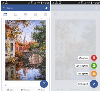
Facebook for Android is dabbling with Material design in some regions
It’s wouldn’t be an exaggeration to say that Facebook tends to drag their feet when it comes to updating their apps to Android’s latest design guidelines. Hell, 2 years ago they barely started using native Android code for their app. More recently — April of last year, to be correct — Facebook finally began pushing out an update to their Android app with a flatter, more Holo UI design (you know, the UI introduced back in Ice Cream Sandwich). But alas, ’twas better than nothing.
It seems Facebook may not be waiting quite as long before jumping on the Material design bandwagon — Android’s all new UI introduced in Android 5.0 Lollipop. Some folks are getting early glimpses at a more Material Facebook in some regions. The UI update is done on the server side of things and rolling out in stages, meaning everyone is running the same version number (28.0.0.0.16), but only some of you will actually see it. Just gotta sit tight for now.
Really, there’s not too much here in terms of Material design (just the floating action button) and we can’t say we’d be too surprised if this is where it ends. We are talking about Facebook here. Here’s to hoping the slightly tweaked design rolls out in more regions.