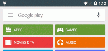
Google Play update brings white Google Search bar into the app (arrow animation too)
It’s not the most consistent UI element, but Google is about to bring their familiar white Search bar to a new application: the Google Play Store. In an update that will be rolling out “soon,” the current/previous colored bar along with its tiny search icon in the upper right has now been replaced by the white Search bar at the top of the Google Play Store’s homepage. Now, Google Play users can tap anywhere on the bar to pull up a search and yes, that wonderful arrow animation is also making a return (it was hidden by the slide out menu in a previous update).
We’re not entire sure how we feel about the change. Especially considering other apps like Gmail or Google Play Music are still using the more Material colored bar style, we have no idea where Google is going with this. No word on when the update will roll out, but we’ll update this post as soon as an APK is available. How do you guys feel about the (admittedly, small) UI change?
[Google+]