
That teasing little countdown timer on Pebble’s website has finally expired, and the announcement we’ve been waiting for has been made. Pebble today introduced Pebble Time, their next generation e-Ink smart watch.
This little guy distinguishes itself from the original with its color e-ink display. It makes for a much nicer-looking watch face which should enable many more possibilities than the monotone display of the original.
Battery life on Pebble Time is still exceptional, with the company boasting the ability to go a week without having to chart it up. That’s much more comfortable than the standard 1-2 days you’ll see for other smart watches.
Pebble Time integrates a microphone for you to be able to issue voice commands with several apps. It’s also water resistant, has standard 22mm watch band clips to be able to use whichever band you like.

Software wise, the updated Pebble OS will continue to support all of the apps that have been made for the original, though developers will have to do some work to upgrade their apps to look their best on the device’s color display.
They’ve also added a new feature called Timeline that will give you access to your apps in chronological order depending on what’s going on. If you get an email at 1:30PM, have a lunch meeting at 2PM, and an alarm set for 8AM the next day, you might see the email app, calendar app and your alarm app lined up in that particular order. It only makes sense for a time piece to construct its flow of activity based on, well, time.
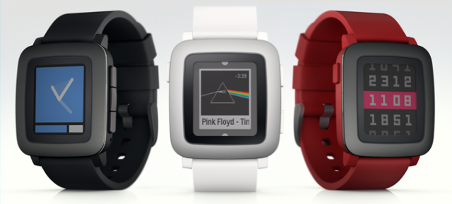
And that’s Pebble Time. In a “back to the roots” move, the company decided to take to Kickstarter to allow early enthusiasts and developers to get in on the fun. The cheapest option for buying one is $159, which is an early access price. Its regular retail price will initially be set at $199 so you’re getting a pretty good deal by grabbing one through Kickstarter.
The page has only been up a short while and Pebble has already sold half of the stock available at that price so you won’t want to wait too long. They will have more units available at a discount after the $159 lot has been claimed, though you’ll have to fork up $179 (which is still cheaper than retail).
The company has raised $1.5 million to smash its $500,000 goal already so you certainly won’t have to worry about it not being funded, and you can expect the first units to begin shipping in May (barring any delays, of course). Be sure to head to Kickstarter and drop your dollars if you’re interested.







Is that a double bezel or are you pleased to see me?
Battery life, price and waterproofing are huge advantages for this device. But it’s so damn ugly I’d never want to wear to actually make use of them.
Thats why i got the metal one :P
Fugly… this is a kids watch. People want to support it because it is esoteric, but I suspect of already weak wearables sales, this things sales are uber weak.
Well it’s raised 6 million dollars in about 7 hours so it looks like the market disagrees
Still looks more like a toy watch than the more current Android wear watch options… Great Battery Life though…
Someone on Reddit pointed out that the display only takes up 38% of the face. Pebble’s have always had pretty big bezels, but the color display just accentuates it.
And people freak out about the flat tire on the 360, but it really has the smallest bezel of the bunch.
Really not a fan of the button interactions. That would get to me pretty quickly.
Also, if I didn’t have to charge the battery more than once a week, I’d probably get out of the habit of charging the battery, so I’d probably actually let it die more than I’d let my 360 die as I put that on the charger at the same time as my phone every night.
Any info about the screen resolution?
Man, I bought the first pebble when it finally hit stores and it disappointed me. I was really hoping for a larger screen but I guess that’s out of the question. I hope that this iterration is better either way.
It looks like a childs version of a smartwatch.
EASY, there are some pebble owners out there that will have something to say to this. haha I had the Pebble Steel for a short while and it was HORRIBLE. This looks like a SLIGHT upgrade on the screen, but the same cheap casio style watch from the 80s. Might as well put a friggin calculator on the front.
What was horrible about it?
Ui…all day long. Felt cheap. Looked cheap. Was told it looked cheap by people I was showing.
are they catering to the large 10 year old market?? must be a lot of them out there looking for child watches.
e-paper display (as Pebble describes it) is not necessarily made by E-Ink (the company that made the original Pebble display). Any chance of clarification?
I had the QUALCOMM TOQ & if I’m not mistaken, had a similar display technology.
While functional & having multi-day use between charges, the sharpness/brightness/clarity pales in comparison to the ANDROID WEAR & SAMSUNG GEAR offerings.
Just something to consider if one is buying a PEBBLE TIME sight unseen.
Thank you for CAPITALIZING all of the PRODUCT NAMES
YOU’RE WELCOME, lolwut.
lol
I love my Pebble, and I would really like to get this version. That being said, with normal daily notifications, I barely have enough battery to last two full days. Still better than other watches, but I look at that battery life claim with a skeptical eye.
Wow this is a step back in design if thats even possible from pebble…Looks like its for toddlers.
What’s up with the triple bezzels all around?
I really think that this is a step backwards, minus the color part. I feel that, other than the battery life, the Pebble has nothing special to offer now that Android Wear devices are widely available. Granted, those have their issues, too, but they aren’t quite so basic.
Personally, I’m waiting for the Moto 360 Gen2. If they make the G Watch R, with the Moto 360 looks and get rid of the flat tire, I’ll be happy.
I think it’s pretty unfair to call this a step ‘backwards’. It is thinner, has a microphone and a color display. EVERY other great feature of the previous model is retained and the resolution and display cover material has yet to be announced still.
You judge the watch as if anything is possible. Those android wear devices are so terrible on battery because of the display and it’s features, you won’t see an always on moto 360 type watch last even half as long as a pebble for 10’s of years to come. Of course if color e-ink displays can increase resolution sooner than that timeframe will change but even increasing refresh rates on an e-ink display will come at the cost of battery life.
Asus says differently…http://ydfgg.com/2015/01/26/asus-zenwatch-battery-life/
You’re right, they agree that smartwatches today SHOULD have a 7 day battery life. They did NOT say that they have or intend to release one in the near future. As I said before with current battery and standard OLED/LCD display tech you will not see an always on smartwatch with anything near that life. They specifically mention optimizing the components of a smart watch that has the LEAST impact on battery life, unfortunately for them it’s the best they can do because they are not in a position to improve efficiencies in display or battery tech themselves.
This is dumbfounding. Why would they go backwards in regards to build quality? The reason i didnt get the first pebble was because it looked like what it was, a smartwatch. it was plastic and looked cheap. When pebble steel came out, i was so close to going out and purchasing one (if i wasn’t married, i probably would have haha). But i waited just to see. Now i have a Moto 360 and am glad i waited. It looks like a sleek watch (like the pebble steel), and thats one of the main reasons i bought it; it looks really good. With Pebble Time, it looks cheap and plastic again. Yes, i know it can last on a single charge for 7 days but i dont care if it looks like that! I’m happy with my 2 day charge out of the 360, not to mention i just set it on a dock when i go to sleep, its not difficult. I’m happy for the company that they funded everything so quickly and are selling units, thats really exciting and amazing. But c’mon, you couldn’t make a Pebble Steel Time?????
Agreed, I like wearing my 360 as an accessory, this looks like something I wore when I was in grade school.
Im guessing they are saving that for next year. In which case I will be be shouting “shut up and take my money”.
In the mean time I will stick to the Steel
I would have liked to see a thinner bezel and maybe a round design like the Moto 360. I did not even need the color display. I never thought that Pebble needed it. I do like the microphone addition though. As an original Pebble owner I wish them good luck but I will stick with my Moto 360 for now.
It wouldn’t look so bad if the screen had been big enough to cover the area of the innermost, black bezel. The interface is pretty awesome, though.
I was both surprised and disappointed that it didn’t have Android Wear. But I think I see why now. It is a case of function following form. Pebble wanted to stay with a three-button design and no touch screen. This is inadequate to support Android Wear, hence timeline (past, present, future – 3 buttons) which can work with their hardware (including the previous versions). Sony SW3 is looking better and better.
I love the battery life of this watch, but this thing looks like one of those V tech watches I bought my kids. I’m sure it will receive timely updates and support tho.
I don’t know, I think it needs more bezel
Why not have the steel version too? This one looks cheap compared to steel. If they had a better looking version it’ll be a toss up between LG round urbane and this one because microphone and battery life are big pluses.
If it has a similar build to the pebble steel, and was thinner, I’d of considered it. Really leaning towards getting the fitbit HR now.