The most iPhone-ish feature of the Galaxy S6
The Apple and Samsung battle has been going on for years… in their marketing jargon, in the legal system, and in the court of public opinion. The two juggernauts constantly try to one-up each other yet aren’t afraid to borrow good ideas, a combination that has helped speed innovation and bring the best-of-the-best to consumers. So has the Galaxy S6 borrowed anything from Apple and the latest iPhone 6?
The Galaxy S6 is a huge diversion from previous Samsung devices, implementing a fixed position battery that cannot be removed which also means there is no expandable storage. The plastic is gone in favor of premium metal. The device is one solid piece of awesome. It’s probably the best device Samsung has ever made, but even the Sammiest of Samsung fanboys would have a hard time denying that one particular Galaxy S6 feature looks particularly iPhone-ish.
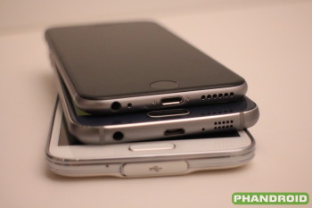
The three phones shown above (from top to bottom):
- iPhone 6
- Samsung Galaxy S6
- Samsung Galaxy S5
It’s pretty clear that in the move from the Galaxy S5 to the iPhone 6, Samsung agreed that Apple was doing some things right in terms of component placement and design. I’m not sure I even have to explain… but just to briefly summarize.
- Samsung moved the headphone jack from the top of the phone to the bottom of the phone, mirroring the iPhone 6
- Samsung did away with their waterproofing so there is no longer a cover to the MicroUSB port
- The speaker was moved from the rear of the device to the bottom, mirroring the iPhone 6
- The speaker “grill” holes look very similarly circular
I’m sure this will be argued endlessly, until of course the iPhone 7 or Galaxy S7 or next DilemmaGate arrives. Perhaps we’re throwing fuel on the fire, but hey, we think it’s an interesting observation and one worthy of discussing. Regardless, after playing with the Galaxy S6 for several hours now, it’s easily one of the most beautiful phones – and maybe the best phone – I’ve ever used in my life. I’ll let Apple and Samsung figure out on what merit that came to be.
What do you think about these similar design choices? Is Samsung getting risky? Are the companies artificially inflating a Jay-Z vs. Nas style feud that helps both of their art grow exponentially? Did I just date myself and are you still even reading this?
I’m sure you’ll let me know all that and more in the comments below.