Check out everything you need to know about the HTC One M9
After numerous leaks — including an exclusive of our very own — suggested HTC would be more-or-less revising the design of the HTC One M8 for the all new HTC One M9 instead of drastically changing it, many were taken aback to find out the leaks were true. Especially considering @evleaks came out of nowhere with some beautiful renders of the device next to its bigger brother, the HTC One M9+.
In the end, the cold reality was a 2015 flagship that looked nearly identical to its predecessor, save for the back which features a new square camera and other very subtle tweaks. No matter how much HTC says to the contrary, the phone looks so close to last year’s HTC One M8 that even HTC is having trouble telling them apart.
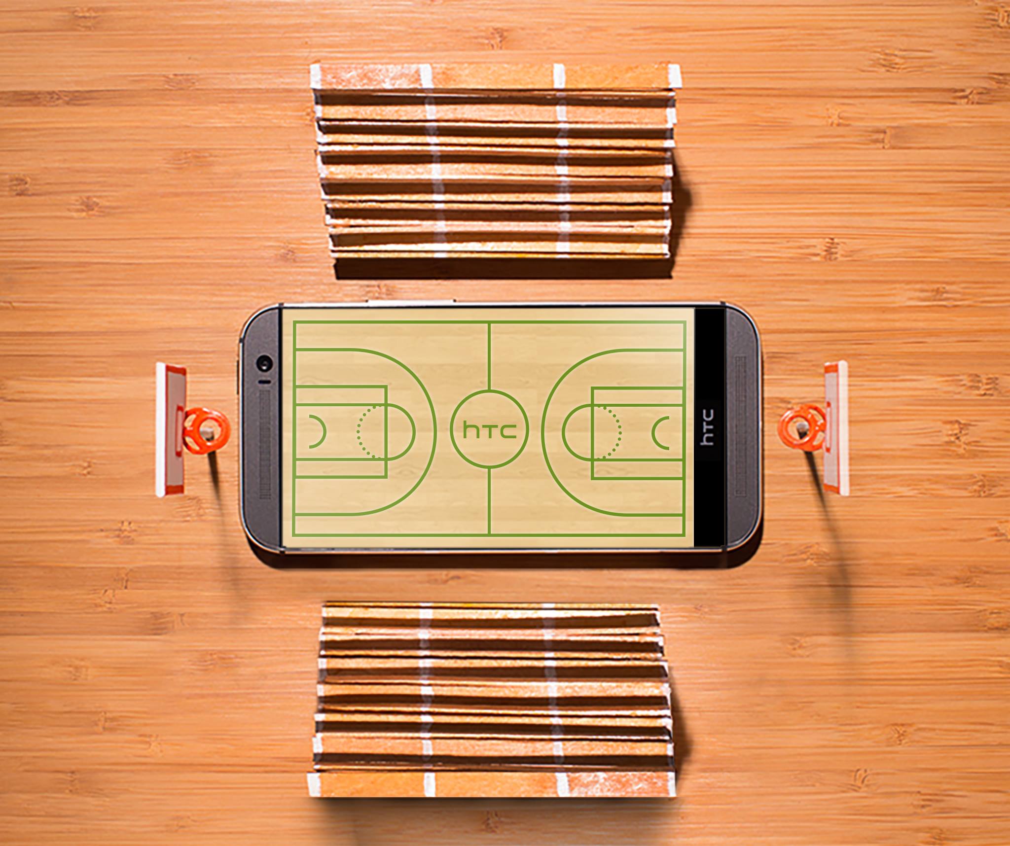
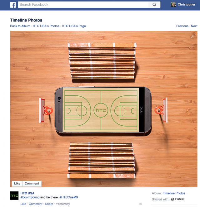
We stumbled across a sponsored post from HTC’s Facebook page which was supposed to show off the BoomSound speakers on the One M9, but actually pictured last year’s One M8 instead. Ouch. Of course, we wanted to give HTC the benefit of the doubt. Maybe this was just an ad touting their One line’s BoomSound speakers only? Unfortunately, the text accompanying the photo clearly makes mention of the HTC One M9 in hashtag form. And if HTC can’t tell the 2 apart, how do they expect anyone else to?
Now, we understand comparisons made with auto makers who build upon the design of a flagship car line. A Corvette will always look like a Corvette and a Porsche, a Porsche. But in the case of the HTC One M9 and M8, maybe they were too close for their own good. Especially considering the great lengths their biggest competitor (Samsung) went through to revise their flagship Galaxy line.
[Facebook]





“a 2105 flagship” Oh dear, how long have I been asleep? Has Android Teleport launched yet?
All around a very disappointing design for a 2105 flagship. Ever since Microsoft took over HTC in 2086, they’ve designed the One in MS Paint.
Lol and I thought it hadn’t happened yet I guess I fell asleep in 2015 and woke up in 2105 wow how things haven’t changed in around 100 years
As I understand it, they finally found a way to fit the Plutonium P36 Space Modulator, regardless of the construction of the body -and that’s if it has a body at all.
It works with Windows 75 now.
I feel lame.. Still running Windows 71.. The behind your eyes display is so amazing..
71 is sooo 2099.
Rumor has it they still needed the big bezels though. This time they say it is because they need the extra internal space to fit the hyper-module which is said to remove any conceivable form of lag by being able to bend the fabric of space-time so that the user is instantly transported to point in time where he immediately experiences the result of the requested action on the phone.
Which brings up the ol’ teleportation philosophical dilemma – is it really you not experiencing the lag?
Since you are technically warping space, and leaving time alone, there is no inherent lag in space-bending teleportation, but when there is a hiccup on the device, it sometimes leaves a few bits of you in the wrong dimension. Usually not important bits, so it’s fine. They said project butter and the Lollipops would fix this back in the first half of the 21st century, but no luck yet.
I think it was overkill to extend the bezels that far though – to the other bezel. Changing the entire screen to bezel, leaving out the display, lacked forethought.
Design is not disappointing, its your who are disappointed cuz you didn’t see major change in design. even its most beautiful designed smartphone, but what it looks like last year model right? ;) lol
Relax…the 2106 HTC One M355 is reported to have a different body style…finally.
The difference between 2013 phones (snapdragon 800) and today’s flagship is quite minimal.
I really don’t understand why everyone is so hard on the design. “If it aint broke don’t fix it”. The design is beautiful but the hardware needed updating. Would everyone be happy if they made it in pink? Maybe you prefer the plastic fake carbon fiber of other brands? How about an all white all plastic version with all rounded corners and hardware buttons? WTF do you people want?
“Wtf so you people want?” Lmao. That made lol!
IT IS BROKE YOU OSTENTATIOUSLY IGNORANT DUCK.
I have one…not broke. Good try though.
I don’t have one! Why? Cause it’s broke!
Your turn.
What are you…12?
Close, 13.
but the bezels are broke tho….
While i agree the changes have been minimal between M8 and M9, i also agree with the “if it ain’t broke, dont fix it” thinking. its a great design to begin with. if you have a M8, is it worth the upgrade to an M9? probably not. But if you are coming from some other phone mfg, M9 should be considered as an option.
Only time and sales numbers will tell if the M9 will be a success or not. If it ends up getting the criticism(and the slump in sales to show for it) that the galaxy S line had been getting the past few years, i’d expect a re-design for the next iteration.
HTC, I love you but y’all really need to get your stuff together.
If that ad mix up is true that’s hilarious! Who’s gonna lose their job for that one.. As for design changes, ya it’s all over blown. Like cars, typically just subtle changes year to year and every few years (or decade[s]) they make a drastic change. That’s fine for phones too.
What’s more important is under the hood. Hardware spec increases and better software etc.
AAA on Twit.tv had a brief demo/review of it and it was great in all aspects except the camera. Was a rather big let down supposedly. Just “good” and far from great for a next flagship with some deficiencies.. The take away was “as long as you don’t put major importance on the camera then this phone is for you, in just about every other way”
Worth testing out.
I guess we have come to a cellphone market now where design needs to keep changing every year. Apple seems to get away with 2y design changes.
Though the design now is pretty much the same for the third year now, since the M8’s design was like the M7’s before it…
eh…I dont know, its funny that these companies are not changing much but they are just following suite. I compare it to cars, they always look alike for a few years, then change. You can only do so much with a design of a phone. People who love HTC will go buy this phone, and there is nothing wrong with that. Its no different than me loving the rear buttons on the back of the LG’s. I’m sure they wont be there in 2-3 years from now.
the worst part about this is the htc account denying that the phone in the picture is the M8, they also photoshopped the image on the screen to cover the bezels this is sad
I feel really sad for HTC.
They just can’t stop screwing up.
Bwahahahahaaa!! I see this ad all the time.
HTC Pwned! … Itself? -_-*
The comment about the “great lengths” Samsung went to in revising their flagship fell a bit flat for me. While there are lots of changes made to the Samsung device, it’s the edges and the back that received the most attention. When you compare pictures of the front of the S5 vs the S6, it would be easy for someone to confuse those two as well (and that’s all that’s shown in the HTC post above). Yeah, the camera is more to the center and the sensors moved to the other side of the earpiece, and yes the home button is a bit more oval than the prior one. But not that much different on the face of it.
Can I just say that the S6 “redesign” seems to have taken a few steps backward? They dumped the SD Card, removable battery (which set them apart) and changed from plastic to glass, correct?
The single biggest complaint on the M8 was the RF camera. Fixed. FF camera gets U.P. which really makes sense (no pun). As far as the actual design of the physical phone, why would you try to fix something that was so very widely popular and accepted? FF speakers are the best idea and sounding ones on the market. All metal body-kept.
The SD card, maybe. But I think it’s time people got over the removable battery issue. It’s pretty much the trend. Even laptops nowadays are coming with non-removable batteries. I’ve been on a non-removable since 2013 and all the fears I had are gone.
The SD card is still necessary – they cannot be replaced by online storage. It’s just not the same thing.
As for HTC, the M9 should have been called HTC M8+. Considering the impressive S6 and S6 Edge improvements, HTC will have a tough sell.
I don’t care about the removable battery either, I was merely pointing out that it was a staple if Samsung, now it’s gone. I was seriously considering the Edge, but once I saw no SD card, I moved on.
I agree about the glass. I don’t understand that. LG phones were cracking their back glass just from sitting then on a cold surface. But I haven’t missed having an SD card or removable battery since I moved to a gnex years ago. I think most people will be ok with that. SD cards were causing lots of problems with people using class 4 and lower ones and then complaining about how android phones were slower than apple when it was just bc they were running apps off the SD card or saving all their pictures to the card and it made camera and video performance very slow.
Um, no. SD cards are must haves. Why pay all that money for extra storage space that could potentially get wiped and can’t easily be transferred to a different phone. Case in point: Phone won’t power on and you don’t have photos backed up. Can’t connect to a PC to copy them.
Forgiveable mistake. This design is HTC’s brand, like the iPhone design is Apple’s and Samsung’s brand. Speakers on top and bottom, HTC vanity bar across the bottom, front camera to the right of top speaker — that’s an HTC One. Big top and bottom bezels and a physical home button, that’s an iPhone or Galaxy. Sure, Samsung and Apple change their phone’s face however much each year, but have either of them ever found a truly winning design? The Galaxy S5 and iPhone 5S were good, probably the best looking of each line, but each had flaws and were changed the next year. The only major flaw with the 2013 HTC One was the capacitive keys… and the camera. 2014 fixed the soft keys and 2015 fixed the camera. They don’t need to fix the front because the front is fine. Maybe in 2016 they use a Quad HD screen, but the best thing they could do for the front is move the HTC vanity bar to the top, so the thumbs have greater reach.
I think we should give HTC a lot more leeway. They had 32GB as standard before both Apple and Samsung, and they’re still allowing memory cards, something Samsung finally folded on this year. I don’t care how fast their EMMC is, if buying a Galaxy S6 won’t triple or even double my data cap, I can’t rely on the cloud for music, and my data cap would have to be removed for me to use the cloud for video. Memory cards are a must as long as data caps are still around 1-3GB/month. Maybe if Verizon does what T-Mobile did and doesn’t count streaming music against the plan… but we all know Big Red will never go for that… Possibly even if T-Mobile starts building towers outside a few major metropolitan areas.
“Big top and bottom bezels… that’s an iPhone or Galaxy”
Actually HTC has some of the biggest bezels of all, thabks to their “BoomSound” speakers (which are apparently really great, though I personally wouldn’t care much since I mostly use headphones). Also personally I never was a fan of HTC’s design.
Fair points though.
That is the M9, it just looks so similar that you think it’s the M8 /s
It’s the M8, you can see the power on/off button on the top of the device. Simply, HTC must of used a M8 promo that never took, and tacked on the lighthearted hashtag for the M9
The /s means sarcasm. I was kidding.
If they’re so similar, how do you know that’s not the M9?
Mostly the power button on the top. On the M9, it’s been moved to the right.
It’s the M8, if you look closely at the top, you can see the power on/off button. The M9 was designed with it on the right hand side of the device. Clearly, HTC used a promo from the M8 that never took, and just simply added a lighthearted hashtag for the M9.
I don’t really care or understand why the people posting here do.
Is it the same processor ram gpu camera battery and os?
I’m sure some work went in to improving the device in many aspects, making it drastically different in design is the last place they should change.
What do people want, a retro 10 pound satellite phone or a phone with arms and legs? The design is used by all manufacturers because it works.
I upgraded from a note to a note 4 recently. The reason I got the note is I like the design. So also the reason I got the note 4 is the design is the same. If it was different it would not be what I was looking for.
The only way these companies can continually improve on the design is to start with a very bad design and be very slow at making improvements.
If you start with a good design you have nowhere to go.
Should we stop buying Apple because it had a good design from the start?
Actually the person that made the post should be fired. While it is true that the devices look very similar anyone that is not blind should be able to differentiate. For one HTC one M9 has independent – and + volume buttons which the M8 doesn’t. The HTC one m9 also has power/sleep button on the side which quite visible from face on pics. That being said, that person is either extremely lazy, blind or has never seen an actual htc one M9.