With the exception of HTC’s Sense UI, it’s been awhile since we last saw a vertical scrolling app drawer on Android. Ever since Ice Cream Sandwich ditched Gingerbread’s vertical scrolling app drawer for a nice horizontally scrolling one, it just felt… well, right. While Froyo’s cubed shaped app drawer will always hold a special place in our hearts, we’ve loved the way vertical scrolling felt.
Last year’s Lollipop update added a little spin on the classic home screen with an all new Google Now launcher featuring easier access to Google Now and white cards in the app drawer. It’s crazy to think that Google is already changing things up again this year and it’s pretty drastic.
The Android M Developer Preview features a new throw-back launcher with an app drawer that scrolls vertically, something we haven’t seen since Android’s early days. Upon opening, a row of recently used apps can be found along the top (something we’ve recently seen in 3rd party launchers) along with apps that are now sectioned off by the alphabet.
You’ll also notice a new app opening animation that kind of zooms out from the app icon itself (although backing out of an app still uses the old Lollipop animation). Oh, and if uninstalling apps from the app drawer wasn’t easy enough, you can now do this by dragging icons straight from the launcher itself. You can see what we’re talking about in the video below.
https://www.youtube.com/watch?v=TNOCaBbn-KE
We have to say, it’s a strange move but of course this is a developer preview and anything can change in time for M’s official release later this year. In either case the vertically scrolling app drawer wont mean much to many of you already invested in one of Android’s many 3rd party launchers.
Thanks, Hernan!


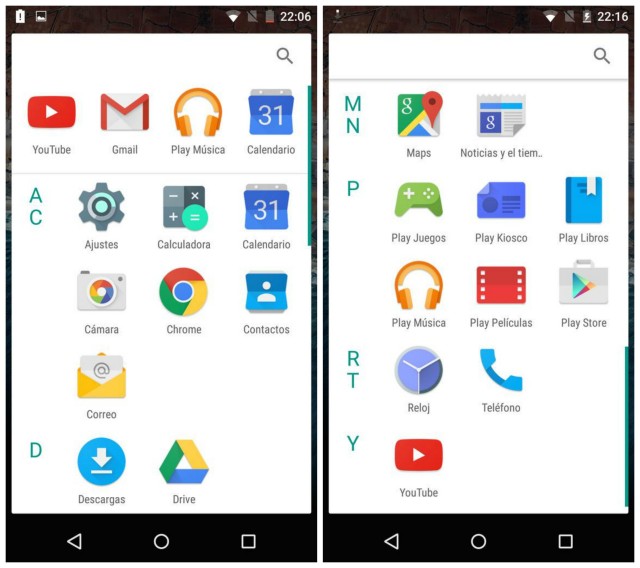






The icons are huge and there is too much wasted space for my liking.
It’s not all bad, really. Perhaps with some transparency and the right icons, it might work. Although, I’ve been using Action Launcher for so damn long, I’ll either welcome the change or get too frustrated learning something new.
Hate it. I much prefer the app drawer in Sense.
I much prefer scrolling….it’s far faster. I quickly get used to how far to scroll down, and I can locate and select one of my 130 apps way faster than having too slide through multiple pages.
The homescreens are for paging…the drawer should be for scrolling.
conversely, I quickly get used to exactly which screen my apps are in the horizontal scrolling drawer. can probably open certain apps with my eyes closed. I agree with the person below us: there should be a choice.
You can get used to which page it’s on easily, but if it’s on page 7, it’s still a pain to get to. I’m now like, swipe up fast, tap to stop it. Boom, I’m there.
I came from the G1, and the OG SGS introduced me to paginated app drawers as they copied the feel of iOS. It’s the reason I started using third party launchers.
So yeah, there’s your choice.
I just hope there’s a choice.
You know there won’t be.
Typical Google creating unnecessary confusion for those die in the wool stock android holier than thou heads. No thanks for me Samsung won’t let this be on any of there handsets thank God.
Yeah… your “insults” need a lot of work.
Also, as if you don’t think you’re “holier than thou” with your self important, self-centered ideas that everyone should/does have the same ridiculous opinions as you.
It’s called “install a different launcher”… something you’ve been able to since Android 1.5
Honestly I like it especially the favorite apps up top.
Its ugly but I like the favorites and sorting. But its only useful for those who are using a TON of apps. I have 138 total, and a lot of those arent in the app drawer
I always hated the horizontal scrolling. It makes it so much harder to find things. It takes me so long to get to my last page that it’s easier to tap widgets and scroll back. Huge pain.
I agree. I use vertical scrolling with Nova and it’s much easier to find apps.
Eeek! You don’t organize your apps inside folders in your drawer? I need order with my layouts. Hehehe… OCD.
Idk what that squished mess is in that video but bleck! I am not a fan of one scrolling style over the other but that just looks terrible and squished letters and no…I know it’s a preview but come on lol
WTH doesn’t Google just buy NOVA or APEX & be done w/it?
Because Google would ruin it? :)
False, I’m probably going to love it
I didn’t like it at first, but am now warming up to it.
Vertical scrolling is more natural than horizontal.
And, the letters provide a nice, glance-able way to orient yourself.
It’s stuff like this that made me very happy for developers of great Launchers. From Launcher Pro to now Nova Launcher Pro, I’ve rarely had to deal with UI changes that would drastically change how I organize my app drawer and home pages! Add to that, the ability to restore my settings via backup and I’ve been golden for years, since I first Joined Android with the original EVO. Just wish Facebook hadn’t change the protocols to disallow posts from 3rd party apps, since that destroyed my use of Android Pro Widgets Timeline widget.
You know what I prefer? Being able to put apps in folders in the app drawer. Why can’t Google add that? The white background still looks horrible. I also hate vertical scrolling. It takes too long to find apps. At least it’s not in list form. Next thing you know, they’ll make you scroll through your home screens vertically.
LG’s ui gives you folders although it’s annoying when a seldom used app is in one and you forget and can’t find it and up doing a search to find it.
If they make you scroll through the homescreens vertically I’m buying a fu$&ing Windows phone.
My wife has a 3rd party launcher that does something similar. Arranges by letter on the side.
Doesnt matter, i keep all the app icons i use regularly on one of my multiple screens. If its something i dont use regularly i dont mind having to scroll down to it. Who would “hate” this ?
Looks good to me.
I had this via Lollipop launchers, and trust me. I HATE these listing of apps.
You are so ZFresh Abby :)
Big surprise.
So it’s gonna like Aviate Launcher?
Well I’ll be happily staying on Lollipop then. Horizontal scrolling is organized, vertical is just a mess especially with all my apps. And the top apps are completely unnecessary as those should already be open in recent apps.
You’re going to forego an entire update just because of the app drawer layout (which can easily be changed by using a 3rd party launcher)?
I was referring to not having to buy a new device that has M, when my current one doesn’t get updated immediately.
Thank goodness for OEM skins!
Said no one ever.
You sound like a hater
Rightfully so. Skins are awful and affect performance, which isn’t hard to do on Android.
I love my Nova Launcher. I guess I’ll continue loving it.
Nova is that launcher :-)
Not really. My configuration of Nova looks nothing like that.
Nah, I meant Nova is the sheeeit…. lol
Not that it was the ugly launcher shown in the M preview.
I wish the white background was more transparent in Android M
Wish Stock Android Had Folders In App Drawer
Who uses the stock Google launcher anyway? You can’t customize a thing
Hate it….
Yuck!
I like it. Looks identical to Aviate’s draw, which I use now.
I like it too. I use Nova launcher, and always use vertical scrolling.
its morally wrong to get rid of the app info option since fling to remove was there anyways.
haha everything old is new again! The Stock Android from 1.x/2.3 versions, use to go up and down. Then it changed to match ios and go sideways, and now its back to up and down…. lovely google can’t make its mind up!
It would be fine if the icons were 4 wide and the drawer was black. The scrolling drawer is much better imo.
I like new – it keeps things fresh and keeps them from becoming stale. When M arrives, most who “hate” the new drawer now will grow accustomed to it after using their new phones day in/day out. Personally, I think the vertical scrolling fits better with the general aesthetic and design language of Material Design. And for devices with larger screens, vertical scrolling may afford better usability and easier handling than palming a large display and swiping left to right.
You’re kidding, right? I always switch Nova’s app drawer to vertical whenever I install it on a new device.
Good God what are Google designers thinking. That is hideous. It has no symmetry and letters are bunched together. Who thought that was a good idea. The icons are also bigger than they need to be.
Just took another look at it. Completely agree with you – hideous and stupid for making the letters look that way and espécially for the vertical scrolling. Guess I’ll stay on Cyanogenmod 11 KitKat until it literally breaks down because even Cyanogenmod’s Lollipop sucks.
Why would I hate this? What’s to hate?
True, I use Nova, or even ADW EX, but I do so with the vertical drawer, because have you ever tried swiping through 12 pages just to find one app, versus simply flicking down to its alphabetical location? The letters on the side are a good addition, too.
If you have more than 4 or 5 pages in your drawer you have too many damn apps installed or you don’t hide the apps you rarely use by using Nova for example. Free up some memory and save yourself some trouble by deleting most of those apps.
16 * 5 = 80. Most phones come with 30-50 apps by default, for things like Phone and Gmail. I hardly think installing 30 apps is “too many damn apps” and what’s the point of hiding rarely used apps? What happens when you need an app? Where do you find it? I do hide never-used apps, like SMS and Calendar, or the default Mail app, but I still use about 50 apps on a daily basis. I prefer a vertical app drawer for the same reason Google made the widget menu scroll vertically in M… Kinetic scrolling is faster than fixed distance scrolling. It’s the same reason I hate scrolling on iOS: it stops after a short while, whereas Android will continue to scroll until it slows down. I’d rather take one flick to get down to YouTube than 10.
I definitely would welcome this. I always get pissed when I install/remove apps and the order I was used to is now messed up and the app is on a different number screen. With the alphabetical order thing this appears that it would solve that annoyance.
Why would most people hate this? Most phones feature carrier and/or manufacturer skins, while power users favour custom launchers anyway.
Most Google apps are irrelevant to most people.
I’d say that Google Now is very relevant but I’ve met people who’ve never even heard of Google Now. Everyone knows Siri, though. Smh.
You’re right. Maps and Youtube are about the only apps everyone uses.
Agreed.
I shudder to think about how when Apple reveals their “Proactive initiative”, people will be like “if only Android had something like this”…
Based on what I know about the people I know, the iOS users all use Siri to some extent, even if they aren’t tech-savvy.
The people I know who use Android only use Google Now if they’re tech-savvy. All the others have no clue what I’m talking about when I ask them.
On a related note, someone I know JUST discovered after two years that they can have voice controls on their phone. Mind you, not even Google Now, but rather Samsung’s voice assistant.
Proactive initiative? What is it that you think people will mistakenly believe Apple has that Android doesn’t?
Blame Google for not marketing Android and its capabilities as much as it should have started doing years ago. You can also thank Apple for their ludicrously overdone (albeit successful) brainwashing/marketing of the general public in North America.
Two years ago I was already creating custom voice commands with Tasker and Autovoice. I can’t understand how you can be so clueless about your phone when you always use it and when it’s always with you.
If only Google Now would be spread out to more places world wide, that would be better.
Apparently, Apple is working on a Google Now competitor, at least according to certain places…
After all, in 2013 they bought an assistant called Cue (included is a screenshot of the app). So I guess it would make sense.
I’m mixed on this.
On the one hand, this makes looking for apps much easier, although most people I know sort apps into folders on their home screens.
On the other hand, this needs work, such as spacing between the letters on the side. Better yet, how about letters which only show up if there are apps with that letter.
Also, in the app drawer in the video, where it has photos, settings, YouTube, and Twitter; I’m assuming that’s something similar to “favorites” ?
If you are one of those who would like to try the new Android M launcher, here is something for you.
http://www.gadgetsupersite.com/download-android-m-launcher/