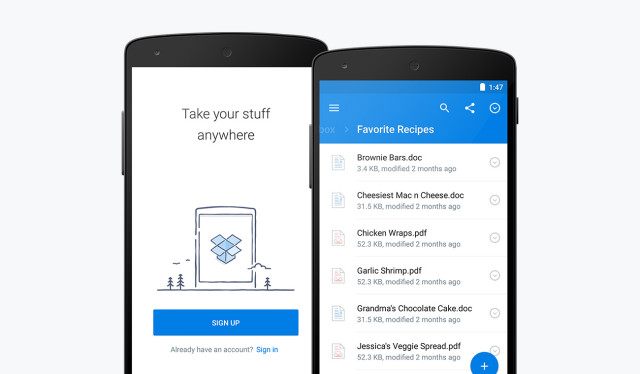
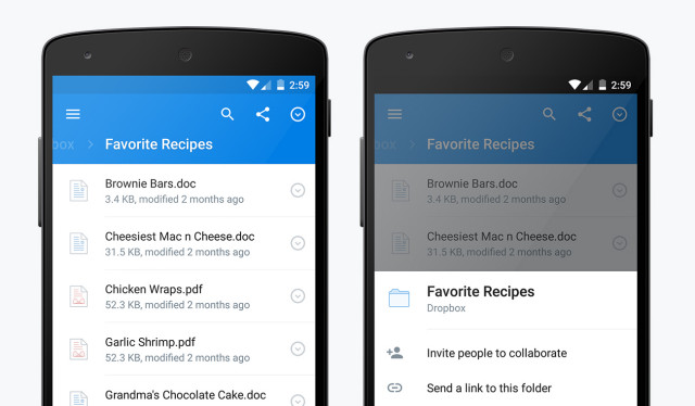
Dropbox has announced a nice new upgrade to their Android app. It’s Dropbox 3.0, and the main highlight is that the app is now doused in a full coat of Material Design. We’re finally getting an excellent use of white space, drop shadows, and — oh yes — that glorious floating action button (which will allow you to easily add files and photos to whichever folder you’re in while you press it).
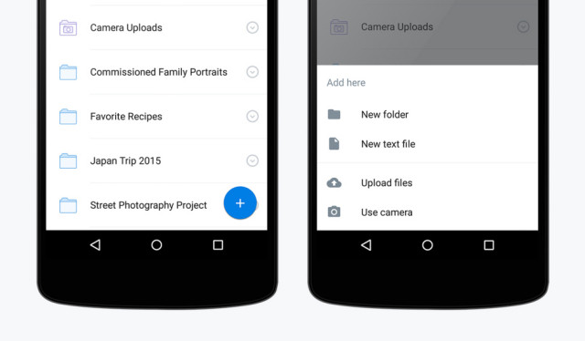
There weren’t many other functional changes made to the app, though you’ll notice a persistent search button throughout the app, as well as more consistent placement of sharing and file management controls throughout the app.
The upgrade should be headed to your phones and tablets shortly, so be sure to keep an eye out on Google Play throughout the course of the day. Oh, and check out the cool new user animation video they’ll be using straight ahead.
[via Dropbox]








Also can be downloaded from APKMirror: http://www.apkmirror.com/apk/dropbox-inc/dropbox/dropbox-3-0-0-2-android-apk-download/
Why do people love the glorious floating action button that’s out of place with the rest of the buttons and gets in the way of things like the check box or whatever. I guarantee you it will not last more than two versions of Android and will turn into a slide-out button from the side bezel which will be non-existent on the next Nexus.