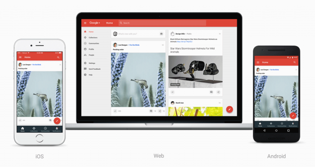
Say what you will about Google+, it’s actually grown a pretty strong following, not just among Android enthusiasts, but those that take have taken the time to find their niche. I guess that’s why in a new update hitting the web today (and soon, mobile apps), Google+ is being redesigned from the ground up to focus on doing what it does best: Collections and Communities.
Upon signing in, users will be presented with a completely redesigned home stream and with what Google is calling a “drastically simplified” product. That means everything from posting, searching, and connecting with others should be easier than ever. Google is putting a big focus on navigation that’s centered around Collections and Communities, which is helpful for finding others with shared interests.
Google says that in a way, things are still beta and not every Google+ feature has found its way into the new redesign. Because those will come at a later time — along with updates to their mobile apps — you may want to roll back the update or hold off for now. In either case, updating on the web is as simple as clicking the “Let’s go” prompt, and you can always go back to the “Classic” design by clicking the button in the lower left-hand corner. Enjoy!
[Google+]


Comments