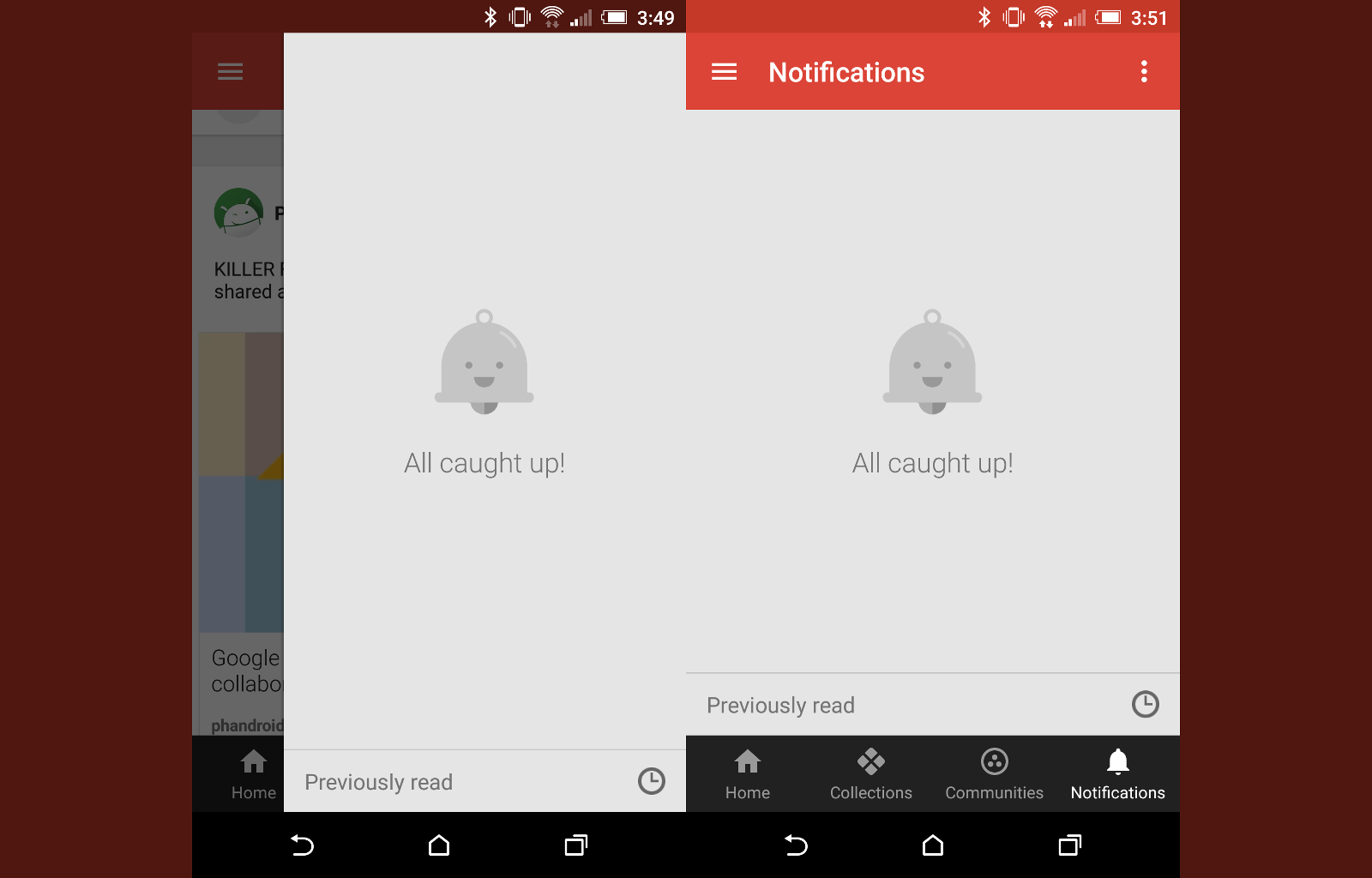
Google has been busy updating Google+ across a couple of platforms. The website version was recently given a massive UI update, and the Android app followed with several changes. The biggest change for the Android app can be seen in the four new tabs across the bottom of the screen: Home, Collections, Communities, and Notifications. The last tab, Notifications, is getting a slight adjustment in the a new update.
Previously, when tapping the Notifications tab, you would see a slide-out from the right side of the screen. The slide-out would cover part of the screen, just like the slide-out menus you see in a lot of Android apps. Version 6.9 of the Google+ app gives Notifications an entire page. Now, when you tap Notifications, it opens as a full page. In the toolbar, there is an option to clear all notifications and a three-dot menu icon.
Small changes like this make the app seem more polished. It didn’t make much sense that a tab would be presented as a slide-out menu. Google probably should have fixed this before they rolled out the previous update, but at least now it looks better.
Google+ for Android | Google Play


Comments