With Google IO 2016 just a few months away, rumors about the next version of Android have been flying around like crazy. A couple of the rumors have indicated major changes to core Android features, such as the removal of the app drawer. The next big change could be found in the Settings menu.
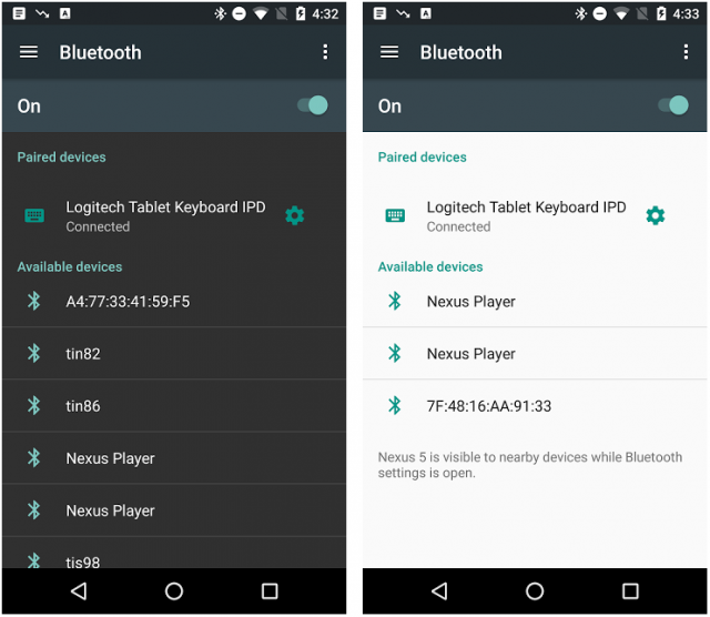
Google may have accidentally shared screenshots of the Settings in Android N. Yesterday, the Android Developer Blog posted about the Android Support Library 23.2. Unless you’re a developer, this is not a terribly exciting post. However, the screenshots towards the bottom of the page show a hamburger menu icon in the Settings. Presumably, tapping the hamburger icon will open a slide-out drawer with the different Settings sections.
Currently, the Settings menu is organized into sections on a single page. It can be a little cumbersome to scroll through the long page looking for a specific setting. A hamburger menu would make it much easier to navigate, and it would match the UI that a lot of Android apps already use. We would be able to quickly jump into the desired section of the Settings.
How do you feel about this new menu in the Settings? It seems that Google is rethinking how certain parts of Android work. We’re not sure how we feel about the app drawer going away, but taking a look at things that have been the same for a long time is a good practice.
[via Android Police]


Comments