While most of have only recently begun settling in with Android 6.0 Marshmallow on our devices, Android N looms near. In fact, we can expect to see our first official look at what the Android team has cooked up during this year’s Google I/O, taking place on May 18th – 20th at the Shoreline Amphitheater. If you were hoping for a sneak peek, a new leak could be giving us an early look at some of the UI changes we can expect.
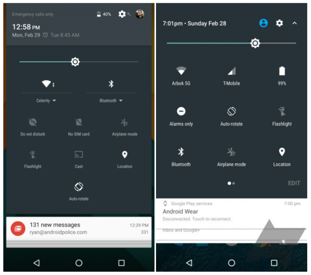
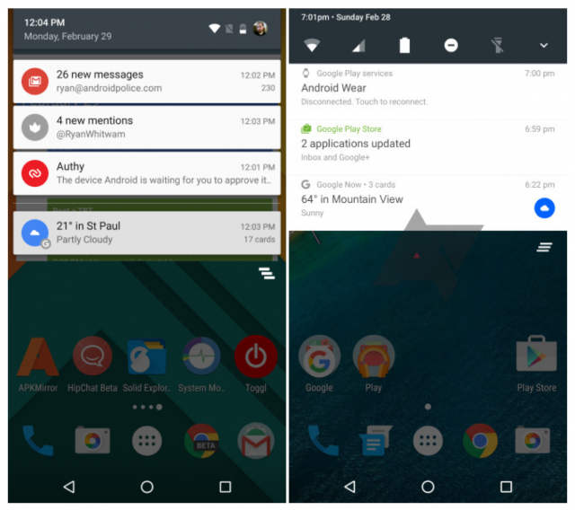
Using a handful of mockups, the folks at Android Police show us what Google could be planning for Android’s trademark notification shade and quick settings panels. Going for more of a Samsung-type feel, a few of the most commonly used quick settings will now appear at the top of the notification shade, removing the need to swipe twice to access things like WiFi, Bluetooth, or the flashlight. Of course, you can still swipe down twice to access all the others, with the new quick settings panel now paginated, allowing you to swipe left to access even more controls.
As for notifications, it seems Google could be toying around with the idea of removing the card UI we have no, going with instead a list and smaller, less prominent app icons. It’s an interesting look, one that almost feels like a throw back to early versions of Android. It may look a little less Material, but overall it seems cleaner and less cluttered. Still aren’t sure how we feel about it yet. What do you guys think?


Comments