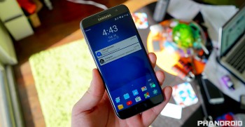
Samsung’s Good Lock gives your Galaxy S7 an entirely new lock screen, notifications, and recents UI
After Samsung introduced a new UI for the Galaxy S6, we didn’t see many changes for this year’s Galaxy S7. Sure the notification shade received a color swap, but for the most part, things mostly remained the same. In what can only be described as some sort of bizarre experiment (or April Fool’s prank), Samsung is releasing an interesting new app called Good Lock that looks to “breathe the smart life into your Galaxy.” Um, OK.
Available in the Galaxy Apps store, the “app” completely changes the look of the phone’s System UI and even installing Good Lock requires a full system reboot. We’re talking lock screen, notifications, recents — the whole nine. Here’s all the details.
Lock screen
The first thing users will notice is a totally revamped lock screen, one that now has widgets, odd notification management, and even an apps tray that can be dragged up to display 16 different app shortcuts.
Running with the idea of different lock screen layouts based on time of day and/or location, users can set “routines” inside the app. Routines allow you to change which widgets, clock style, and UI colors you’d like to display according to the time of day. For instance, set a routine for work and Good Lock will show you productivity short cuts, widgets, and maybe even more business-like UI colors. These are selected by the user, so it’s whatever you like.
Other settings inside Good Lock include the ability to enable a lock screen wallpaper and apply a routine color to it, as well as change the unlock effect. But Good Lock changes more than just the lock screen…
Notification shade and quick settings
Good Lock also features a completely new notification shade which, at first glance, appears to mirror the look of stock Android (only with a weird new color scheme). That’s where similarities end, however. Notifications can now be grouped into folders with the ability to save notifications for later in a new “keep” tab. Pressing and holding notifications allows you to store them inside folders, block them, or snooze them for later. These are all novel ideas, don’t get us wrong, just ones that don’t feel like they were executed very well.
Recents
Recents has been retooled as well, with recent apps now presented in a list view (along with a weird scrolling animation). Once again, the apps tray found on the lock screen is also present, allowing you to jump quickly to your favorite apps. Samsung tried to make their split-view and pop-up view features work here as well, with tiny icons above each app icon letting users know when it’s available.
Since Good Lock is essentially updating the existing System UI, uninstalling the app will simply replace it with the factory version (the UI that originally came with your Galaxy S7). This is why the app listing in the Galaxy Apps store says “update” instead of install.
Although it’s easy to be hard on Good Lock — the experimental UI can only be described as one big cluster f*ck — we have to admit, It’s fun to play around with. It’s also so drastically different from what we’re used to on Android, just about anyone will have a hard time getting over that steep learning curve.
At best, Good Lock offers a sneak peek into the creative mind of Samsung as it relates to Android. It’s possible this is the direction Samsung would have liked to take Android, you know, if Google wasn’t around to keep them in check, something that’s a little scary to even think about.
We just can’t help but wonder: with the ability to drastically change the UI with a simple update like this, why the hell Samsung wont just offer a stock “Google Play Edition” UI and call it a day. Android enthusiasts from all over the would sure appreciate it a lot more than whatever the heck this thing was.