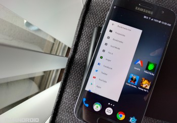
Chrome for Android is getting a Material Design bookmarks widget, ditches grid layout for list view
The Chrome bookmarks widget has long been in need of an overhaul. Aside from looking like it was ripped straight out of Ice Cream Sandwich, those darn thumbnails could never seemed to work properly. But it looks like that will soon change. An all new Chrome bookmarks widget is showing up in the latest Chrome Dev release, the bleeding edge version of the browser app that allows developers to check out features before they land in Chrome proper.
It seems the current grid view layout will be going away, replaced instead with a thumbnail-less list view. The overall look is definitely more Material if not slightly less functional. Instead of having 12+ bookmarks displayed, you now only have about 12 — no matter how you resize it. They can be scrolled through, so it’s not a big deal either way, just seems like wasted space. Those using the bookmarks widget on their home screens, will probably have to reorganize the layout to adjust for the changes.
So, when can you expect the new bookmarks to arrive in the stable release of Chrome on Google Play? Providing releases stay on track, the Chromium Project’s schedule is showing a May 31st estimated release date for Chrome 51 with the new Material bookmarks widget. Looks like you’ve still got some time to continue enjoying (or loathing) the Holo widget before then.
Download on Google Play: Chrome Dev
[via Android Police]